Sex Pistols poster
28.01.22
Design: Jamie Reid. Year: 1977.
Design: Jamie Reid. Year: 1977.
No other youth movement has really come close to punk’s energy and anarchy.
The band spearheading it all back in the mid/late 70s was of course the Sex Pistols. And the things that really set them apart, were the constant controversy surrounding the band and, not unrelated to that, their graphic identity created by designer/artist, Jamie Reid.
Although John Lydon (vocals), Steve Jones (guitar), Glen Matlock (bass — later replaced by Sid Vicious) and Paul Cook (drums) most certainly played their part, much of the band’s infamy was orchestrated by their manager, Malcolm McLaren, who was also responsible for bringing Reid on board — they had been students together at Croydon Art School.
The band burst into the collective consciousness with an expletive-laden live TV interview in December ’76.
The press, naturally, had a field day. And when The Pistols’ seismically controversial second single, ‘God Save the Queen’ was released in June ’77, the BBC and the commercial radio stations all refused to give it any airtime.
The band members have subsequently played down their political intent, but the record is nevertheless a blatant attack on Britain’s social structures and deference to the monarchy. All delivered with a nihilistic snarl and the guitar amps turned up to eleven.
And to mightily add to all the fuss, the single was released to coincide with and satirise the Queen’s Silver Jubilee year.
Lydon saw the song as supporting ’the ordinary working man’, exploited by ’the system’.
Unfortunately it didn’t resonate too well with that audience.
Workers at the pressing plant and the printers went on strike in protest at the lyrics and cover artwork. Then there were the discussions in Parliament about prosecuting the band under the Traitors Act. Oh, and they were fired by their record label, A&M, who paid them £75K to go away.
But despite (or maybe because of) all the furore, when the single was eventually released, on Virgin, it shot up to No. 2 on the official UK Chart.
Conspiracy theorists will tell you that it was deliberately kept off the No. 1 slot. And they’re probably right.
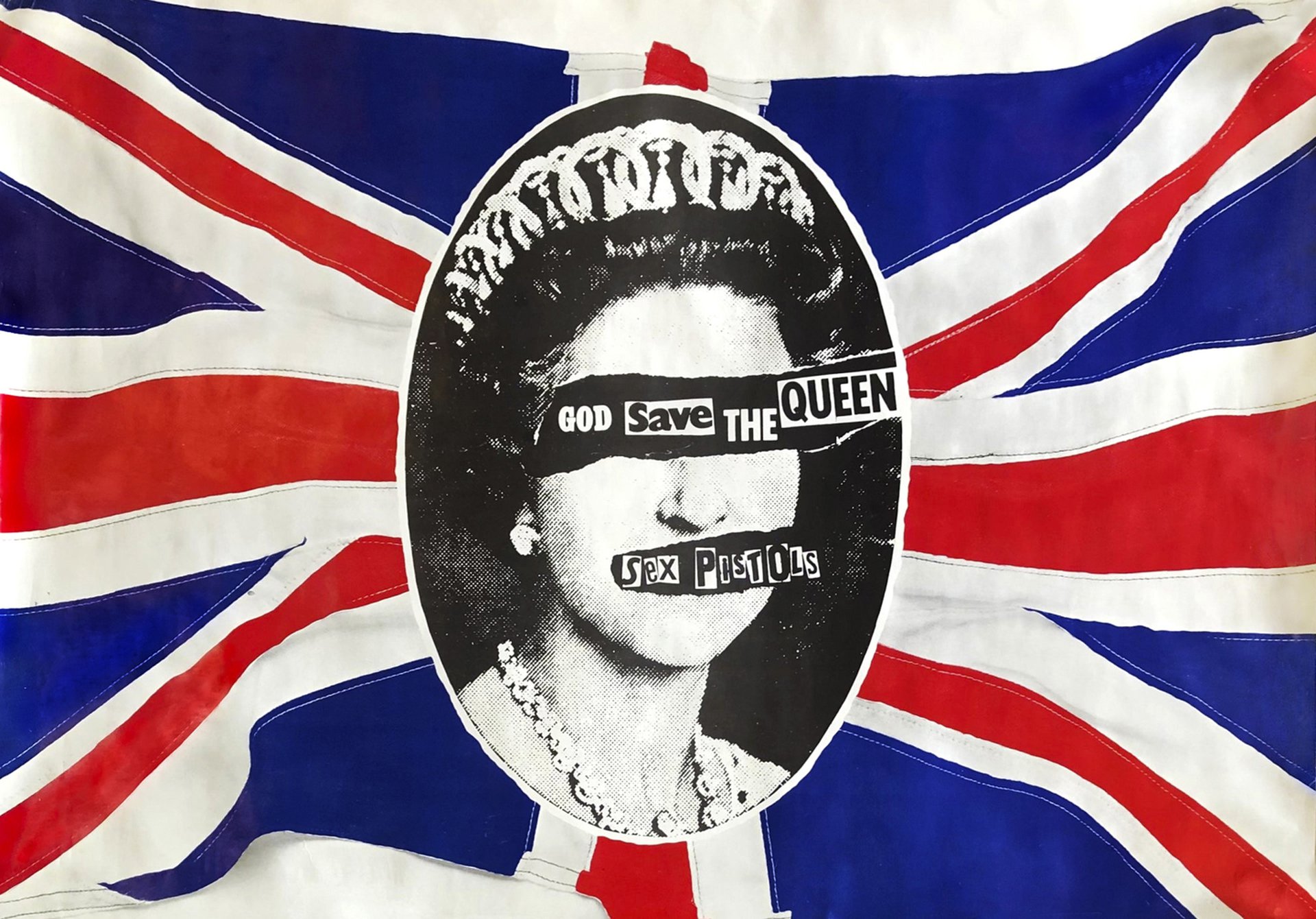
The above poster promoted that record.
Reid was certainly more political than the band members. He realised that the Sex Pistols could be the perfect vehicle to communicate ideas to people who were not connecting with traditional left-wing politics.
So appropriating the Union Jack (reproduced the wrong way round) and defacing Peter Grugeon’s iconic photograph of the Queen, were deliberately contentious, yet relevant, shock tactics, designed to attract attention.
And the subject matter somehow appeared even more dangerous when presented in his rough, cut and paste trademark style.
Reid’s design is not however as crude as you might first think.
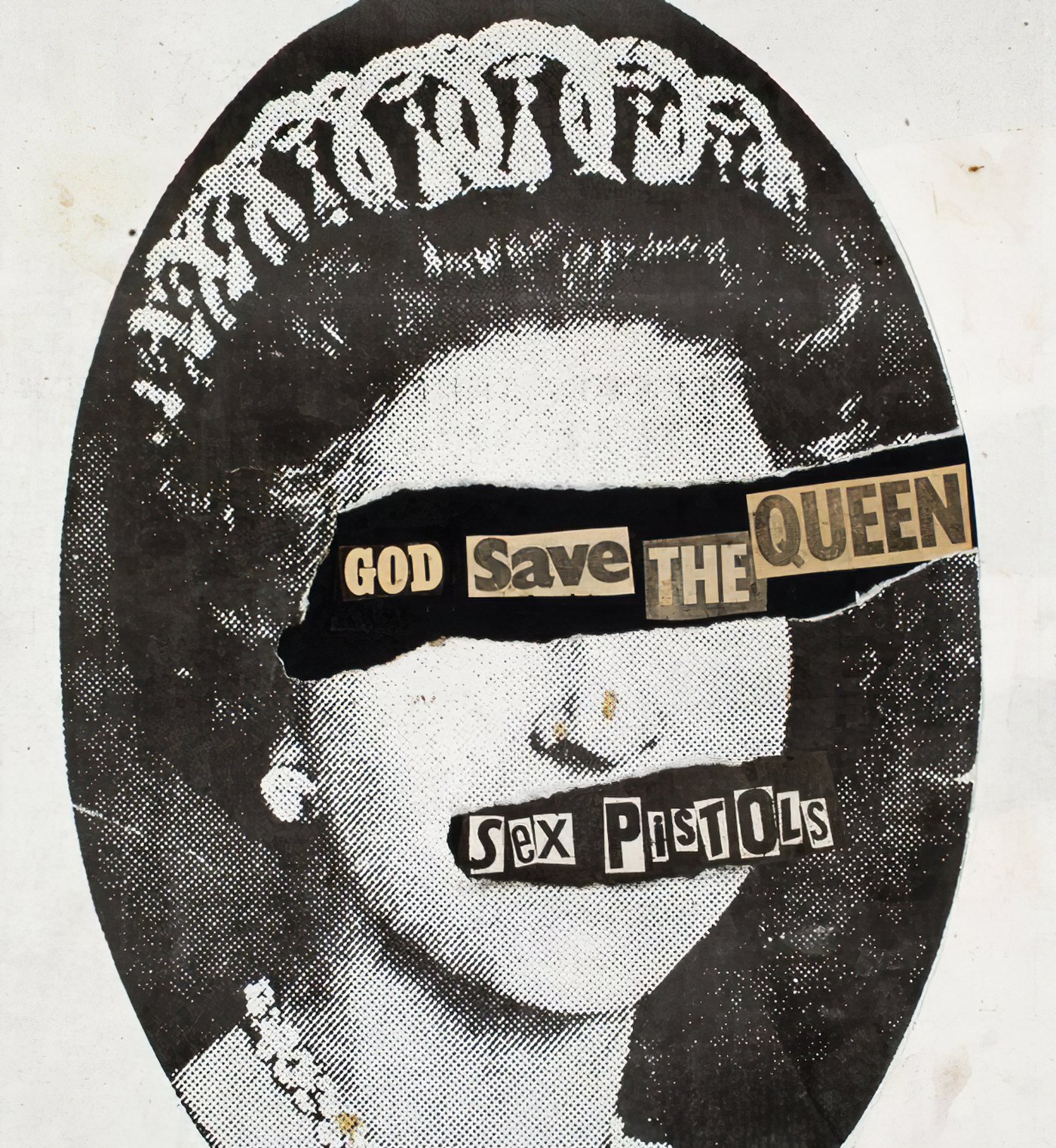
Yes, the ransom note typography is deliberately ugly and a graphic nod towards criminality. It’s also a clear reference to the UK’s royal-obsessed tabloid newspaper culture; as is the heavy dot screen on the photo (see the original artwork below).
The band spearheading it all back in the mid/late 70s was of course the Sex Pistols. And the things that really set them apart, were the constant controversy surrounding the band and, not unrelated to that, their graphic identity created by designer/artist, Jamie Reid.
Although John Lydon (vocals), Steve Jones (guitar), Glen Matlock (bass — later replaced by Sid Vicious) and Paul Cook (drums) most certainly played their part, much of the band’s infamy was orchestrated by their manager, Malcolm McLaren, who was also responsible for bringing Reid on board — they had been students together at Croydon Art School.
The band burst into the collective consciousness with an expletive-laden live TV interview in December ’76.
The press, naturally, had a field day. And when The Pistols’ seismically controversial second single, ‘God Save the Queen’ was released in June ’77, the BBC and the commercial radio stations all refused to give it any airtime.
The band members have subsequently played down their political intent, but the record is nevertheless a blatant attack on Britain’s social structures and deference to the monarchy. All delivered with a nihilistic snarl and the guitar amps turned up to eleven.
And to mightily add to all the fuss, the single was released to coincide with and satirise the Queen’s Silver Jubilee year.
Lydon saw the song as supporting ’the ordinary working man’, exploited by ’the system’.
Unfortunately it didn’t resonate too well with that audience.
Workers at the pressing plant and the printers went on strike in protest at the lyrics and cover artwork. Then there were the discussions in Parliament about prosecuting the band under the Traitors Act. Oh, and they were fired by their record label, A&M, who paid them £75K to go away.
But despite (or maybe because of) all the furore, when the single was eventually released, on Virgin, it shot up to No. 2 on the official UK Chart.
Conspiracy theorists will tell you that it was deliberately kept off the No. 1 slot. And they’re probably right.
The above poster promoted that record.
Reid was certainly more political than the band members. He realised that the Sex Pistols could be the perfect vehicle to communicate ideas to people who were not connecting with traditional left-wing politics.
So appropriating the Union Jack (reproduced the wrong way round) and defacing Peter Grugeon’s iconic photograph of the Queen, were deliberately contentious, yet relevant, shock tactics, designed to attract attention.
And the subject matter somehow appeared even more dangerous when presented in his rough, cut and paste trademark style.
Reid’s design is not however as crude as you might first think.
Yes, the ransom note typography is deliberately ugly and a graphic nod towards criminality. It’s also a clear reference to the UK’s royal-obsessed tabloid newspaper culture; as is the heavy dot screen on the photo (see the original artwork below).
But the poster takes design cues from the Italian Futurists and European Dadaists too — they often used bits of random cut out type in their art and printed manifestos.
The contrast between the black and white image of the Queen and the bright red and blue of the flag is also noteworthy.
The viewer’s eye is naturally drawn towards the colours and strong graphic shapes of the Union Jack. This makes the greyscale Queen appear somewhat antiquated and less important in the hierarchy of elements on the poster; as per the anti-establishment principles behind the song’s lyrics. Tearing off the eyes and mouth obviously has a similar effect, whilst also creating an outrageously defiant position for the typography.
For a music poster, the band name is incredibly small. But it doesn’t need to be any bigger, such is the impact of the design.
And of course ripping the picture is a clear reference to the idea of abolishing the monarchy.
The graphic technique employed here is called décollage; where areas of an image are cut or torn away. This all started in the late 50s, in France, with artists Jacques Mahé de la Villeglé and Raymond Hains exhibiting ripped poster artworks torn from the walls of Paris. It was part of an art movement called ‘New Realism’, a kind of European counterpart to Pop Art.
Those ‘poster canvases’ have an obvious energy and implicit violence that works perfectly as inspiration for punk graphics.
So there you have it, Futurist, Dadaist and New Realist influences, all in a single poster.
And as we seem to have strayed into name-dropping 20th century art movements, it’s also worth mentioning that Reid had connections to the Situationists. An international organisation of social revolutionaries comprised of avant-garde artists, intellectuals and political theorists.
In fact he first developed his lo-tech, ransom note aesthetic in 1970 whilst designing a radical Situationist-influenced magazine called Suburban Press.
But it’s his incredible body of work for The Sex Pistols that will surely endure.
Interesting, isn’t it, that a poster designed to promote a 7” single in the Virgin Megastore can become such a significant social document and anti-establishment totem.
Testament to the potential power of youth culture, music and, of course, design.