Pink Floyd album cover
15.01.22
Design Group: Hipgnosis. Year 1975.
Designer: Storm Thorgerson.
Photographers: Aubrey Powell, Storm Thorgerson.
Designer: Storm Thorgerson.
Photographers: Aubrey Powell, Storm Thorgerson.
Design Group: Hipgnosis. Year 1975. Designer: Storm Thorgerson. Photographers: Aubrey Powell, Storm Thorgerson.
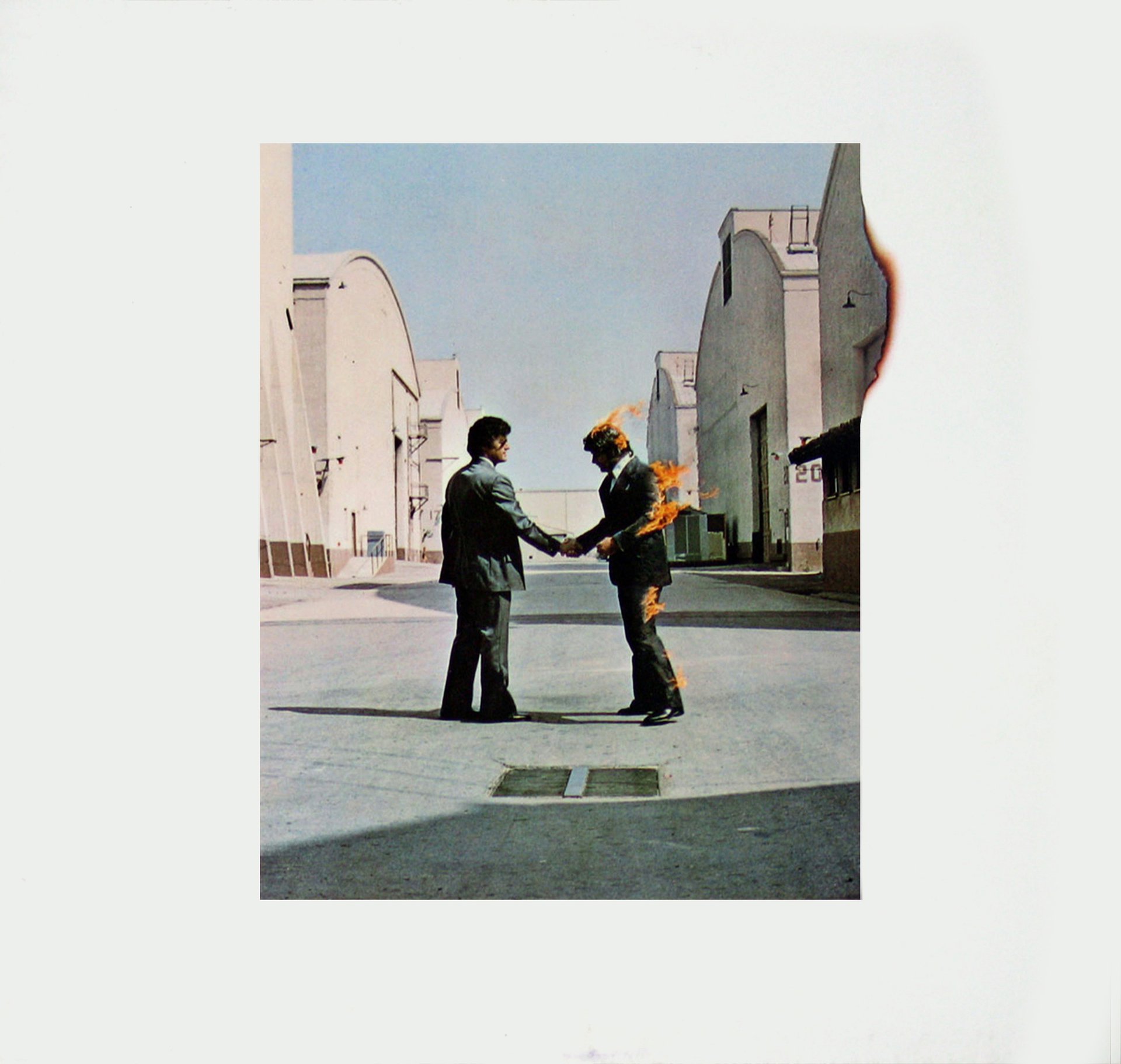
The acrid stench of his moustache catching fire was the final straw. Stuntman Ronnie Rondell Jr. dropped to his knees and disappeared in a dense cloud of fire extinguisher.
Once the white mist had cleared, he emphatically announced “THAT’S IT. NO MORE”.
All in a day’s work for a Hollywood stuntman I suppose. And all in a day’s work for the design group Hipgnosis, who found themselves shooting a Pink Floyd album cover at the intersection of Ave. D and 5th St. on the Warner Bros. studio lot in Burbank California, sometime in early 1975.
Yes, they did it for real. It’s generally the best policy if you want something to look real. Rondell wore a fire-retardant suit beneath his corporate business attire, with the protective layer continuing up over his head, underneath a wig.
To get the shot, he was covered in a napalm-like gel, took up position, and was ’sparked’, as I believe they say.
The process was repeated 15 times until a rogue gust of wind blew up and wrapped the flames around his face. Luckily he only lost an eyebrow and half of his moustache.
To add to the difficulty of the shoot, the wind was actually blowing from the wrong direction. Which meant that if Rondell was on the right, as per the concept layout, then the flames would be blowing directly onto our other stuntman Danny Rogers. To get around this, they stood the opposite way round to the layout and shook hands using their left hands. The figures were then flipped for the final artwork.
But enough detail. Why, you may reasonably wonder, are there two business men (one on fire) shaking hands, on the cover of the Pink Floyd album ’Wish You Were Here’?
Well, like all the brilliant album covers by Hipgnosis, the concept was inspired by analysing the lyrics, listening to the music of course, and debates with the band. What emerged from all that was the notion of ’absence’ or ’unfulfilled presence’. Especially apparent in the words of the track ’Shine on You Crazy Diamond’ about ex-Floyd member Syd Barrett.
In designer, Storm Thorgerson’s words: “The concept is two men — record execs shaking hands on some unknown deal. The handshake being an empty gesture, void of meaning. With the flames being a visualisation of people’s tendency to remain emotionally withdrawn (or absent) for fear of ’being burned’”.
Well, I guess that’s all in there if you want it.
But with album covers, I think it’s perfectly fine for the viewer to interpret some of their own meaning in the artwork (much like the music). Having spent a portion of my career working in ad agency creative departments, I can certainly relate to that guy on the right.
There’s also clearly a strong anti-corporate theme here, no doubt inspired by the lyrics to tracks like ’Have a Cigar’ and ’Welcome to the Machine’. With the band alluding to the loss of a more simple, freer period in their history.
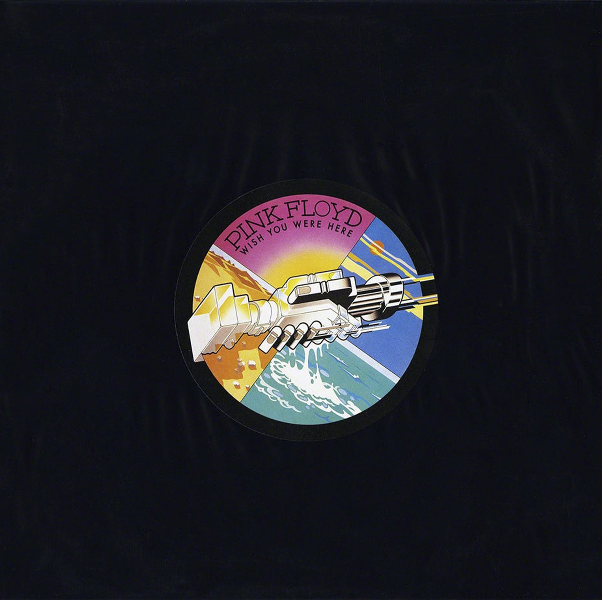
Hipgnosis further developed the concept by enclosing the album in black shrink-wrap, so even the album art itself became ’absent’. There was however a sticker on the front, featuring an illustration by George Hardy of two machine-like hands, referencing the cover image. The design also included the band name and album title; a neat way of keeping any type off the front cover.
Once the white mist had cleared, he emphatically announced “THAT’S IT. NO MORE”.
All in a day’s work for a Hollywood stuntman I suppose. And all in a day’s work for the design group Hipgnosis, who found themselves shooting a Pink Floyd album cover at the intersection of Ave. D and 5th St. on the Warner Bros. studio lot in Burbank California, sometime in early 1975.
Yes, they did it for real. It’s generally the best policy if you want something to look real. Rondell wore a fire-retardant suit beneath his corporate business attire, with the protective layer continuing up over his head, underneath a wig.
To get the shot, he was covered in a napalm-like gel, took up position, and was ’sparked’, as I believe they say.
The process was repeated 15 times until a rogue gust of wind blew up and wrapped the flames around his face. Luckily he only lost an eyebrow and half of his moustache.
To add to the difficulty of the shoot, the wind was actually blowing from the wrong direction. Which meant that if Rondell was on the right, as per the concept layout, then the flames would be blowing directly onto our other stuntman Danny Rogers. To get around this, they stood the opposite way round to the layout and shook hands using their left hands. The figures were then flipped for the final artwork.
But enough detail. Why, you may reasonably wonder, are there two business men (one on fire) shaking hands, on the cover of the Pink Floyd album ’Wish You Were Here’?
Well, like all the brilliant album covers by Hipgnosis, the concept was inspired by analysing the lyrics, listening to the music of course, and debates with the band. What emerged from all that was the notion of ’absence’ or ’unfulfilled presence’. Especially apparent in the words of the track ’Shine on You Crazy Diamond’ about ex-Floyd member Syd Barrett.
In designer, Storm Thorgerson’s words: “The concept is two men — record execs shaking hands on some unknown deal. The handshake being an empty gesture, void of meaning. With the flames being a visualisation of people’s tendency to remain emotionally withdrawn (or absent) for fear of ’being burned’”.
Well, I guess that’s all in there if you want it.
But with album covers, I think it’s perfectly fine for the viewer to interpret some of their own meaning in the artwork (much like the music). Having spent a portion of my career working in ad agency creative departments, I can certainly relate to that guy on the right.
There’s also clearly a strong anti-corporate theme here, no doubt inspired by the lyrics to tracks like ’Have a Cigar’ and ’Welcome to the Machine’. With the band alluding to the loss of a more simple, freer period in their history.
Hipgnosis further developed the concept by enclosing the album in black shrink-wrap, so even the album art itself became ’absent’. There was however a sticker on the front, featuring an illustration by George Hardy of two machine-like hands, referencing the cover image. The design also included the band name and album title; a neat way of keeping any type off the front cover.
In fact Storm Thorgeson and his partner Aubrey Powell (who also took the cover picture) really went to town on all the associated imagery, dramatising ’absence’ in different ways with more surreal conceptual craziness.
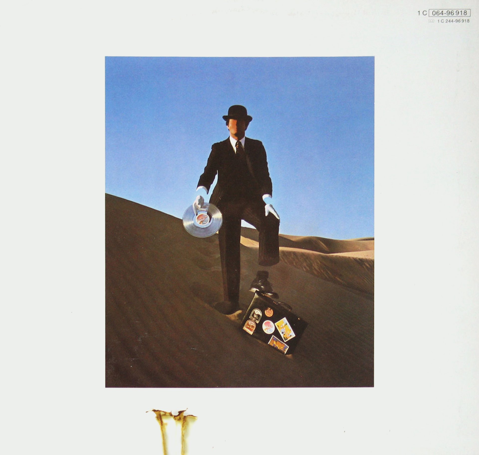
On the back cover there’s another photograph of a faceless salesman ’selling his soul’, shot by Powell in California’s Yuma desert. He wears an empty suit with absent wrists and ankles.
On the back cover there’s another photograph of a faceless salesman ’selling his soul’, shot by Powell in California’s Yuma desert. He wears an empty suit with absent wrists and ankles.
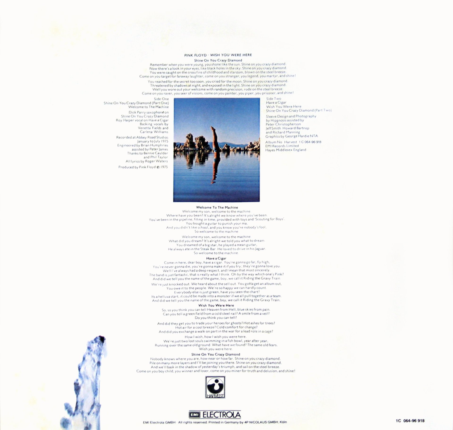
The inner sleeve features photography by Thorgerson of a diver entering California’s Mono Lake with an absent splash. The effect was actually created without retouching when the diver performed a handstand underwater until the ripples dissipated.

There’s also a photograph of the form of a nude woman within a red veil; the veil being a symbol of hiding or absence. Also note the billowing outline of the photograph itself; a nice graphic touch.
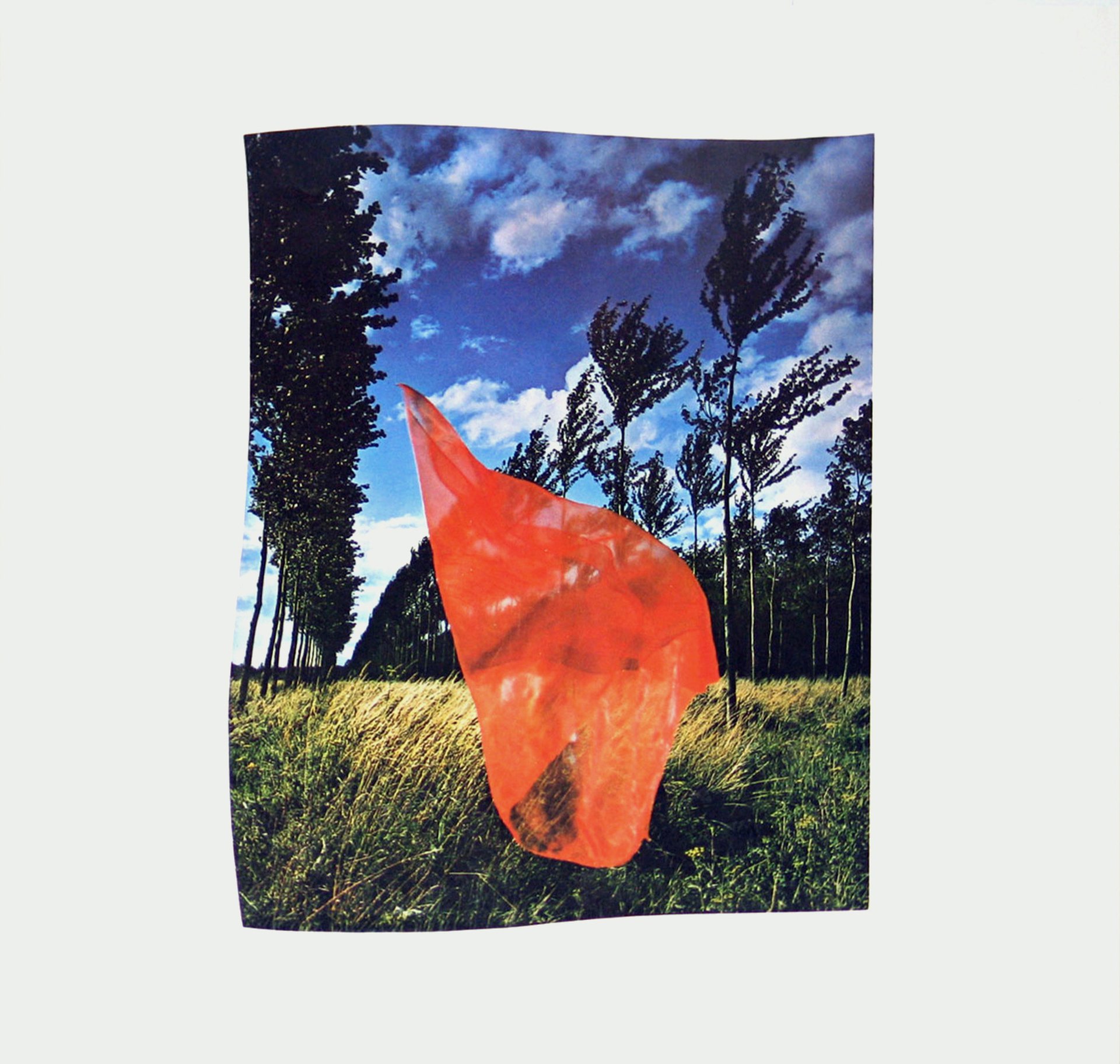
One other design detail I particularly love is the scorched extension of the cover image spreading into the white border, further emphasising the burning man.
Obvious really, isn’t it? If you’re dramatising something about any product or service, you should aim to do it in the most extreme way possible. Because that’s how you get noticed and remembered. Hipgnosis did it by setting a man on fire.
What will you do on your next brief?
Can we all say “THAT’S IT. NO MORE” to boring work please?