English Heritage press ad
20.03.21
Agency: Leagas Delaney. Year: 1997.
Art Director: Dave Dye. Copywriter: Sean Doyle.
Typographer: Dave Wakefield.
Art Director: Dave Dye. Copywriter: Sean Doyle.
Typographer: Dave Wakefield.
Agency: Leagas Delaney. Year: 1997. Art Director: Dave Dye. Copywriter: Sean Doyle. Typographer: Dave Wakefield.
No one reads anymore. Apparently.
It seems that people mysteriously lost that ability sometime around the late-nineties, if you believe the received wisdom in some advertising circles. There was even a funny ad written around that time, poking fun at long copy. It got into D&AD I recall. For copy.
To be fair, they did have a point. There were some unnecessarily rambling examples of the genre. But as usual in all these debates, it’s not black or white.
I’m obviously not suggesting that every piece of advertising communication requires a few hundred of words of text. Far from it. But why totally dismiss that option?
Writing even a medium amount of copy on an ad has bizarrely become desperately unfashionable. It’s an attitude propagated by those who quite correctly conclude that no one will read a rubbish ad but can’t seem to get their heads around the fact that some people may happily read an interesting one.
Let’s face it, how else can you persuasively communicate several benefits of a product or service in print?
And if you honestly believe that no one reads anymore, then it naturally follows that few juniors are going to be encouraged to learn to write well.
So here we are. With a generation of ‘writers’ who can’t really write and a generation of art directors who don’t know their ampersand from their ellipsis.
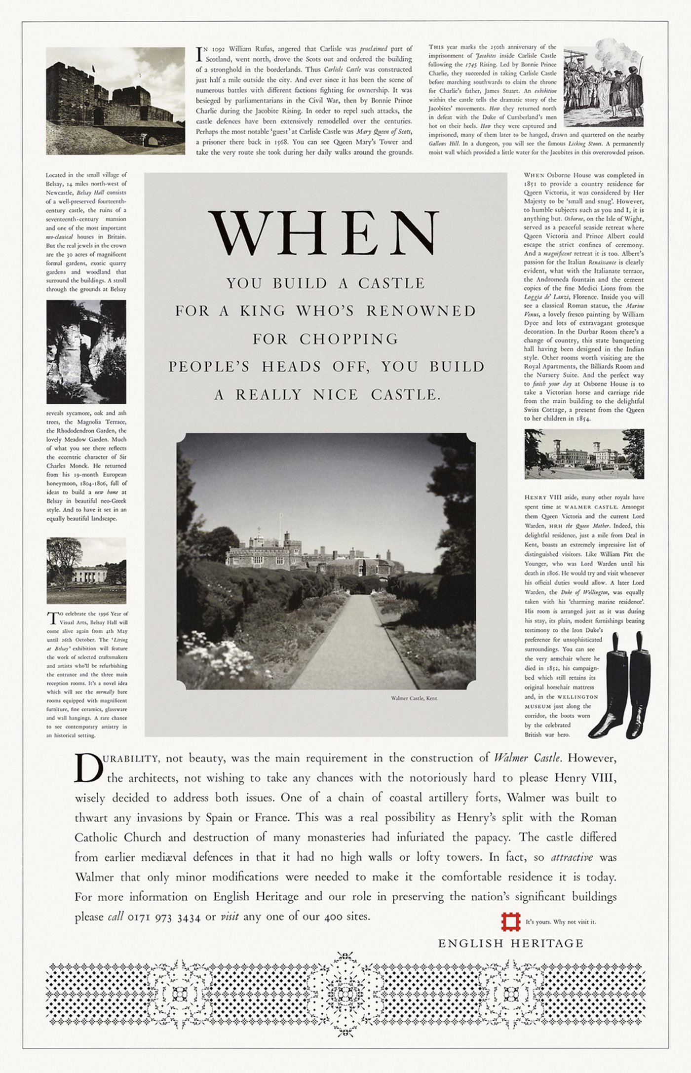
A stark contrast to 1997 when this wonderful full-page newspaper ad for English Heritage was created. All 980 beautifully typeset, kerned, leaded, justified and endlessly tweaked words of it. This really is a sublime piece of art direction and typography. And, of course, copywriting.
Quite apart from the brilliant headline (remember them?), the writer and typographer had to spend many hours perfectly justifying narrow columns of text. This is letterpress type, and being hot metal, the character count per line was crucial. So the typographer would call the writer regularly with requests: e.g. “On line 22, could you trim the character count from 19 to 17”. Incredibly difficult and tedious work.
But was it worth it?
Well look at it. There are so many reasons why this ad is great. For a start, the choice of headline typeface (Van Dijck 203) is perfect for the subject matter. The typefaces for the other ads in this campaign were all different, again, to relate to the particular subject of each ad. Because when you have such a distinctive and consistent layout, the typefaces can change, no problem. It will still look like an English Heritage ad.
In fact even that headline has way more words than your average line. And to make it more inviting to the reader, the first word has been massively enlarged.
Okay, what else?
The choice and variety of imagery is unusual for an ad; mixing photography, illustration, colour, black and white, squared-off pictures and cut-outs. It shouldn’t work but it does. In fact all the pictures are individually somewhat nondescript but when grouped together they become much more interesting.
There are wonderful quirks and subtle imperfections in the letterpress typography, rather than taking the easier but less authentic option of using digital typefaces on a Mac. The hierarchy created by having variable body copy sizes makes the text less intimidating. It also helps all the type fit of course. And the use of drop caps and small caps at the start of the text blocks guides the eye; a technique borrowed from editorial and book design.
The position of the endline in the logo lockup is also unusual.
And along the base of the page we see a decorative strip but it’s not mere decoration. It uses 6pt Monotype decorative units arranged in the shape of a Tudor Rose; the inspiration behind the architecture of the main castle featured in the ad.
A lovely touch. Note also how the logo is perfectly centered above one of the main elements in this strip.
There’s another important thing to say about the amount of copy.
Simply seeing so much text on a page surely implies that English Heritage must be able to give you a really interesting day out. This is communicated in a millisecond before you’ve even read a word of copy.
That’s right, those 980 words are really part of the visual. The ad still works brilliantly without them, with just headline, main visual and logo. But if you’re interested in history (the target market) and you do care to read everything, then it’s very rewarding.
Sadly, there were only three ads in this campaign. But many more headlines were written and ready to go. My favourite contained: ‘Where Henry VIII’s 5'1" wife, soon to be 4'3", once…’.
But the client abruptly fired the agency half way through putting the fourth ad together. I’m told it was because there was a complaint that one of the ads referred to the Queen as ‘Her Highness’ instead of ‘Her Majesty’.
Well at least that proves someone read it.
It seems that people mysteriously lost that ability sometime around the late-nineties, if you believe the received wisdom in some advertising circles. There was even a funny ad written around that time, poking fun at long copy. It got into D&AD I recall. For copy.
To be fair, they did have a point. There were some unnecessarily rambling examples of the genre. But as usual in all these debates, it’s not black or white.
I’m obviously not suggesting that every piece of advertising communication requires a few hundred of words of text. Far from it. But why totally dismiss that option?
Writing even a medium amount of copy on an ad has bizarrely become desperately unfashionable. It’s an attitude propagated by those who quite correctly conclude that no one will read a rubbish ad but can’t seem to get their heads around the fact that some people may happily read an interesting one.
Let’s face it, how else can you persuasively communicate several benefits of a product or service in print?
And if you honestly believe that no one reads anymore, then it naturally follows that few juniors are going to be encouraged to learn to write well.
So here we are. With a generation of ‘writers’ who can’t really write and a generation of art directors who don’t know their ampersand from their ellipsis.
A stark contrast to 1997 when this wonderful full-page newspaper ad for English Heritage was created. All 980 beautifully typeset, kerned, leaded, justified and endlessly tweaked words of it. This really is a sublime piece of art direction and typography. And, of course, copywriting.
Quite apart from the brilliant headline (remember them?), the writer and typographer had to spend many hours perfectly justifying narrow columns of text. This is letterpress type, and being hot metal, the character count per line was crucial. So the typographer would call the writer regularly with requests: e.g. “On line 22, could you trim the character count from 19 to 17”. Incredibly difficult and tedious work.
But was it worth it?
Well look at it. There are so many reasons why this ad is great. For a start, the choice of headline typeface (Van Dijck 203) is perfect for the subject matter. The typefaces for the other ads in this campaign were all different, again, to relate to the particular subject of each ad. Because when you have such a distinctive and consistent layout, the typefaces can change, no problem. It will still look like an English Heritage ad.
In fact even that headline has way more words than your average line. And to make it more inviting to the reader, the first word has been massively enlarged.
Okay, what else?
The choice and variety of imagery is unusual for an ad; mixing photography, illustration, colour, black and white, squared-off pictures and cut-outs. It shouldn’t work but it does. In fact all the pictures are individually somewhat nondescript but when grouped together they become much more interesting.
There are wonderful quirks and subtle imperfections in the letterpress typography, rather than taking the easier but less authentic option of using digital typefaces on a Mac. The hierarchy created by having variable body copy sizes makes the text less intimidating. It also helps all the type fit of course. And the use of drop caps and small caps at the start of the text blocks guides the eye; a technique borrowed from editorial and book design.
The position of the endline in the logo lockup is also unusual.
And along the base of the page we see a decorative strip but it’s not mere decoration. It uses 6pt Monotype decorative units arranged in the shape of a Tudor Rose; the inspiration behind the architecture of the main castle featured in the ad.
A lovely touch. Note also how the logo is perfectly centered above one of the main elements in this strip.
There’s another important thing to say about the amount of copy.
Simply seeing so much text on a page surely implies that English Heritage must be able to give you a really interesting day out. This is communicated in a millisecond before you’ve even read a word of copy.
That’s right, those 980 words are really part of the visual. The ad still works brilliantly without them, with just headline, main visual and logo. But if you’re interested in history (the target market) and you do care to read everything, then it’s very rewarding.
Sadly, there were only three ads in this campaign. But many more headlines were written and ready to go. My favourite contained: ‘Where Henry VIII’s 5'1" wife, soon to be 4'3", once…’.
But the client abruptly fired the agency half way through putting the fourth ad together. I’m told it was because there was a complaint that one of the ads referred to the Queen as ‘Her Highness’ instead of ‘Her Majesty’.
Well at least that proves someone read it.