Nike press campaign
11.03.21
Agency: Wieden + Kennedy, Amsterdam. Year 1993.
Art director: Warren Eakins. Writer: Evelyn Monroe Neill.
Typographer: Lucia Eakins. Photographer: Nadav Kander.
Art director: Warren Eakins. Writer: Evelyn Monroe Neill.
Typographer: Lucia Eakins. Photographer: Nadav Kander.
Agency: Wieden + Kennedy, Amsterdam. Year 1993. Art director: Warren Eakins. Writer: Evelyn Monroe Neill. Typographer: Lucia Eakins. Photographer: Nadav Kander.
I find most mainstream beauty ads kind of ugly.
It’s not just the big brands’ formulaic approach to type and layout. It’s also the near universal tendency to forensically over-retouch the models. Making the resulting images closer to illustration than photography. And closer to lies than truth.
Strangely enough, it takes a sportswear brand to show us how it should be done.
Because this offering from Nike is actually a beauty ad. Or at least a sportswear ad masquerading as a beauty ad.
The copy is based on the proposition that ‘working out’ gives you better skin. Though, much like physical exercise, you do have to make a bit of an effort with this ad.
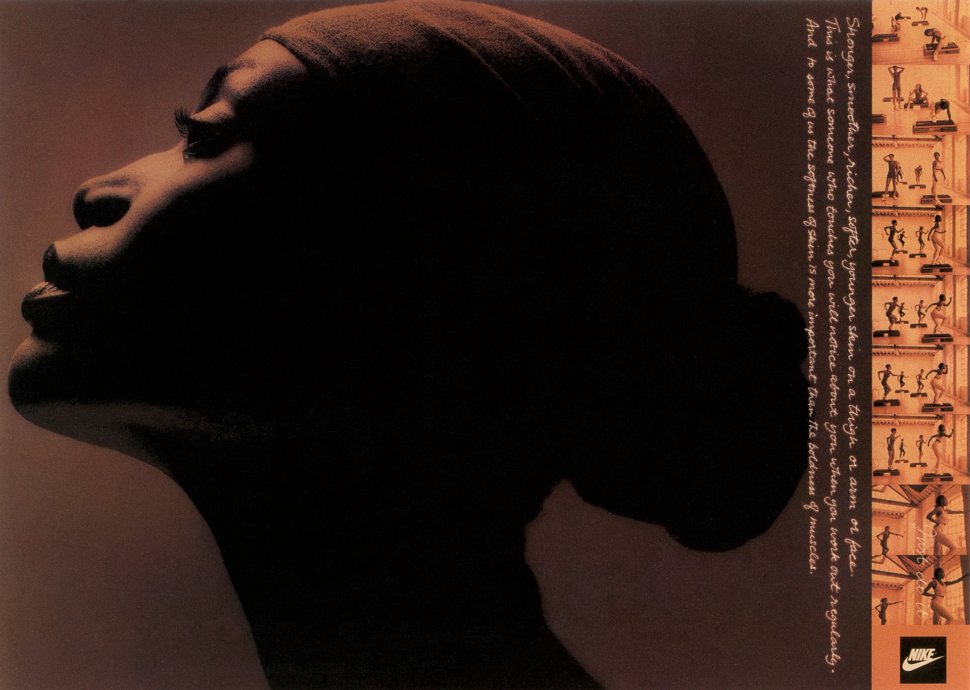
Not only are the words set in small handwriting, they’ve also been reversed out and the copy has been rotated 90 degrees.
Now, where did I put those reading glasses?
Here’s the text in a more legible form: “Stronger, smoother, richer, softer, younger skin on a thigh or arm or face. This is what someone who touches you will notice about you when you work out regularly. And to some of us the softness of skin is more important that the boldness of muscles.”
Great. A pretty appealing benefit that many people may not have considered. But will anyone read it?
The page layout has clearly sacrificed legibility in favour of elegance and a distinctive look. In fact I’ve been staring at this ad for about 20 minutes and I’ve only just noticed the endline. Yes, there it is, above the logo; the brilliant ‘Just do it’. Also in handwriting, reversed out, with reduced opacity and rotated 90 degrees over a busy background. Blimey.
It seems that supreme art direction can sometimes deliberately make the words hard to read. But why would anyone do that? And why would a large global client let them?
I would argue that this page sits in the minuscule category of ads that are so visually stunning, the viewer is hooked from the first millisecond.
That’s what great art direction can do. And a conventional-looking ad cannot. After all, we perceive the look of the page before we read the message. This ad will surely be the most impactful spread in the magazine (shouldn’t that be the ambition of every art director with every press brief?).
And now that we have the reader’s full attention, they will naturally assume that the words must be interesting; why else would the brand put so much effort into crafting such a visually incredible layout?
(In this case, a less subtle type treatment could easily reduce that instant visual appeal.)
So yes, they’ll start to read the copy. Whether they continue to read it is of course the responsibility of the writer.
The visual mood is well and truly set with a large, tightly cropped photograph of a model’s face. Nothing new there of course. But now we begin to subvert the genre. We use a toned, low key black and white image, obscuring much of her face in deep shadow for graphic effect.
We also have an unusual angle and composition.
This is certainly not your average beauty shot. It’s much, much better. The photographer has created something unique, powerful and wonderfully evocative.
But we’re actually selling sportswear here. So down the right-hand side of the layout, the art director has added a strip of nine similarly toned smaller images featuring women ’working out’. These shots, with their light background, stand out yet perfectly complement the main image without reducing its impact.
They also keep the client happy by featuring some products.
Another clever feature of the strip is how it incorporates the logo, making it look like an integral part of the design, rather than a jarring visual element plonked into the bottom corner. This helps the page to not look like an ad.
It’s also worth noting that the sequence of pictures, presumably shot with a motor drive, ingeniously conveys a strong sense of movement despite being still images.
And last but by no means least, the strip also, of course, makes the layout more interesting.
Which leads us on to the type treatment. Why handwriting? Why is it on its side? And where’s the headline?
I think the handwriting makes the message more personal. And softer. Like a friend writing to you or thoughts from someone’s diary. So there’s almost a voyeuristic desire to discover what the words say.
Its vertical position sits perfectly with the orientation of the strip, whilst also allowing the height of the main image to be as large as possible; thereby increasing its impact. The lack of a headline also creates more space for the photography, and yes, again, stops the page looking like an ad.
Note that the type has been reproduced in colours sampled from the toned photographs. This is a neat trick to help visually glue everything together.
It’s not just the big brands’ formulaic approach to type and layout. It’s also the near universal tendency to forensically over-retouch the models. Making the resulting images closer to illustration than photography. And closer to lies than truth.
Strangely enough, it takes a sportswear brand to show us how it should be done.
Because this offering from Nike is actually a beauty ad. Or at least a sportswear ad masquerading as a beauty ad.
The copy is based on the proposition that ‘working out’ gives you better skin. Though, much like physical exercise, you do have to make a bit of an effort with this ad.
Not only are the words set in small handwriting, they’ve also been reversed out and the copy has been rotated 90 degrees.
Now, where did I put those reading glasses?
Here’s the text in a more legible form: “Stronger, smoother, richer, softer, younger skin on a thigh or arm or face. This is what someone who touches you will notice about you when you work out regularly. And to some of us the softness of skin is more important that the boldness of muscles.”
Great. A pretty appealing benefit that many people may not have considered. But will anyone read it?
The page layout has clearly sacrificed legibility in favour of elegance and a distinctive look. In fact I’ve been staring at this ad for about 20 minutes and I’ve only just noticed the endline. Yes, there it is, above the logo; the brilliant ‘Just do it’. Also in handwriting, reversed out, with reduced opacity and rotated 90 degrees over a busy background. Blimey.
It seems that supreme art direction can sometimes deliberately make the words hard to read. But why would anyone do that? And why would a large global client let them?
I would argue that this page sits in the minuscule category of ads that are so visually stunning, the viewer is hooked from the first millisecond.
That’s what great art direction can do. And a conventional-looking ad cannot. After all, we perceive the look of the page before we read the message. This ad will surely be the most impactful spread in the magazine (shouldn’t that be the ambition of every art director with every press brief?).
And now that we have the reader’s full attention, they will naturally assume that the words must be interesting; why else would the brand put so much effort into crafting such a visually incredible layout?
(In this case, a less subtle type treatment could easily reduce that instant visual appeal.)
So yes, they’ll start to read the copy. Whether they continue to read it is of course the responsibility of the writer.
The visual mood is well and truly set with a large, tightly cropped photograph of a model’s face. Nothing new there of course. But now we begin to subvert the genre. We use a toned, low key black and white image, obscuring much of her face in deep shadow for graphic effect.
We also have an unusual angle and composition.
This is certainly not your average beauty shot. It’s much, much better. The photographer has created something unique, powerful and wonderfully evocative.
But we’re actually selling sportswear here. So down the right-hand side of the layout, the art director has added a strip of nine similarly toned smaller images featuring women ’working out’. These shots, with their light background, stand out yet perfectly complement the main image without reducing its impact.
They also keep the client happy by featuring some products.
Another clever feature of the strip is how it incorporates the logo, making it look like an integral part of the design, rather than a jarring visual element plonked into the bottom corner. This helps the page to not look like an ad.
It’s also worth noting that the sequence of pictures, presumably shot with a motor drive, ingeniously conveys a strong sense of movement despite being still images.
And last but by no means least, the strip also, of course, makes the layout more interesting.
Which leads us on to the type treatment. Why handwriting? Why is it on its side? And where’s the headline?
I think the handwriting makes the message more personal. And softer. Like a friend writing to you or thoughts from someone’s diary. So there’s almost a voyeuristic desire to discover what the words say.
Its vertical position sits perfectly with the orientation of the strip, whilst also allowing the height of the main image to be as large as possible; thereby increasing its impact. The lack of a headline also creates more space for the photography, and yes, again, stops the page looking like an ad.
Note that the type has been reproduced in colours sampled from the toned photographs. This is a neat trick to help visually glue everything together.
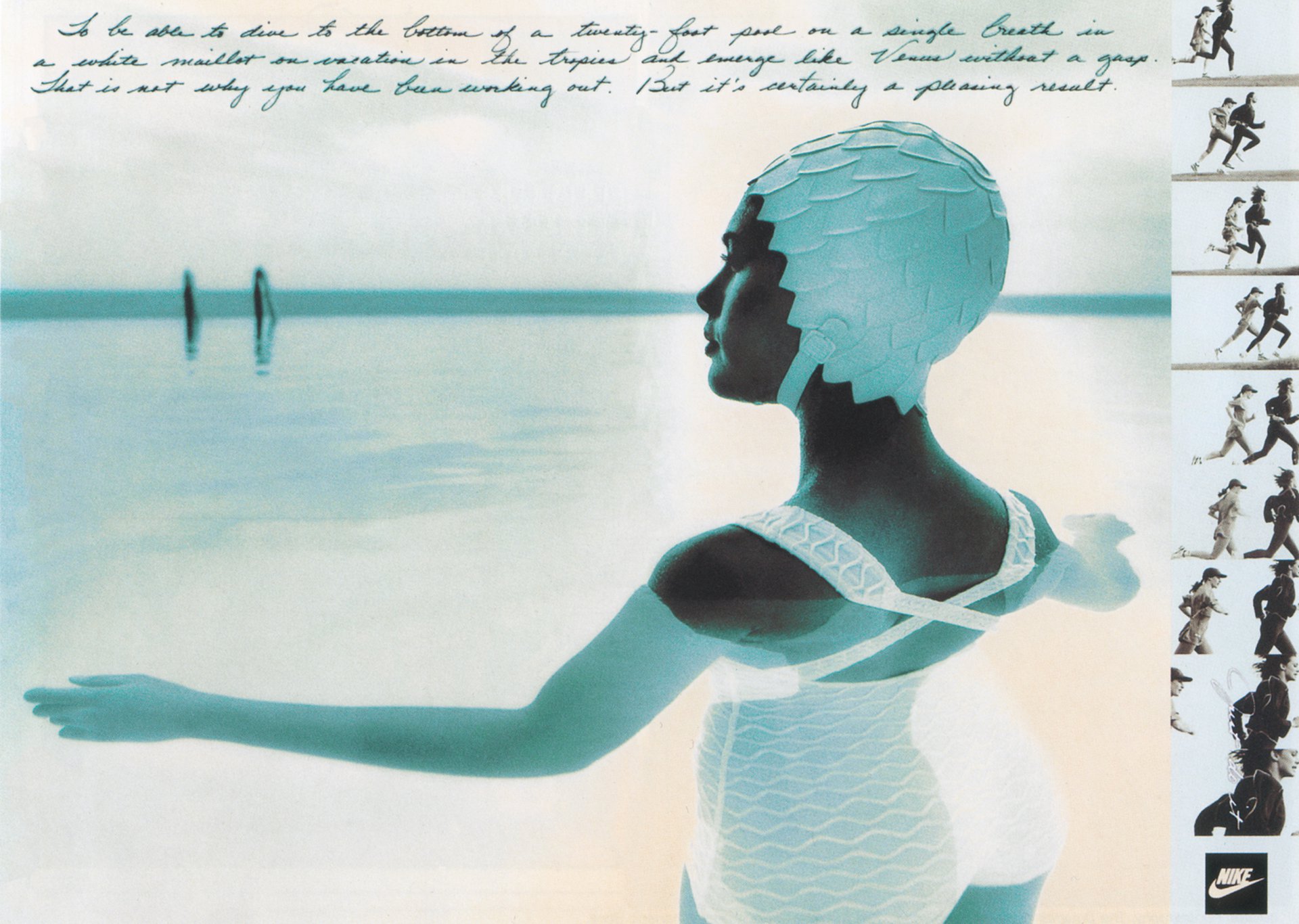
The second execution in this campaign takes a similar yet marginally less hardcore approach by at least having the words the right way up.
The image is differently toned, in shades of blue and cream, and the poetic copy, in a different handwriting style, gives women who ’work out’ a different benefit as follows: “To be able to dive to the bottom of a twenty-foot pool on a single breath in a white maillot on vacation in the tropics and emerge like Venus without a gasp. That is not why you have been working out. But it’s certainly a pleasing result.”
A pleasing result indeed.