The Guardian press ad
15.06.22
Art director: Peter Gausis. Copywriter: Tim Riley. Agency: BMP.
Year: 1987.
Year: 1987.
Art director: Peter Gausis. Copywriter: Tim Riley. Agency: BMP. Year: 1987.
Art direction. It all starts with a blank page.
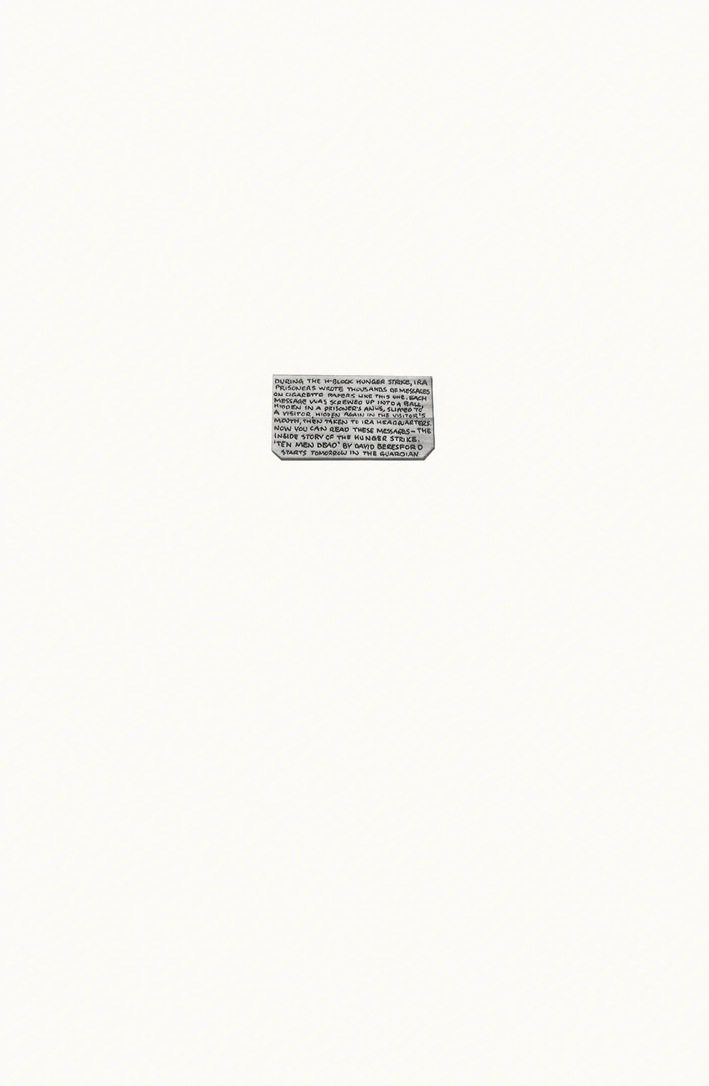
And sometimes doesn’t progress much further. For instance this full-page tactical ad for The Guardian newspaper from 1987.
Here’s what the copy says:
DURING THE H-BLOCK HUNGER STRIKE, IRA PRISONERS WROTE THOUSANDS OF MESSAGES ON CIGARETTE PAPERS LIKE THIS ONE. EACH MESSAGE WAS SCREWED UP INTO A BALL, HIDDEN IN A PRISONER’S ANUS, SLIPPED TO A VISITOR, HIDDEN AGAIN IN THE VISITOR’S MOUTH, THEN TAKEN TO IRA HEADQUARTERS. NOW YOU CAN READ THESE MESSAGES — THE INSIDE STORY OF THE HUNGER STRIKE. ‘TEN MEN DEAD’ BY DAVID BERESFORD STARTS TOMORROW IN THE GUARDIAN.
Compelling stuff.
There’s really only one way to art direct this ad of course. But I’m amazed the client agreed. It has to be handwritten as a message on a cigarette paper, photographed and presented on a newspaper page at actual size. Absolutely nothing else.
So that’s exactly what they did. Brilliant. Credit to the client for seeing sense.
The formal framing by the expanse of white space doesn’t just dramatise the size of the cigarette paper. It also implies to the viewer, in a millisecond, that this tiny type must be very important, so you’d better read it.
I’m reminded of a quote by designer John McConnell about designing book covers: “Every sales director wants to know if they can have the title bigger. So I say, ‘The book is only six inches wide and you cannot get it any larger. I’ve blown it up as big as I can. I simply cannot get it any bigger.’ But what they really mean is, ‘Can you make my book stand out more in the shop?’ Nothing stands out in American bookshops because they treat every book as a product in its own right they’re all screaming so loud. They have their volume knobs turned up full blast. So when you look around, it’s a blank-out, you see nothing. The trick is to go the other way.”
For an ad, the purity of approach here is staggering.
Which means that I can pretty much guarantee that whatever disaster or scandal was happening in the world on the day the ad ran, this page will have been the single most memorable thing in the entire newspaper. And almost certainly the most memorable piece of communication the viewer would have seen that day across any medium.
And that, in a nutshell is our job.
Until the legions of box-tickers get in the way. Because this is an ad. And everyone knows that ads are supposed to have big headlines and big gaudy pictures and big (no, I’m not approving it until it’s 10% bigger) logos in the bottom right hand corner and tag lines and brand guidelines to strictly adhere to etc, etc, etc.
But there’s none of that here. Thank goodness. You never know, someone might actually engage with it now.
Because the page looks interesting. Shocking even.
Just like the words.