Avis press ads
09.02.21
Agency: Doyle Dane Bernbach. Year: 1963/64.
Art Director: Helmut Krone. Writers: John Withers,
David Herzbron, Helmut Krone.
Art Director: Helmut Krone. Writers: John Withers,
David Herzbron, Helmut Krone.
Agency: Doyle Dane Bernbach. Year: 1963/64. Art Director: Helmut Krone. Writer: John Withers, David Herzbron, Helmut Krone.
The editor of a creative magazine once accused me of being ’anti-innovation’.
Well, anyone who’s ever worked with me will, I’m sure, confirm that I always try to create innovative work. So what happened?
It all kicked off when I wrote something about people with daft, yet real, job titles. Things like ‘SEO Ninja’, ‘Social Media Visionary’, ‘Pay-per-click Prophet’, ‘Conversation Manager’ and anything with ‘Guru’, ‘Rock Star’ or ‘Wizard’ at the end of it… or ‘Awesome’ at the front of it… you get the drift.
I was merely observing that they take ’creative jobs’ yet never seem to know the first thing about effective communication.
Tech innovation can of course be a wonderful thing. But not if it’s used to relentlessly fire highly targeted crap at people. Cue 600 million devices running ad blocking software globally.
We need creative innovation if we want to be effective.
And I think many ad industry people (and clients) confuse tech innovation with creative innovation.
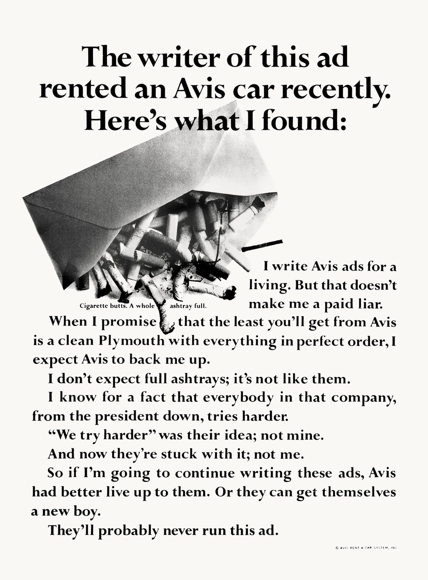
To demonstrate my point, here are a couple of Avis ads. Yes, they’re over 50 years old but had this campaign never happened, and someone came up with it today, it would still be innovative. No hashtag necessary.
No planner necessary either. The brilliant strategy of: ‘Avis is only No.2, so we try harder’, was created by writer Paula Green.
Despite getting slagged off at the time in AdAge magazine… journalists eh? And despite failing badly in consumer testing… research eh? And despite being hated by the agency account people… suits eh? And despite not winning creative awards… juries eh? This campaign did something astoundingly innovative in terms of strategy, ideas and execution; with nothing more than black ink on white paper.
It was so innovative in fact, that it transformed not just the client’s profitability but also the ethos of the entire company.
Everyone really did start to try harder.
Well, anyone who’s ever worked with me will, I’m sure, confirm that I always try to create innovative work. So what happened?
It all kicked off when I wrote something about people with daft, yet real, job titles. Things like ‘SEO Ninja’, ‘Social Media Visionary’, ‘Pay-per-click Prophet’, ‘Conversation Manager’ and anything with ‘Guru’, ‘Rock Star’ or ‘Wizard’ at the end of it… or ‘Awesome’ at the front of it… you get the drift.
I was merely observing that they take ’creative jobs’ yet never seem to know the first thing about effective communication.
Tech innovation can of course be a wonderful thing. But not if it’s used to relentlessly fire highly targeted crap at people. Cue 600 million devices running ad blocking software globally.
We need creative innovation if we want to be effective.
And I think many ad industry people (and clients) confuse tech innovation with creative innovation.
To demonstrate my point, here are a couple of Avis ads. Yes, they’re over 50 years old but had this campaign never happened, and someone came up with it today, it would still be innovative. No hashtag necessary.
No planner necessary either. The brilliant strategy of: ‘Avis is only No.2, so we try harder’, was created by writer Paula Green.
Despite getting slagged off at the time in AdAge magazine… journalists eh? And despite failing badly in consumer testing… research eh? And despite being hated by the agency account people… suits eh? And despite not winning creative awards… juries eh? This campaign did something astoundingly innovative in terms of strategy, ideas and execution; with nothing more than black ink on white paper.
It was so innovative in fact, that it transformed not just the client’s profitability but also the ethos of the entire company.
Everyone really did start to try harder.
It’s also worth noting that this strategy did not BECOME the creative execution, as it does with so many dull, lazy contemporary campaigns. It wasn’t even necessary to write it on the ads as an endline cluttering up the layout. Because each new headline dramatised that strategy in brilliantly different ways. This gave the advertising ’legs’; there were over 50 ads in this campaign. All of them great.
There was no logo.
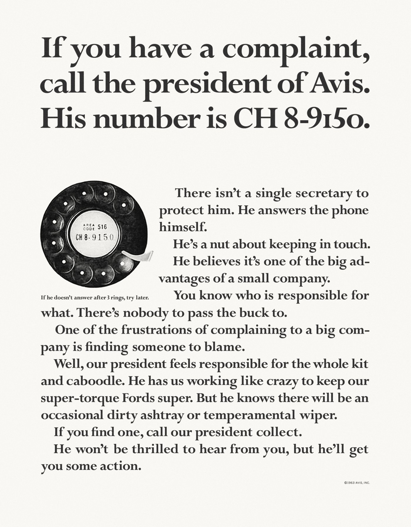
And that’s what stopped the ads looking like ads. It immediately made the page more interesting to readers, argued Helmut Krone the art director behind this work. And of course he was right.
There’s a kind of no-nonsense ugliness to the art direction. In a good way. The only thing that’s dated in the above ad is the phone dial. That’s how great the layout is.
And brilliant copywriting never goes out of fashion. Here’s what Krone had to say about the writing in this campaign: ’It’s not copy, it’s talking. We pulled down the wall between the reader and the company… that’s probably the single most important thing about it, how new that was…’
Another interesting quote from Krone: ’You should be able to tell who’s running an ad at a distance of 20 feet. You can tell an Avis ad from a distance of 40 feet’.
Because at the time, these ads with their large body copy and small, ordinary, understated visuals looked like nothing else.
Who needs logos? Especially when the brand name is in pretty much every headline.
The font choice of Perpetua Bold was also unusual. As was the decision to use the same bold weight for both the body copy and the headlines. There’s another interesting thing about the type; the numerals of the phone number in the headline above are neither just ’old-style figures’ nor just ’lining figures’. They are a mixture of the two, with a lowercase ’o’ thrown in for good measure instead of a zero. Krone chopped them around until he was completely happy with the shape. See? Innovating to the last tiny detail.
All these factors combined to make the work distinctive. And distinctive usually means effective.
In the six years that the account was at DDB, Avis grew 500% and market share went from 29.9% to 37.6%. In the same period Hertz went down from 56.6% to 48.9%.
Maybe if today’s ad agencies directed their energy (and hiring policy) more towards creative innovation we wouldn’t be in such a depressing mess.
If you’re a Brand Evangelist, Ambassador of Buzz or a Chief Amazement Officer and you have a complaint about this blog, don’t call me.
There was no logo.
And that’s what stopped the ads looking like ads. It immediately made the page more interesting to readers, argued Helmut Krone the art director behind this work. And of course he was right.
There’s a kind of no-nonsense ugliness to the art direction. In a good way. The only thing that’s dated in the above ad is the phone dial. That’s how great the layout is.
And brilliant copywriting never goes out of fashion. Here’s what Krone had to say about the writing in this campaign: ’It’s not copy, it’s talking. We pulled down the wall between the reader and the company… that’s probably the single most important thing about it, how new that was…’
Another interesting quote from Krone: ’You should be able to tell who’s running an ad at a distance of 20 feet. You can tell an Avis ad from a distance of 40 feet’.
Because at the time, these ads with their large body copy and small, ordinary, understated visuals looked like nothing else.
Who needs logos? Especially when the brand name is in pretty much every headline.
The font choice of Perpetua Bold was also unusual. As was the decision to use the same bold weight for both the body copy and the headlines. There’s another interesting thing about the type; the numerals of the phone number in the headline above are neither just ’old-style figures’ nor just ’lining figures’. They are a mixture of the two, with a lowercase ’o’ thrown in for good measure instead of a zero. Krone chopped them around until he was completely happy with the shape. See? Innovating to the last tiny detail.
All these factors combined to make the work distinctive. And distinctive usually means effective.
In the six years that the account was at DDB, Avis grew 500% and market share went from 29.9% to 37.6%. In the same period Hertz went down from 56.6% to 48.9%.
Maybe if today’s ad agencies directed their energy (and hiring policy) more towards creative innovation we wouldn’t be in such a depressing mess.
If you’re a Brand Evangelist, Ambassador of Buzz or a Chief Amazement Officer and you have a complaint about this blog, don’t call me.