Apple posters
14.11.20
Agency: Apple and TBWA\Media Arts Lab. Year: 2015.
Agency: Apple and TBWA\Media Arts Lab. Year: 2015.
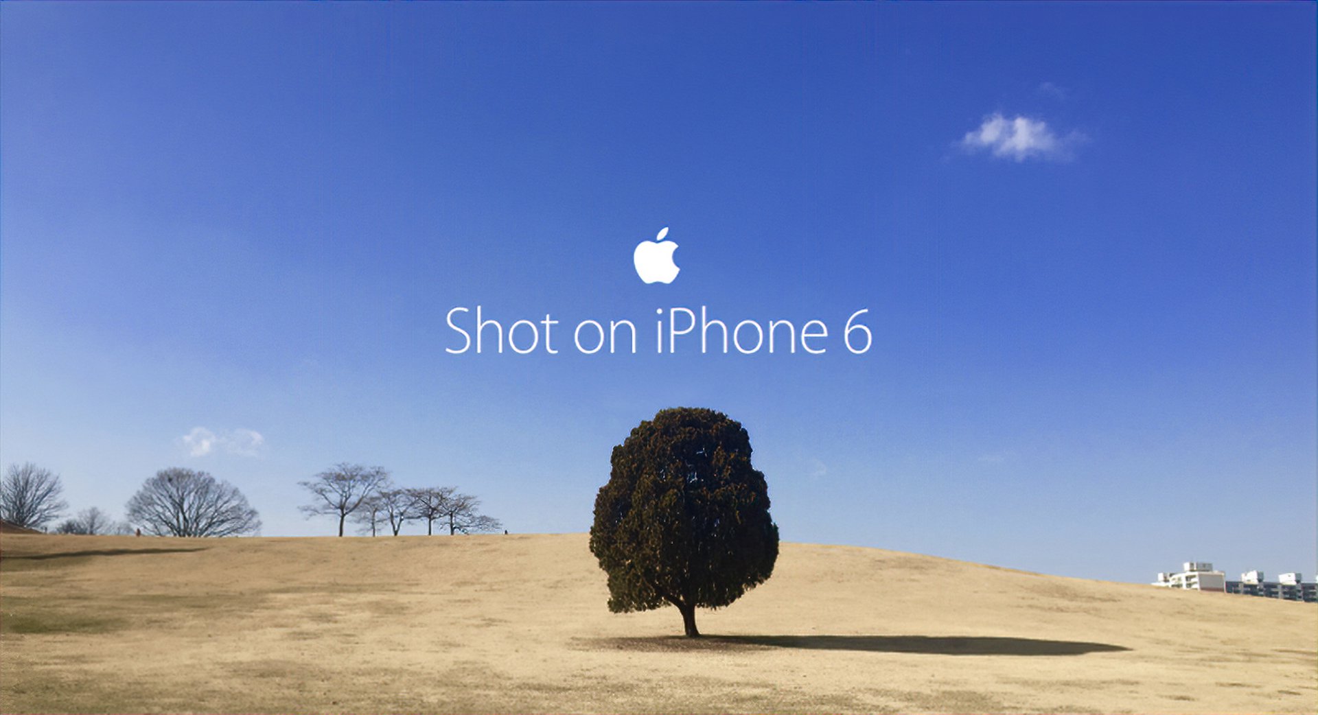
Shot on iPhone 6. A campaign so simple and minimal that they even dispensed with the word ‘an’. Those clever geeks at Apple certainly think different(ly) to your average advertiser.
We seem to be living through an unfortunate blip in the world of marketing. Where most ad agencies are cynically scrambling to out-bullshit each other with all manner of tech gimmickry and scam product innovations masquerading as communications strategies. Somewhat ironically, it takes a tech company to show them how advertising should be done.
Funny isn’t it, how the most successful corporation in the entire history of civilisation concentrates their advertising budget on press, poster and television. Media that every ad agency is furiously running away from in a fatally misguided attempt to appear more ‘modern’. I rest my case.
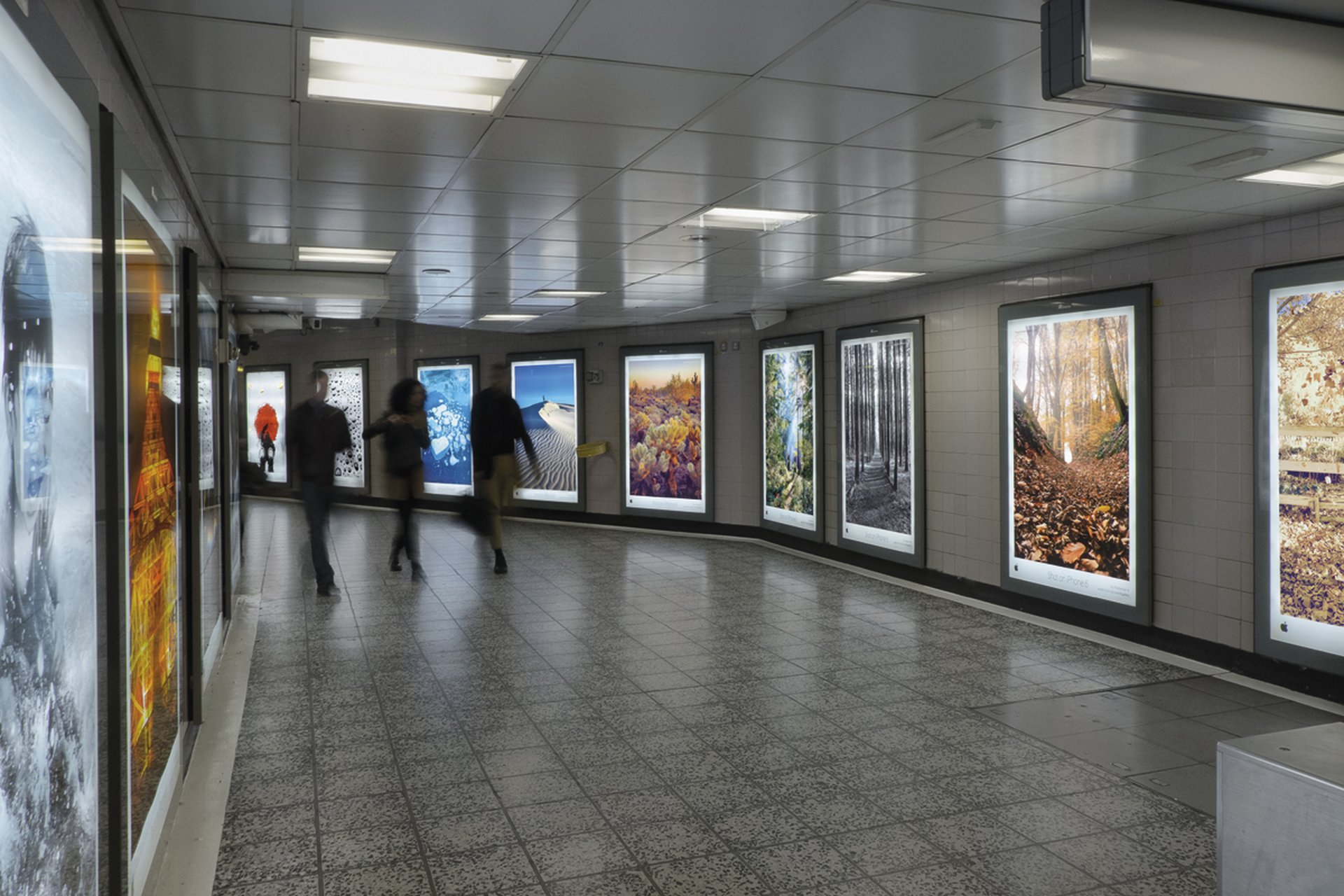
Anyway, back to one of the best campaigns of 2015. Maybe even the best. In the hardest medium of them all. Posters.
These deceptively simple ads inarguably demonstrate what a fantastic camera the iPhone 6 had. And in an age when we share over 1.8 billion photos per day via our smart-phones, surely that’s a pretty appealing benefit.
We seem to be living through an unfortunate blip in the world of marketing. Where most ad agencies are cynically scrambling to out-bullshit each other with all manner of tech gimmickry and scam product innovations masquerading as communications strategies. Somewhat ironically, it takes a tech company to show them how advertising should be done.
Funny isn’t it, how the most successful corporation in the entire history of civilisation concentrates their advertising budget on press, poster and television. Media that every ad agency is furiously running away from in a fatally misguided attempt to appear more ‘modern’. I rest my case.
Anyway, back to one of the best campaigns of 2015. Maybe even the best. In the hardest medium of them all. Posters.
These deceptively simple ads inarguably demonstrate what a fantastic camera the iPhone 6 had. And in an age when we share over 1.8 billion photos per day via our smart-phones, surely that’s a pretty appealing benefit.
These are basically great demo ads (remember them?). And what better way to demonstrate the potential of the camera than to take wonderful photos and blow them up to poster size. Persuasively illustrating the quality of the lens, the power of the processor and the high resolution.
I’m sold. This is advertising you can actually believe and remember. Because it’s impressive.
It’s also beautiful. And devoid of all the ugly crap that advertisers invariably inflict on us. No dumb embarrassing end-line. No multiple logos (I’m certain that anyone else would have done some sort of stupid deal that would have demanded a row of Instagram, Snapseed, VSCO Cam, Mextures, Afterlight, Filterstorm Neue, Camera+, Flickr, Instaflash Pro, olloclip Photo Lens and Adobe Photoshop Express logos across the base of these posters. Logos that no viewer would ever take in and would completely ruin the impact of the design).
There’s no pack shot. No small print. And no crass typography fighting the image. Yet these posters couldn’t be better branded. When will advertisers learn that the branding is determined by the quality of the communication, the hierarchy of the elements, and good design. Not the biggest logo size.
The campaign is about the pictures, so the art direction becomes all about the pictures. Images not by famous photographers but by people we’ve never heard of. Amateurs. Thereby further demonstrating what a great camera it is — if they can do it, then surely so can I.
But these ads also demonstrate one other important thing. That advertisers have a social responsibility.
I would strongly argue that great poster advertising like this actually improves the urban environment and brightens the viewer’s day by its presence.
Will the campaign you’re working on right now do that?