


<01/11>
Happy Paul—Brand +
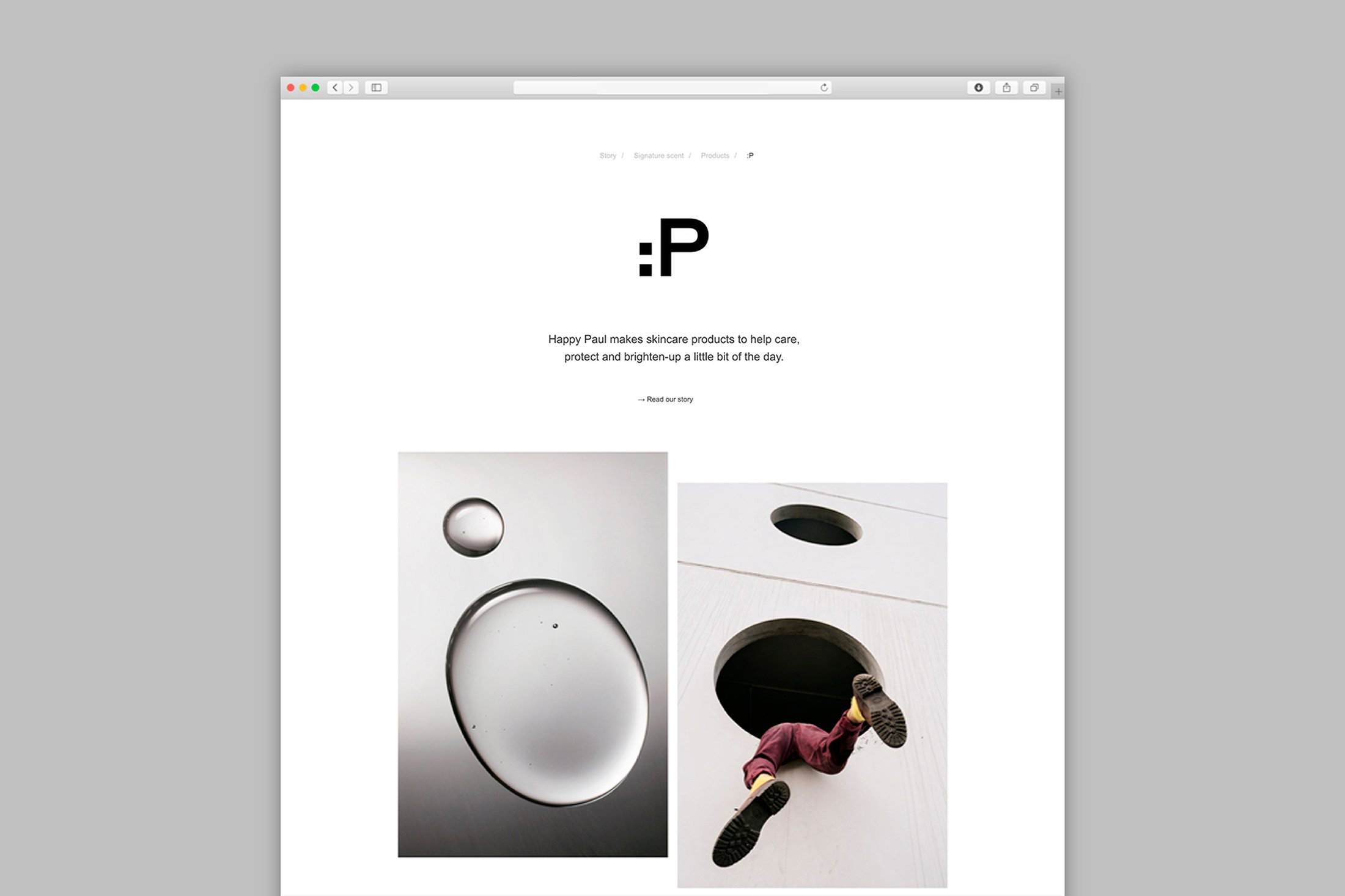
hard to think about the simplest rituals of self-care.
The founder of Happy Paul knows this from experience,
and so he set out to build a brand that would help to
challenge the stigma surrounding men’s mental health
while encouraging individuals to look after themselves
both inside and out.
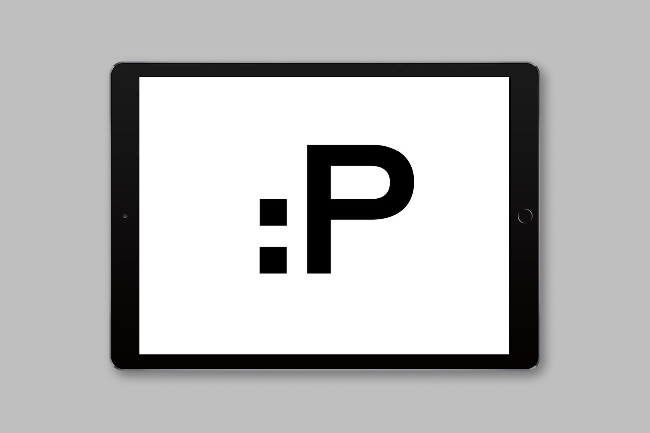
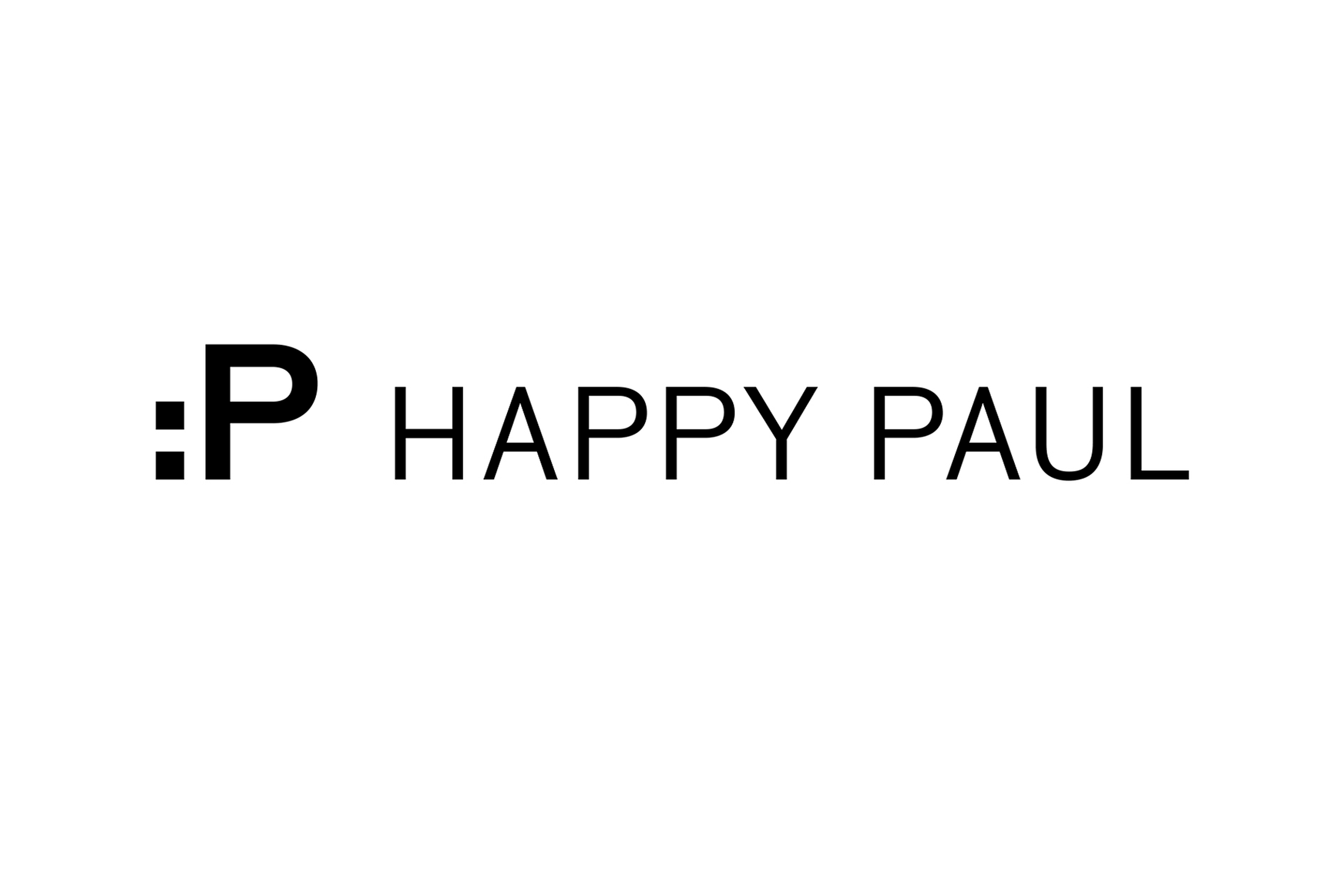
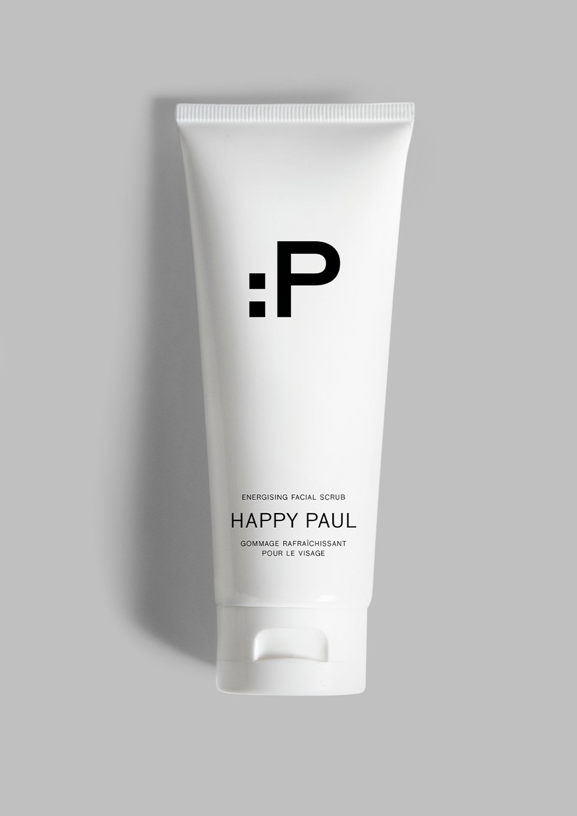
The logo is inspired by the familiar vocabulary of
emoji, establishing an immediate tone of voice as well
as a careful balance between the playful and the
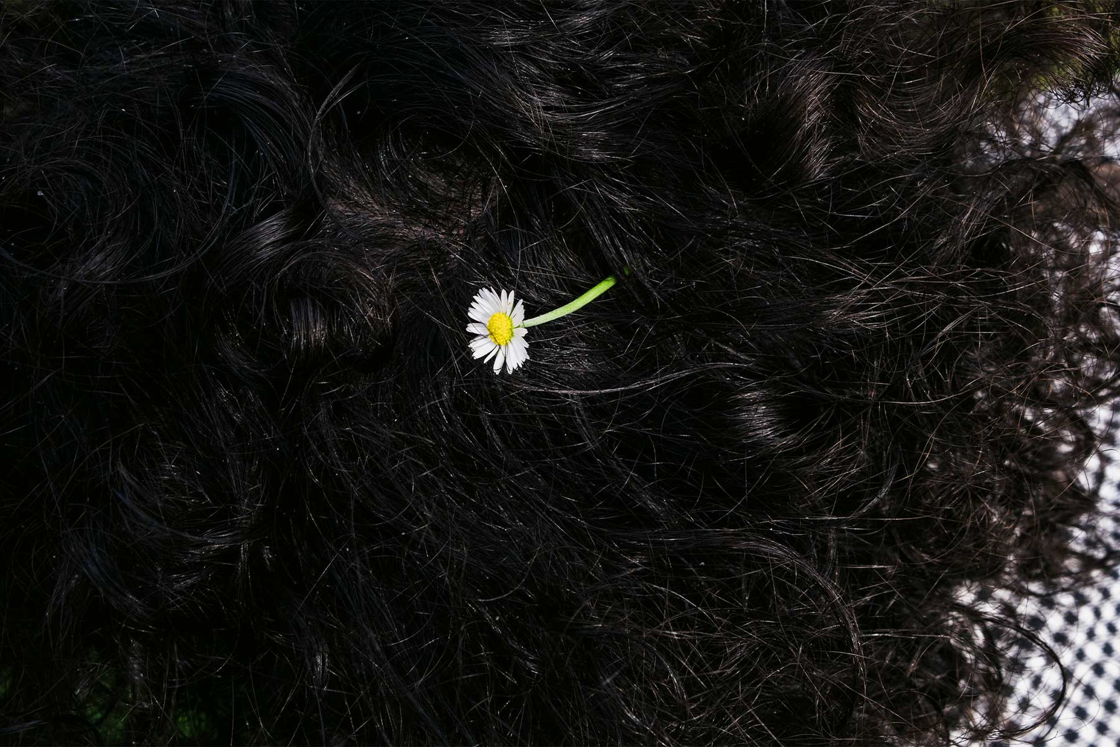
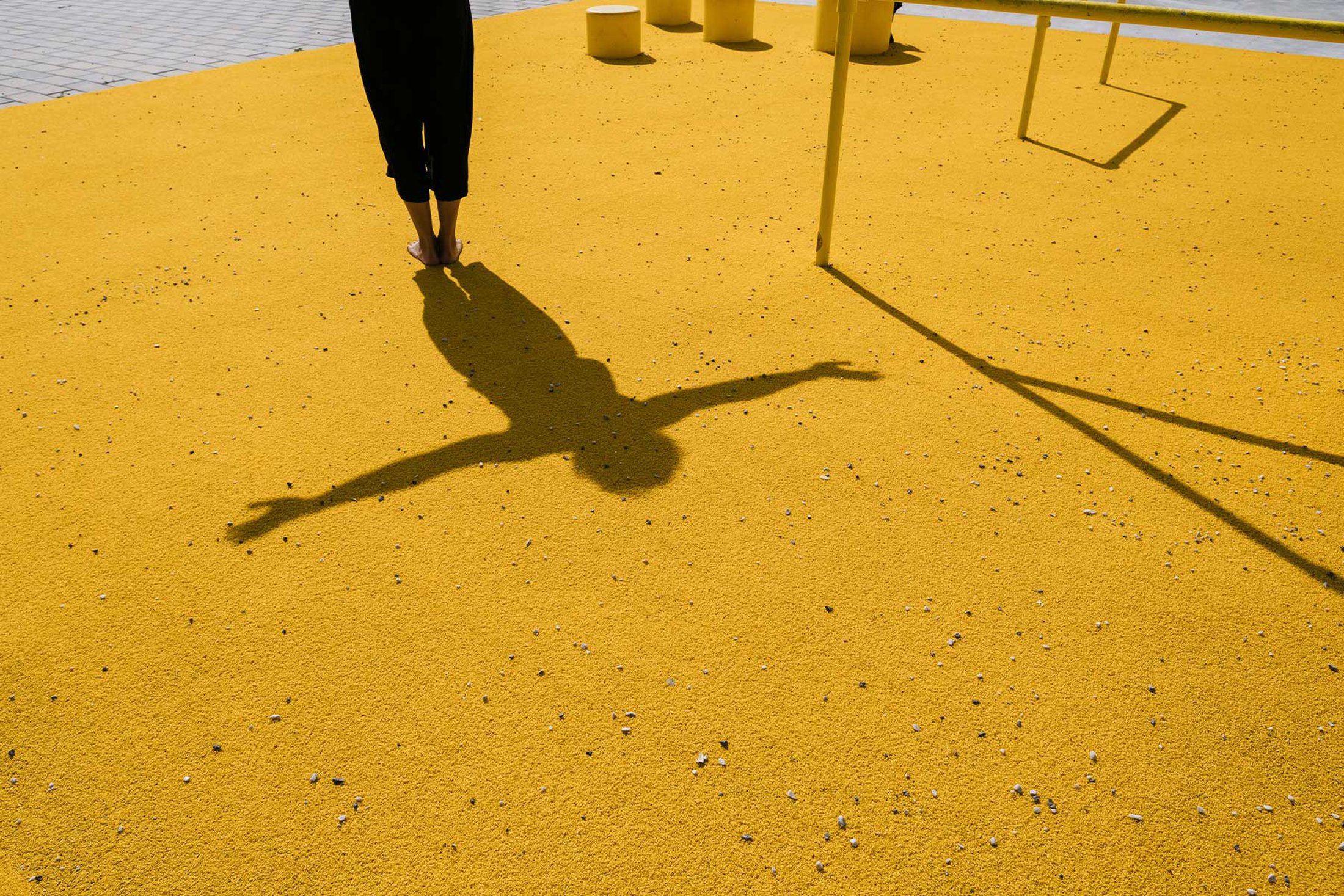
serious. Photography also plays an important part in
the brand language, communicating joyfulness with the
right touch of irreverence.
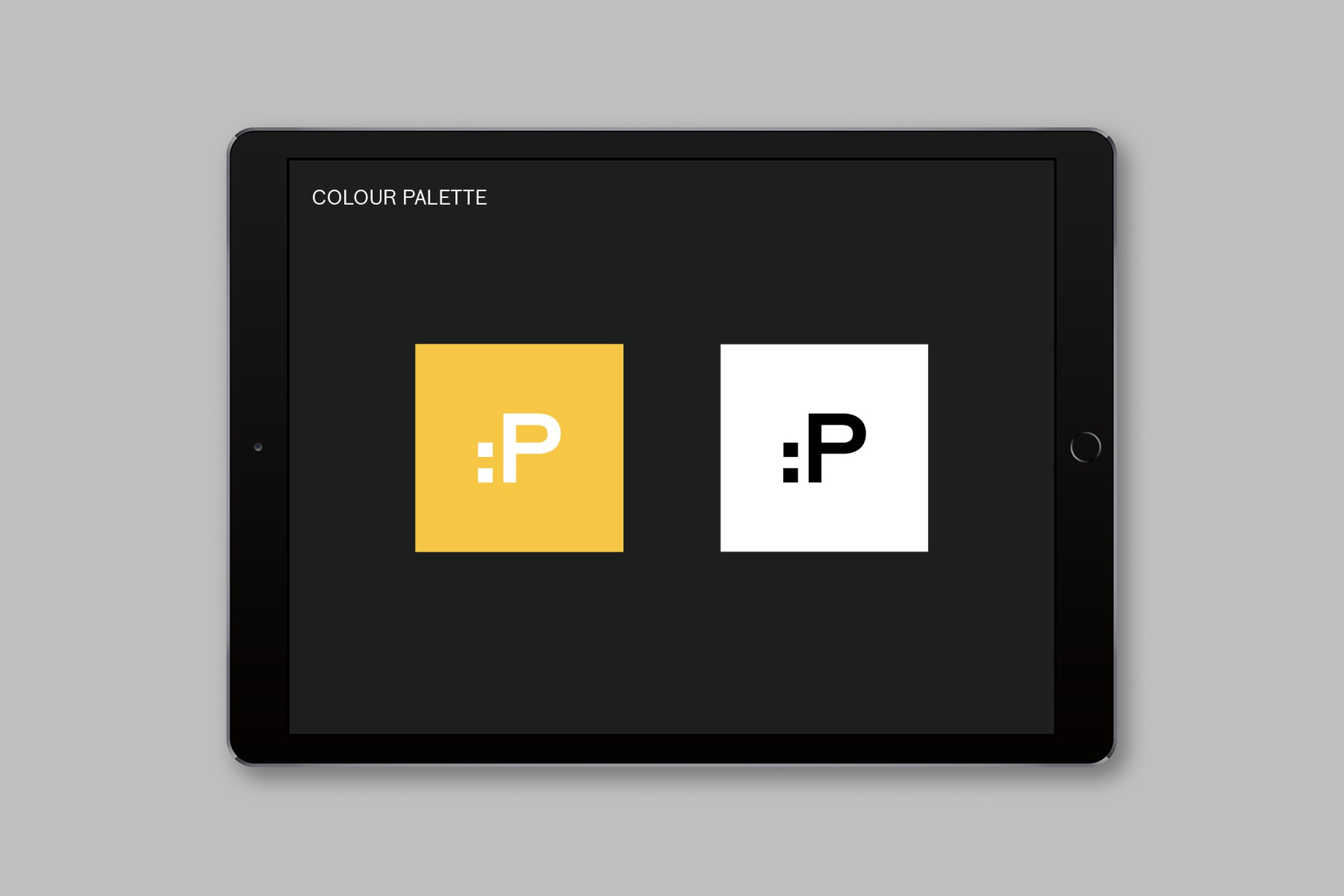
Yellow is used as an accent motif.
The brand aims to be relatable and accessible with an
understated sense of cool.
20% of Happy Paul profits and time will go to mental
health initiatives which focus on the prevention of
poor mental health.