British Army poster
02.02.21
Agency: Saatchi & Saatchi. Year 1998.
Art director: Alexandra Taylor.
Copywriters: Ian Edwards, Tristian Price.
Art director: Alexandra Taylor.
Copywriters: Ian Edwards, Tristian Price.
Agency: Saatchi & Saatchi. Year 1998. Art director: Alexandra Taylor. Copywriters: Ian Edwards, Tristian Price.
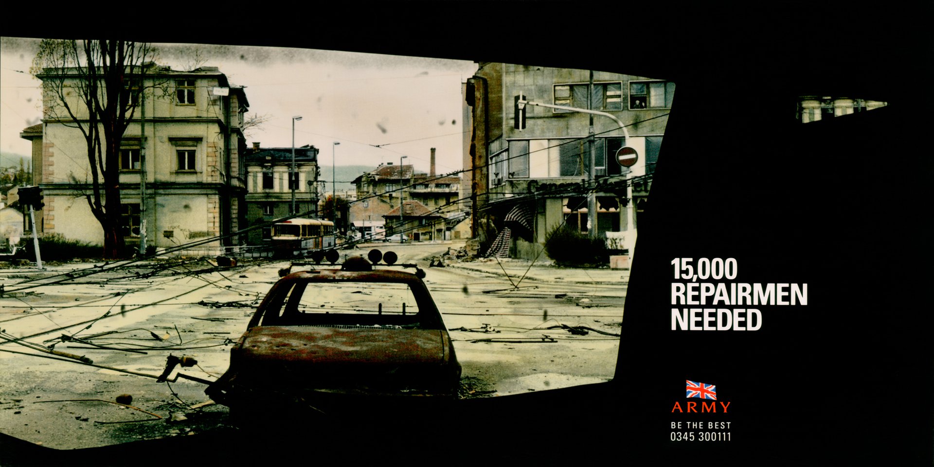
The bravery of the British Army also extends to buying great advertising ideas.
When first presented with this recruitment campaign, Brigadier Rory Clayton apparently said ‘I wouldn’t ask you how I should run the British Army. So I don’t intend to tell you how to do your advertising.’
Other clients please take note.
In fact, the greatest threat to this campaign actually came from people within the agency. They considered the prevalence of black as being too funereal. (Yes, creative teams have to endure ‘friendly fire’ on a regular basis.)
But without the black, we lose a brilliant art direction idea.
The vista of the desolated town, with its odd desaturated greenish tone is of course a very powerful image. But the window framing device makes it even stronger. Because it’s unusual.
The expanse of black also gives us somewhere to reverse out the headline, ensuring maximum contrast and, therefore, legibility. Which means that the type doesn’t have to be too big, so it won’t fight with the picture.
The font choice of a bold, condensed sans is tonally perfect. But I wonder why there is no full stop after the headline. I always think a full stop makes the line appear that bit more important. It gives you a natural pause. Suggesting you stop and think about what you’ve just read. In this case; a simple, yet clever line that uses a different job title to dramatise a soldier’s multiple roles.
Below and ranged left with the headline, we see the logo. Credit must go to the client for not insisting that the agency make it so big that it fights with the headline.
If the viewer cares about an ad they’ll notice the logo; it doesn’t have to be huge. And if they don’t care, a big logo won’t make them care. The same applies to a url or a phone number. Big numbers don’t magically make people call them. You have to care about the message first. And if you do, you’ll call, whatever the point size. An amazing number of clients can’t seem to grasp this simple truth.
Two more features contribute to this fabulous art direction. Firstly, the sliver of light coming from the second window balances the headline and logo position.
And secondly, the decision to justify and group the endline and phone number with the logo. This converts what would be three different elements into just one; simplifying the layout and maximising its impact.
Funny isn’t it, how ad agencies adopt military terms such as ’impact’, ’target’, ’shoot’ etc. But at least no one’s firing guns at us.
We just get stabbed in the back.