Paul Belford Ltd
Case studies
About
Introduction
Information
People
Testimonials
Work
Contact
Blog
A rebrand for YO! Sushi, to coincide with global expansion for the restaurant chain.
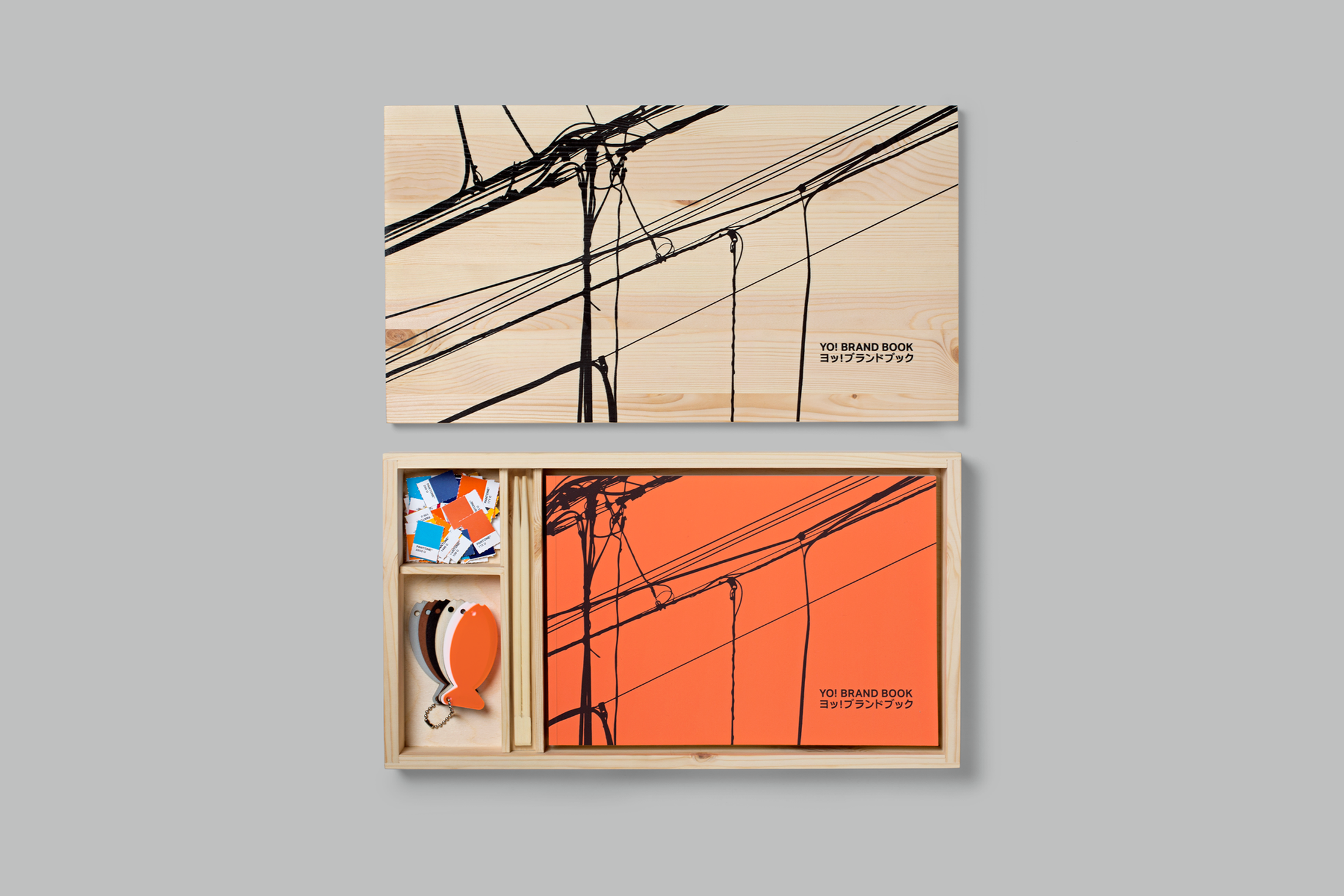
The printed brand guidelines book is housed in a bento box. Together with materials samples, colour chips and chopsticks.
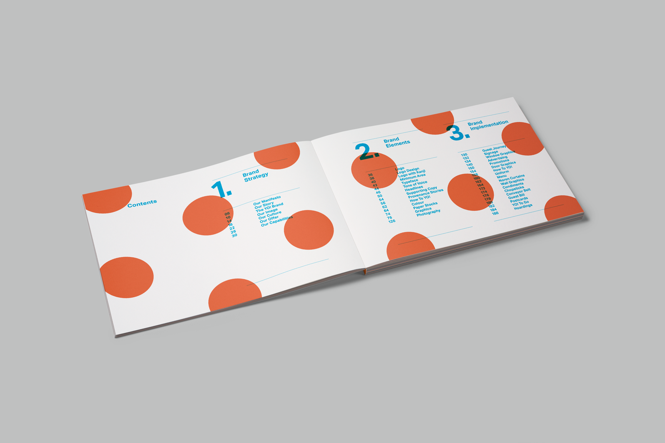
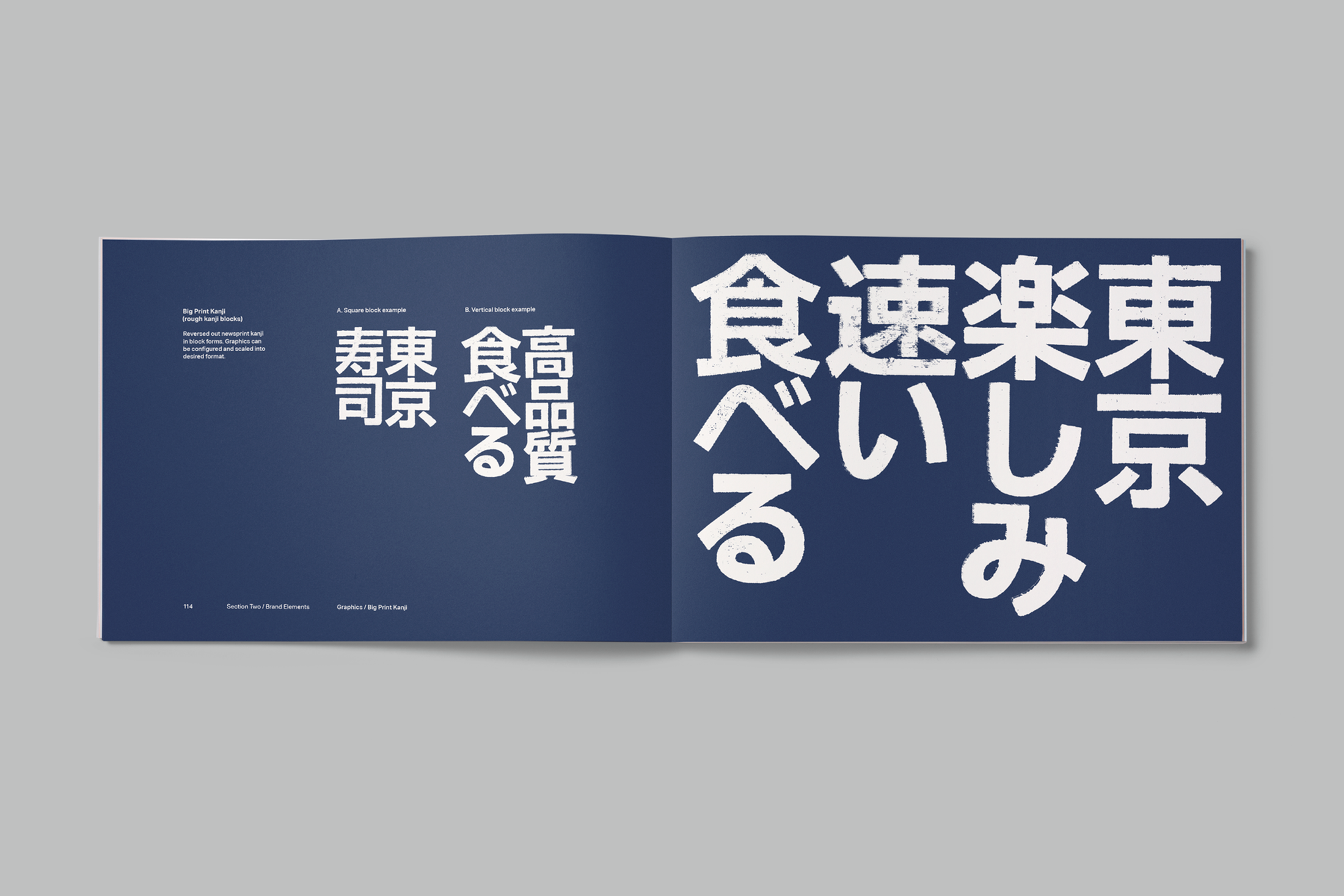
Extensive brand guidelines.
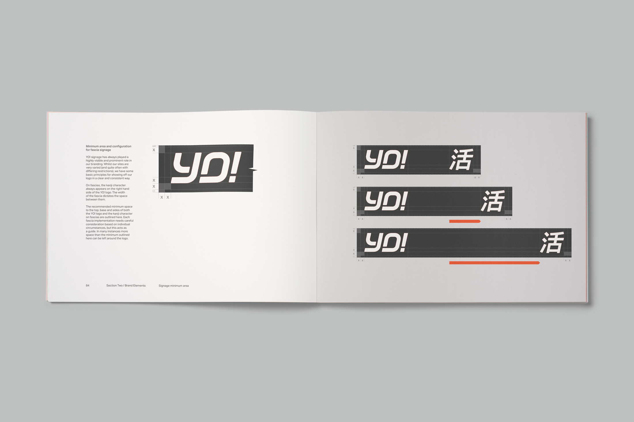
The addition of a kanji character to the logo adds an authentic Japanese flavour.
New restaurant fascia.
Flexible restaurant fascia guidelines.
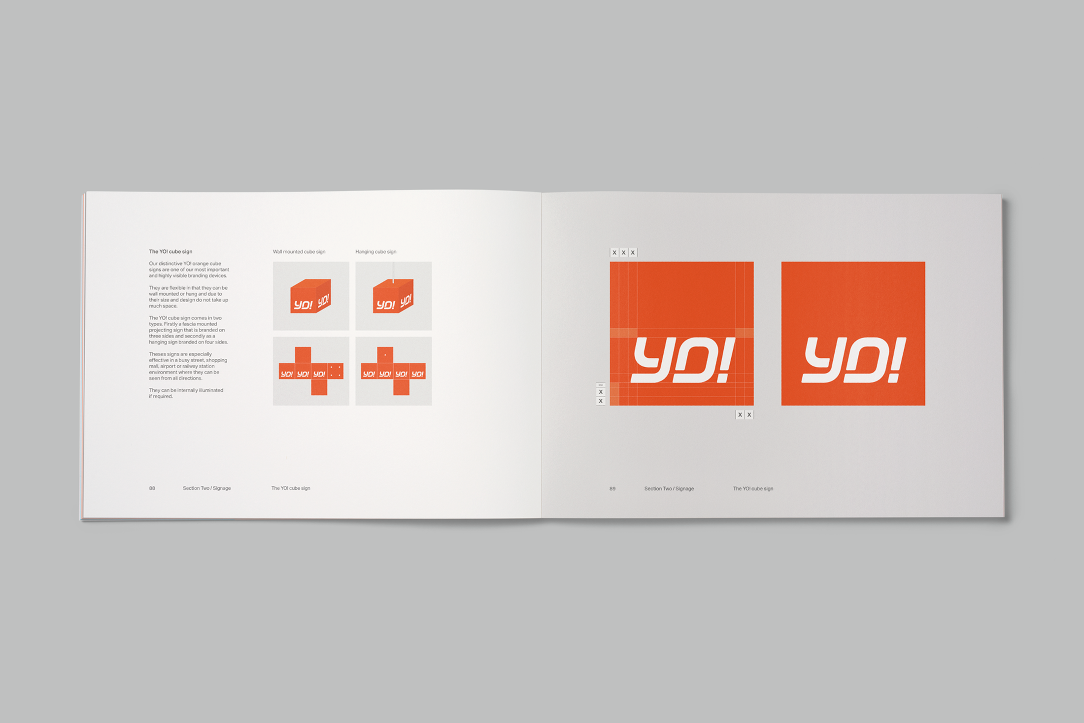
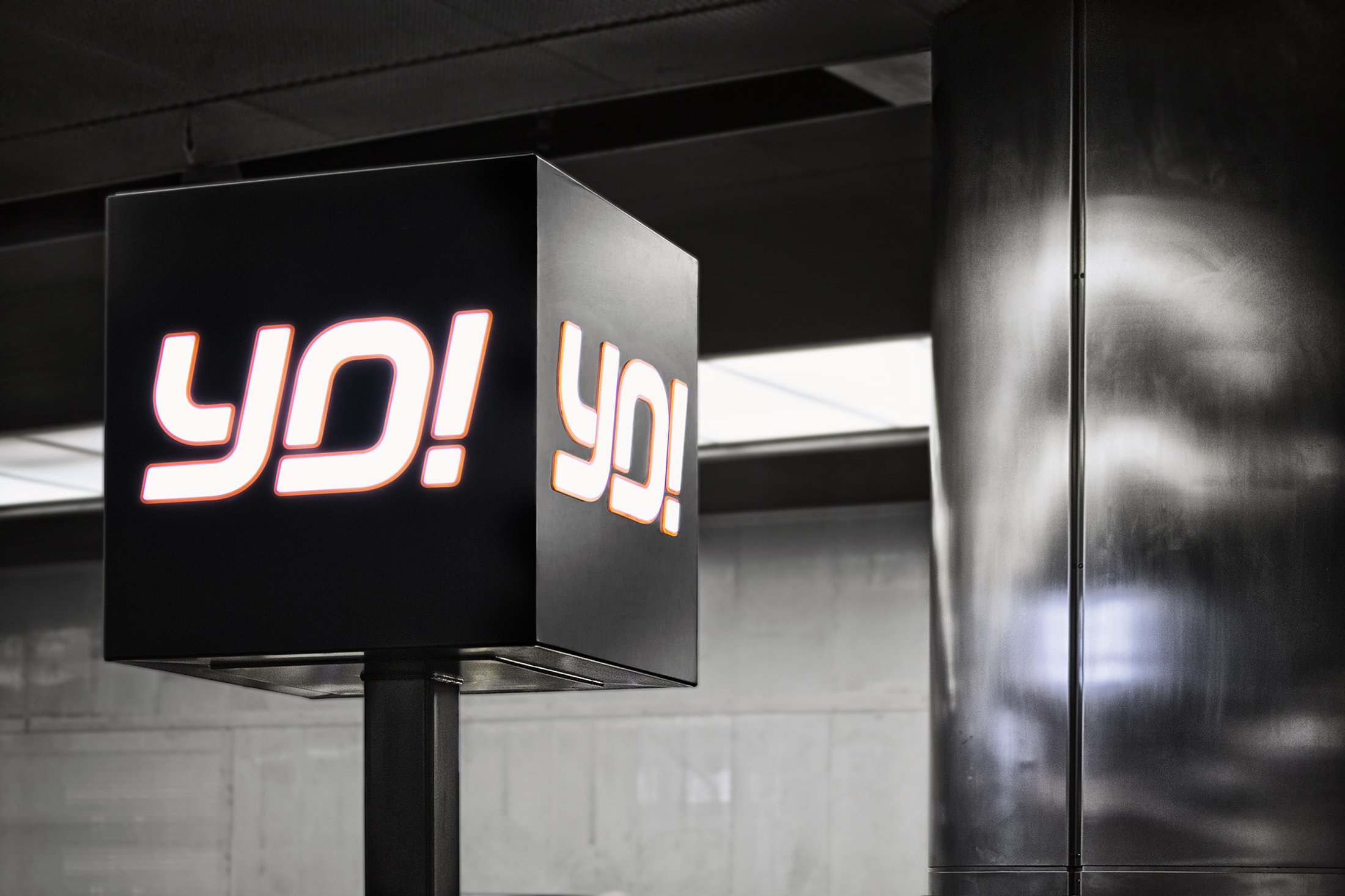
The YO! orange 'cube sign' for restaurants.
YO! Sushi cube sign variant at a new restaurant site in London.
Another cube sign variant.
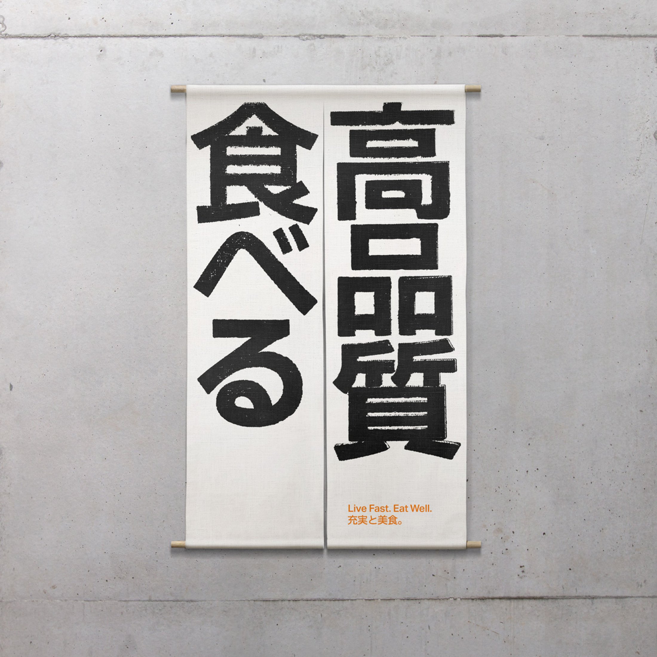
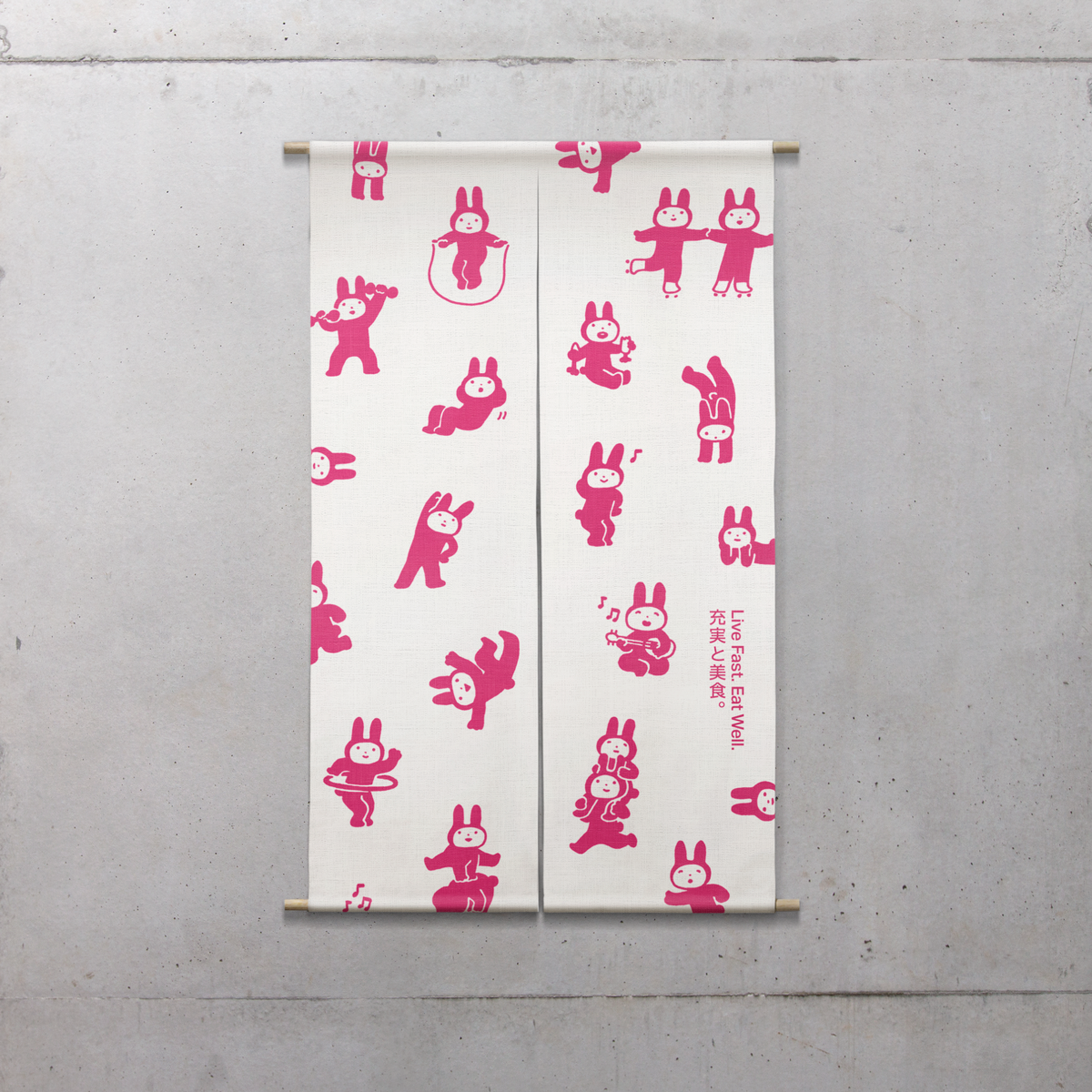
More authentic kanji artwork on Japanese noren curtains, for restaurant decoration.
Guidelines for the use of kanji artwork.
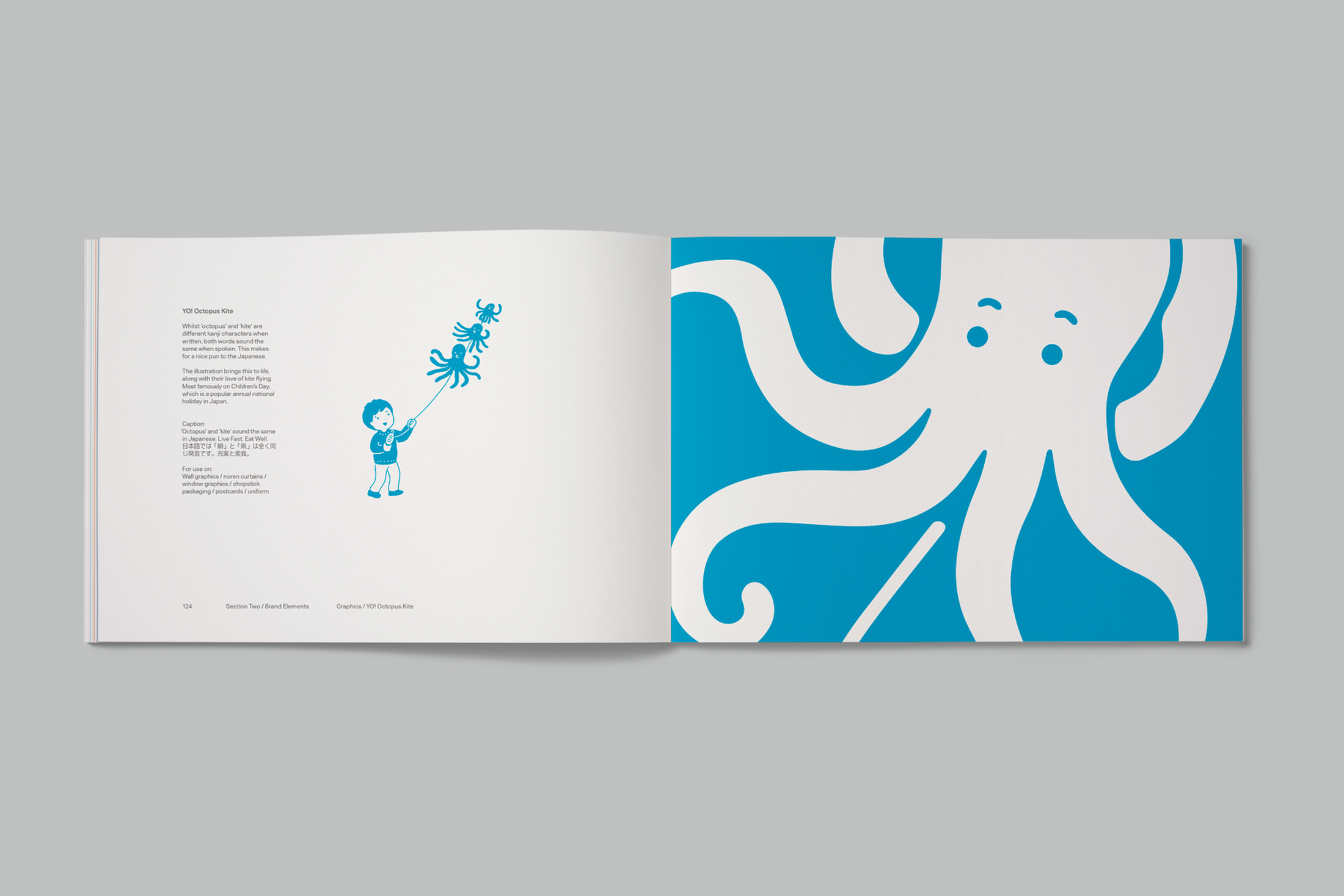
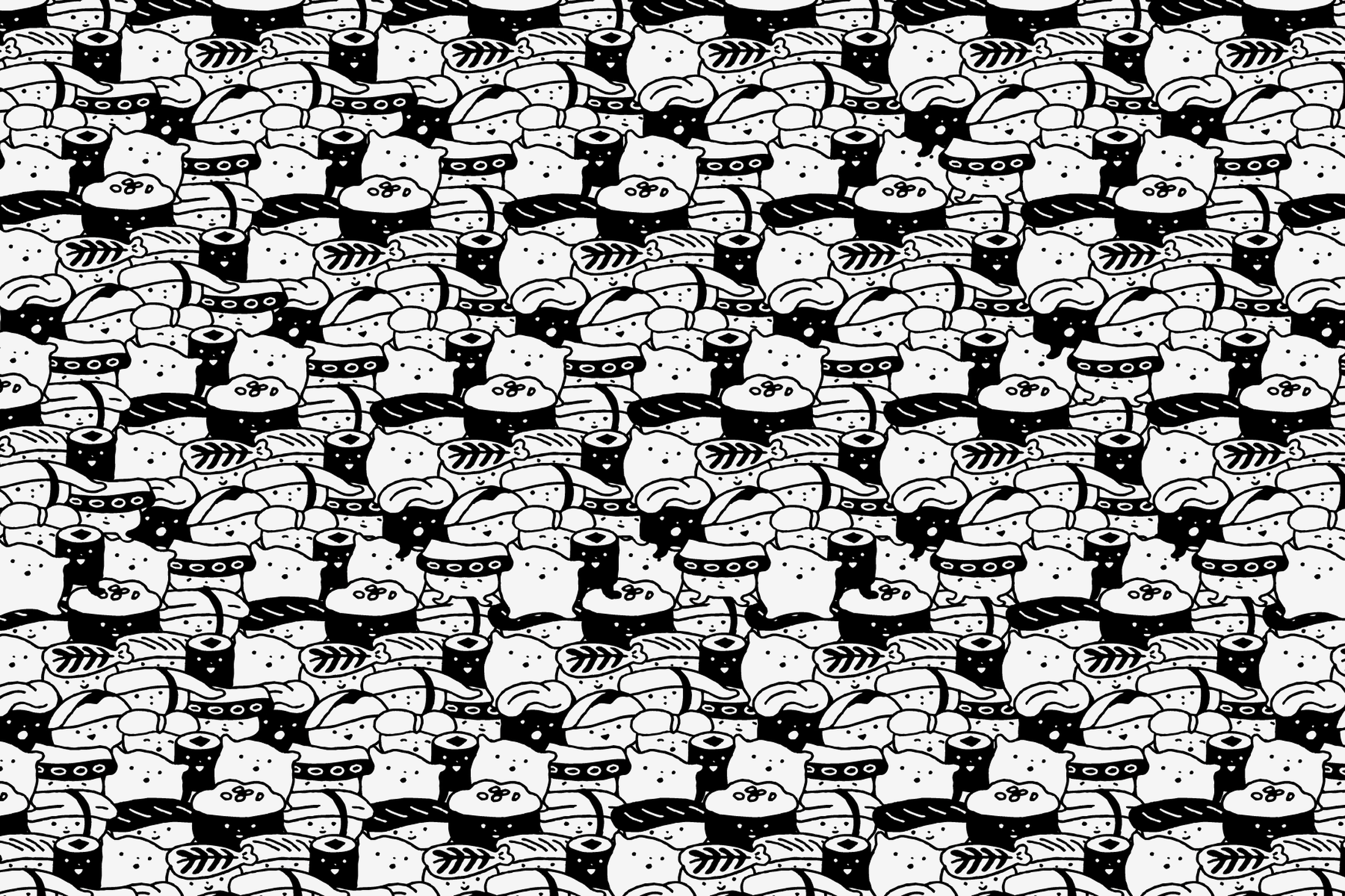
We also worked with Japanese illustrators to create a series of visual assets for the brand.
Japanese illustrations on a restaurant noren curtain.
More examples of Japanese illustrations to be used as visual assets across print and screen.
<
01
/14>
YO! Sushi—Branding
+
Design/Agency: Paul Belford Ltd.