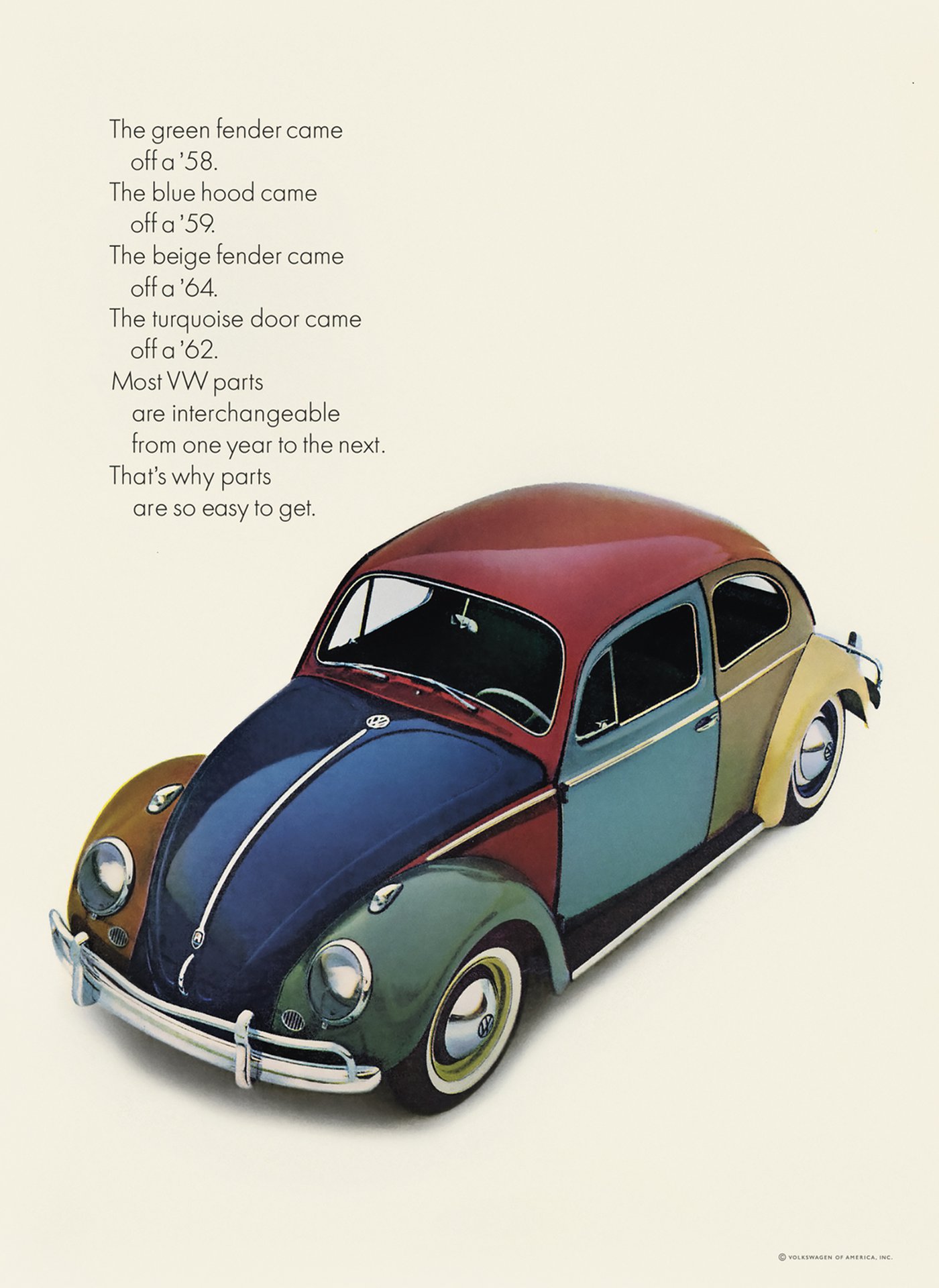
VW Beetle press ad
10.01.21

Agency: Doyle Dane Bernbach. Year: 1963.
Agency: Doyle Dane Bernbach. Year: 1963.
There’s a scene in an episode of the TV show ’Mad Men’, set in 1960, featuring a group of ad executives huddled around Life Magazine, criticising a real VW Beetle ad of that year.
The layout elements and typography were shockingly European and minimal. And the copy talked about the car in a new, smart and insightful way. This campaign started a revolution that changed advertising for the better.
Fast forward 60 years, and unfortunately vast swathes of the ad business seem to have come full circle. I can certainly imagine a modern day group of misguided, digital marketing obsessed agency people rejecting the very same ad. Mad indeed.
You can see many examples of this kind of work in a wonderful book containing the ad in question. The book is called ‘Remember those great Volkswagen ads?’ and it’s published by Merrell.
Buy it. You’ll learn a lot. Such as how on earth agencies used to manage without planners. Which, it turns out, was just fine. The book also shows us how to write and art direct at the very highest level.
For example the ad at the top of this page. A ‘traditional’ ad (as people with cringe-worthy job titles such as ‘SEO Ninja’ would disparagingly describe it). The copy gives us a simple, single-minded (and therefore memorable) reason to buy the car. And the visual brilliantly illustrates the copy whilst making the ad impossible to ignore.
It doesn’t need a headline. There’s no tortuous endline / strategy (no planners). And there’s no logo. Well, there are actually three logos visible on the car, but this iconic product IS the branding. So we don’t really need yet another logo cluttering up the bottom right-hand corner of the layout do we? Is the viewer in any doubt that this is a Volkswagen ad? Of course not. Less is more.
Some other details of note: The apostrophes appear to have been changed from the Futura typeface to something else. I have no idea why. The typesetting of the copy creates easy to read paragraphs out of each short sentence. The cool, restrained layout has the text arranged in a narrow column in an acre of empty space. And unlike most ads, there are just two elements on the page: text block and product. The unusual car angle is designed to show as much of the bodywork as possible, as per the idea. And any distracting details of the car interior have been darkened right down to allow the viewer to just concentrate on the colourful exterior, again, to support the idea of highlighting all the different parts of the car body. Oh, and someone forgot to level up the VW logos on the hub caps.
But surely the most interesting observation is that this ad is well over half a century old, yet more modern than pretty much anything you’ll see today.
‘Traditional’ my arse. (Excuse the colourful language.)