V&A print campaign
24.01.21
Year: 1988. Agency: Saatchi & Saatchi.
Writers: Jeff Stark, Peter Barry.
Art directors: Paul Arden, Chris Gregory.
Photographer: Lester Bookbinder.
Writers: Jeff Stark, Peter Barry.
Art directors: Paul Arden, Chris Gregory.
Photographer: Lester Bookbinder.
Year: 1988. Agency: Saatchi & Saatchi. Writers: Jeff Stark, Peter Barry. Art directors: Paul Arden, Chris Gregory. Photographer: Lester Bookbinder.
You would expect arts institutions to commission and approve outstanding creative work for their communications.
It rarely happens.
So I’m amazed that this 1988 campaign by Saatchi & Saatchi for London’s V&A Museum ever saw the light of day. Maybe, just maybe, the fact that Maurice Saatchi was on the museum’s Board of Trustees at the time had something to do with it. Otherwise, surely not a hope in hell.
But hooray that this daring and executionally superb campaign made it out into the world.
There’s also the added bonus that it severely pissed off a bunch of pretentious art world snobs. Richard Dorment, art critic of The Daily Telegraph called it ’a crass bid for the charabanc trade’. Brian Sewell, art critic in the London Evening Standard hit back by calling him ’a crabby old woman’. There were even questions in Parliament and it made the TV news.
PR gold.
The strategy is, admittedly, a tad irreverent. But perfectly reasonable when you stop to think about it. The intention was to counter the museum’s staid image and appeal to a much younger audience; people who normally would never consider visiting the V&A. The tone and message of ’An ace caff with quite a nice museum attached’ would surely cut through and appeal to them. It’s a funny line. And a perfectly good insight; who doesn’t love a nice cup of tea and a slice of cake when out and about?
Plus, the V&A actually has form in this area. Apparently it was the first museum in the world to have a restaurant open to the public, way back in 1869.
Well that’s Jeff Stark’s brilliant strategy and endline sorted. How do we execute the ads? Oh, y’know, usual rules: great headlines with stunning pictures. Try it sometime, it works.
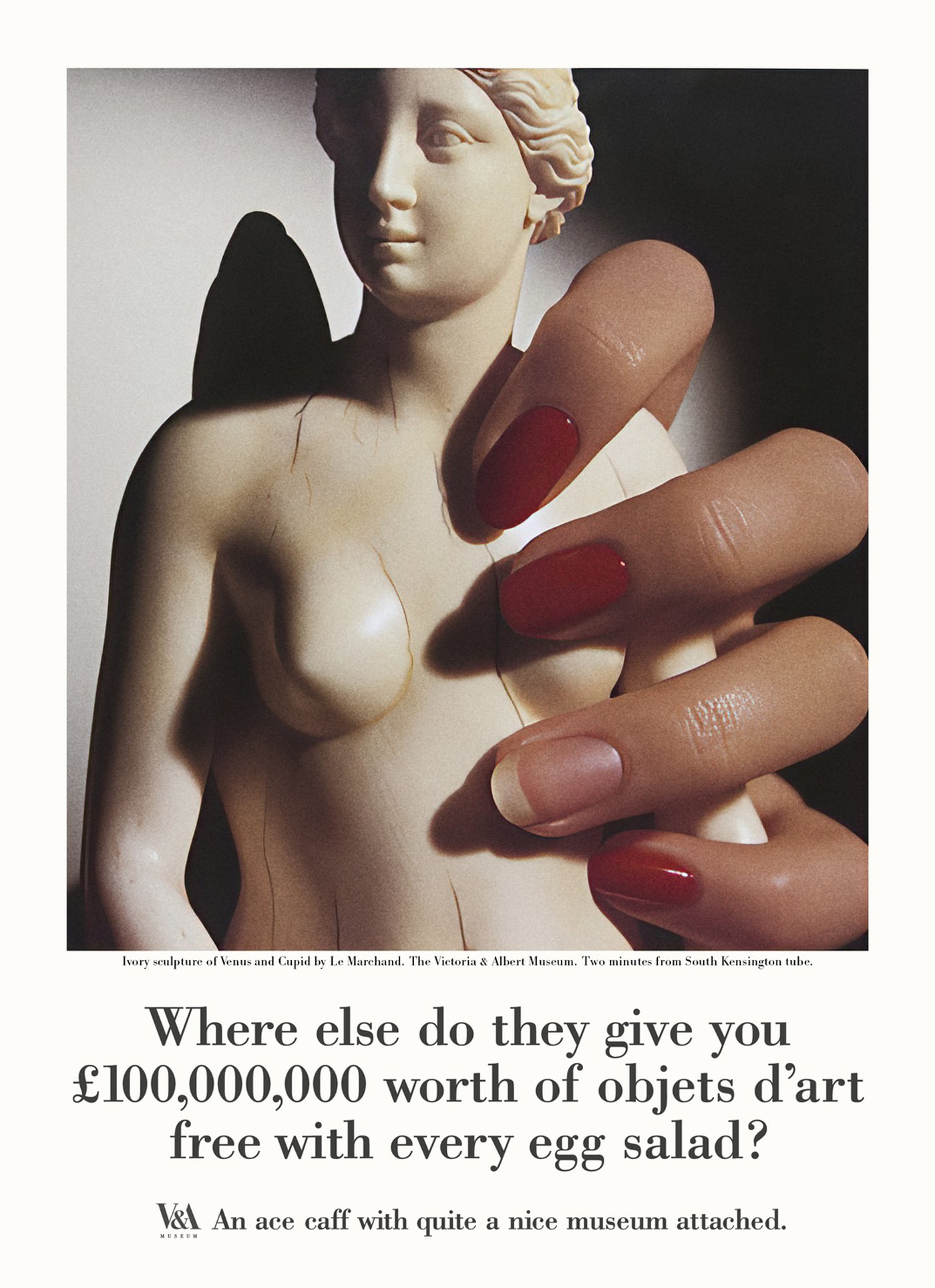
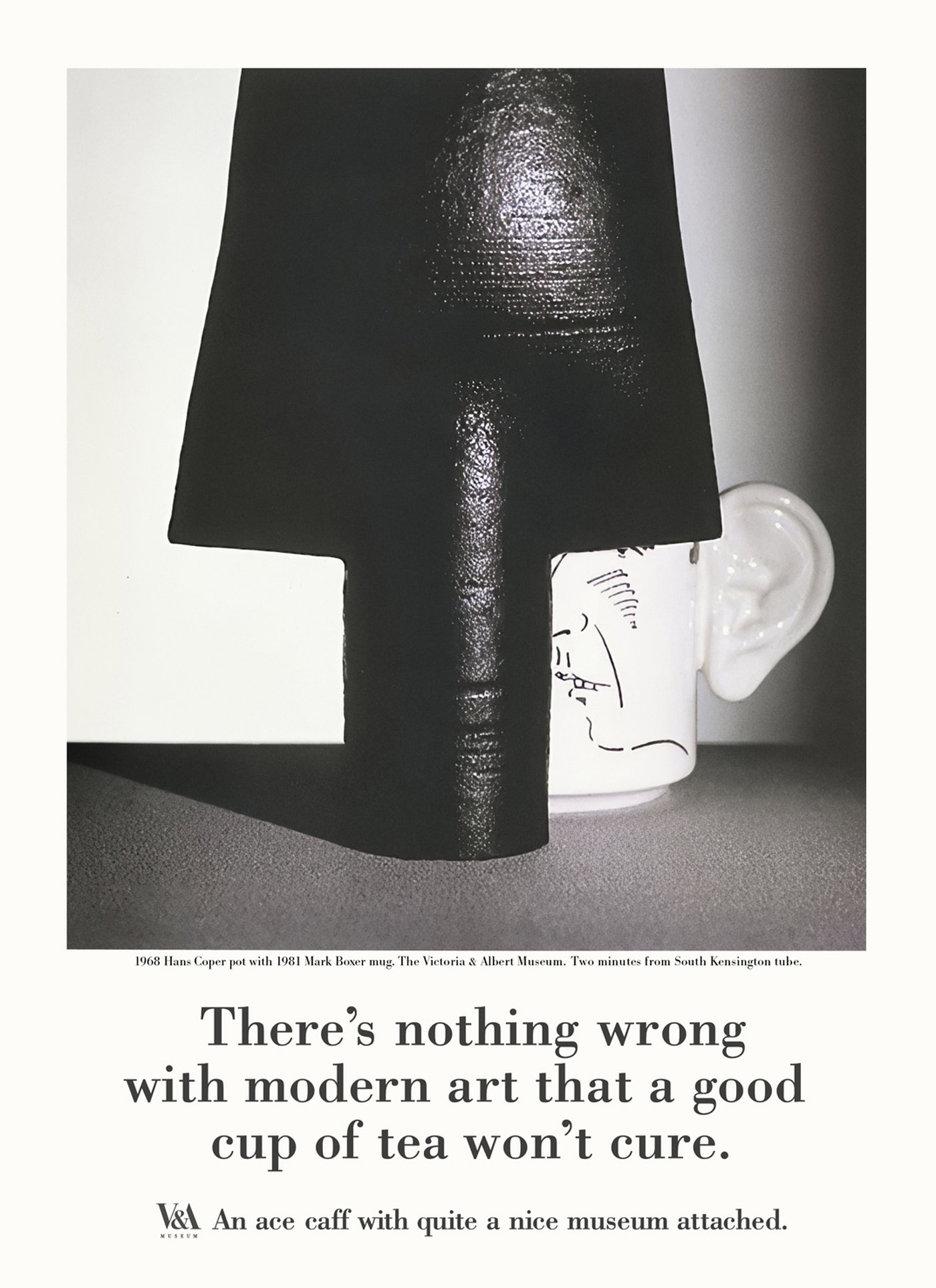
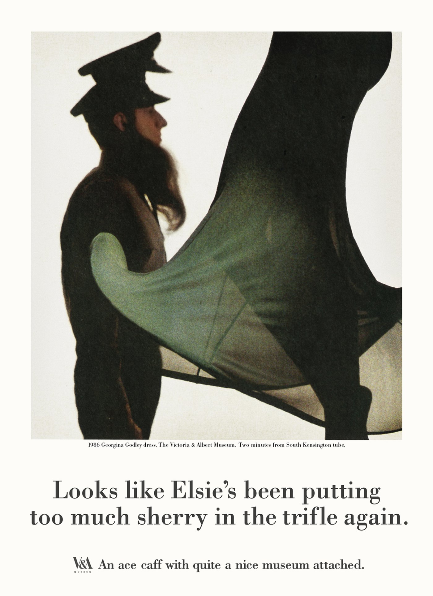
These aren’t ’clever’ visuals though (actually they’re genius visuals but we’ll get to that). They are simply photographs of selected objects from the museum’s collection. No doubt carefully chosen to include a few modern and contemporary pieces. The images occupy the upper three-quarters of each page and are framed by a small white border.
They are stratospherically good. A masterclass in composition, juxtaposition, cropping, colour and lighting. Take Le Marchand’s ’Venus and Cupid’ (above). As if it isn’t magnificent enough, photographer Lester Bookbinder weirdly adds a female hand to complete the composition. But it doesn’t stop there. One of the fingernails has been left unvarnished. And the high contrast lighting further adds to the dramatic feel. It’s this mystery and impact that really elevates these beautiful images.
It rarely happens.
So I’m amazed that this 1988 campaign by Saatchi & Saatchi for London’s V&A Museum ever saw the light of day. Maybe, just maybe, the fact that Maurice Saatchi was on the museum’s Board of Trustees at the time had something to do with it. Otherwise, surely not a hope in hell.
But hooray that this daring and executionally superb campaign made it out into the world.
There’s also the added bonus that it severely pissed off a bunch of pretentious art world snobs. Richard Dorment, art critic of The Daily Telegraph called it ’a crass bid for the charabanc trade’. Brian Sewell, art critic in the London Evening Standard hit back by calling him ’a crabby old woman’. There were even questions in Parliament and it made the TV news.
PR gold.
The strategy is, admittedly, a tad irreverent. But perfectly reasonable when you stop to think about it. The intention was to counter the museum’s staid image and appeal to a much younger audience; people who normally would never consider visiting the V&A. The tone and message of ’An ace caff with quite a nice museum attached’ would surely cut through and appeal to them. It’s a funny line. And a perfectly good insight; who doesn’t love a nice cup of tea and a slice of cake when out and about?
Plus, the V&A actually has form in this area. Apparently it was the first museum in the world to have a restaurant open to the public, way back in 1869.
Well that’s Jeff Stark’s brilliant strategy and endline sorted. How do we execute the ads? Oh, y’know, usual rules: great headlines with stunning pictures. Try it sometime, it works.
These aren’t ’clever’ visuals though (actually they’re genius visuals but we’ll get to that). They are simply photographs of selected objects from the museum’s collection. No doubt carefully chosen to include a few modern and contemporary pieces. The images occupy the upper three-quarters of each page and are framed by a small white border.
They are stratospherically good. A masterclass in composition, juxtaposition, cropping, colour and lighting. Take Le Marchand’s ’Venus and Cupid’ (above). As if it isn’t magnificent enough, photographer Lester Bookbinder weirdly adds a female hand to complete the composition. But it doesn’t stop there. One of the fingernails has been left unvarnished. And the high contrast lighting further adds to the dramatic feel. It’s this mystery and impact that really elevates these beautiful images.
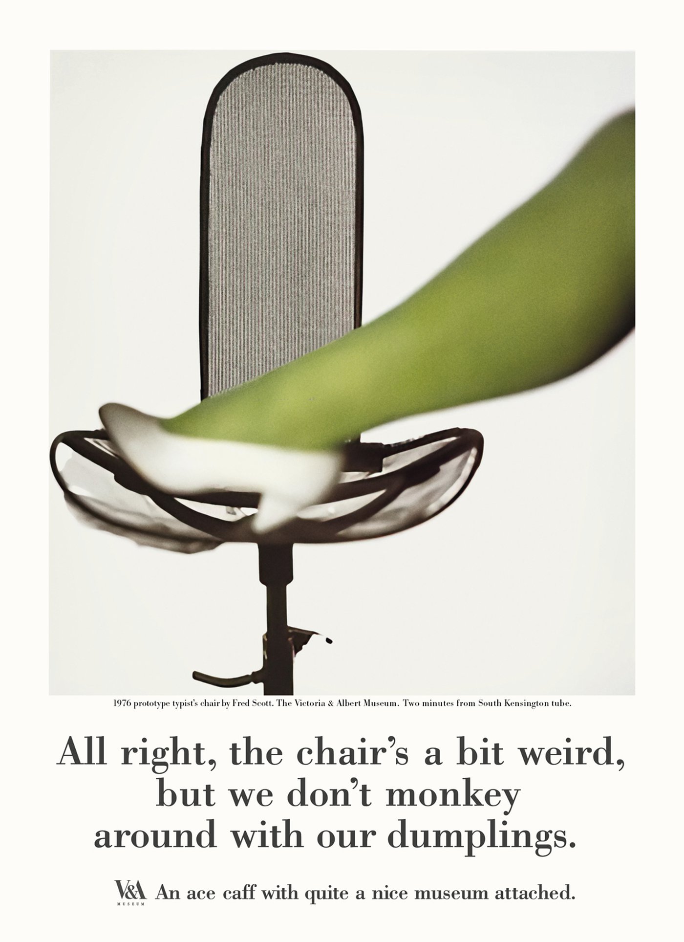
An out of focus female leg, wearing bright green tights in front of the graphic monochrome lines of a contemporary office chair. What an amazing picture. The hard lighting on a black Hans Coper pot next to the contrasting shape and colour of a Mark Boxer mug. Wow. And as for the weirdness of the ’too much sherry in the trifle’ one, featuring a Georgina Godley dress and a man with a beard and two hats… Fantastic. I’d hang these photographs on my wall any day.
Okay, so the pictures have well and truly grabbed me. Now each headline plays off the subject matter of the image, whilst using gentle wit to dramatise the proposition. Not surprisingly, the typography has a kind of 80s ad feel but it really doesn’t look that dated. The centered Bodoni is pretty timeless. It’s also simple and doesn’t detract from the photographs.
Bodoni was presumably chosen to match Alan Fletcher’s brilliant logo design. But it doesn’t match exactly. The logo letterforms are inspired by some characters in Giambattista Bodoni’s Manuale Tipografico, 1818, with slightly bracketed serifs; not the crisp slab serifs of the Bodoni used in these ads. I guess they had to work with what was available for phototypesetting at the time.
Bodoni was presumably chosen to match Alan Fletcher’s brilliant logo design. But it doesn’t match exactly. The logo letterforms are inspired by some characters in Giambattista Bodoni’s Manuale Tipografico, 1818, with slightly bracketed serifs; not the crisp slab serifs of the Bodoni used in these ads. I guess they had to work with what was available for phototypesetting at the time.
And just look how perfectly the branding is handled. Unlike the somewhat brash approach of using massive logos on more recent V&A work.
I note the following words in a 2002 V&A brand refresh by one of the big branding consultancies: “The V&A logo is now used in a more ’dramatic’ and ’confident’ way.” Oh dear. Time and time again, I see branding agencies create ill-thought-out graphic straitjackets for advertising; ignoring hierarchies of information and forgetting to leave enough room for an idea.
The way the branding works in these ads is more appropriate. And ironically, much more ’confident’. Yes, the logo is small. Yet it is perfectly legible. And beautifully balanced within the layout. If you have a compelling idea that attracts and holds the viewer’s attention, you really don’t need a big logo. But if you don’t have an interesting idea, it doesn’t matter how huge the logo is, people will move on and forget you.
There’s no ignoring these ads though. In fact they’re so good, they now reside in the V&A’s permanent collection. Oh, and they worked of course. With visitor numbers significantly up despite a low media spend.
I often hear clients describing work like this as ’brave’. Which means that they would be too scared to run it.
But surely a brave thing to do would be to churn out the usual bland mediocrity and expect it to even get noticed at all.