Met Police press ad
20.02.22
Agency: CDP. Year: 1988.
Art Director: Graham Fink. Writers: Jeremy Clarke, John Salmon.
Typographer: Len Cheeseman. Photographer: Don McCullin.
Art Director: Graham Fink. Writers: Jeremy Clarke, John Salmon.
Typographer: Len Cheeseman. Photographer: Don McCullin.
Agency: CDP. Year: 1988. Art Director: Graham Fink. Writers: Jeremy Clarke, John Salmon. Typographer: Len Cheeseman. Photographer: Don McCullin.
It’s certainly not easy being an advertising creative. But at least you don’t have anyone screaming ‘pig’ and spitting at you, or sticking a sawn-off shotgun in your face.
It is of course a vastly tougher job being a cop on London’s streets, where all of the above can happen, and much more.
CDP creative team Graham Fink and Jeremy Clarke discovered quite how difficult the police have it by spending several days shadowing officers in Brixton, London, not long after a major riot in the area had left a photojournalist dead, with 43 civilians and 10 police officers badly hurt.
The visit was deemed valuable preparation for working on a recruitment campaign for the Metropolitan Police. A particularly tricky brief; let’s face it, how on earth do you convince someone that endlessly enduring violence and insults is some kind of rewarding career choice?
In fact the creative team were probably bracing themselves for a few choice insults when, after several weeks, they sheepishly went into the creative director’s office to explain that they didn’t actually have anything good yet. But instead, they were sent to stay in a luxury hotel for a week in the hope that a change of scenery may aid the creative process.
It did. The fantastic ad above is testament to that.
It forms part of a campaign that challenges potential applicants by presenting various scenarios that the police can encounter. Each ad then goes on to describe the training, intelligence and bravery required to deal with each situation.
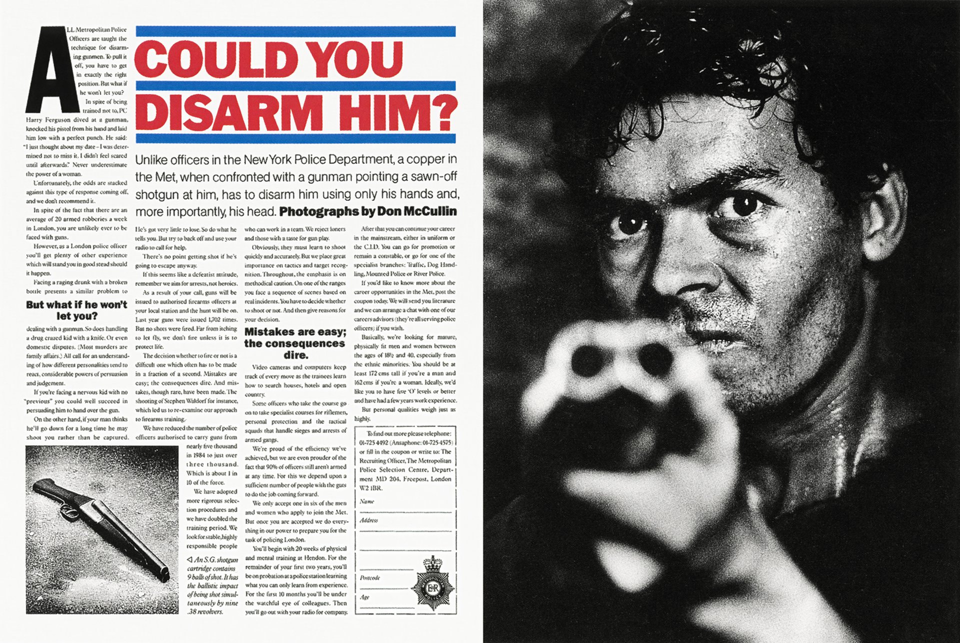
Compelling stuff. Expertly expressed in the above example with the image of someone pointing a shotgun directly at the reader, juxtaposed with a headline containing the clever play on words: ‘Could you disarm him?’
When reproduced in print this idea would certainly be one of the more interesting things to read in the entire magazine. And since people read magazines for the articles, not the ads, the art director decided to further increase readability and therefore effectiveness by making the ad look like editorial.
For a start, there’s way more copy than most ads. Four dense columns complete with editorial page furniture such as an initial drop cap, pull quotes, image caption and subhead. And can we please take a moment to appreciate the expert copyfitting and typography of the subhead; four perfectly justified lines ranging with the width of the headline over three columns.
There’s even a photographer’s credit. And what a photographer. Don McCullin, the great photojournalist; such a smart choice for the subject matter.
Apparently during casting, this particular model was the only one to convincingly point the gun into McCullin’s face. Something the photographer had extensive experience of after covering 12 war zones for UK newspapers.
The realism was further enhanced by the model’s stressed, sweaty and aggressive demeanour. This was achieved on the shoot day without the use of ‘hair & makeup’, by McCullin forcing the model to repeatedly sprint 200 meters. After that, needless to say, the model looked just right and did indeed want to kill the photographer. This image wasn’t shot in a studio but in a disused area of a train station, providing appropriate natural lighting with a dark urban ambience. It’s also brilliantly composed, with the shotgun graphically out of focus and all the attention on the model’s sharp, wildly staring eyes. Because the story is all about dealing with the psychology of the criminal, not just trying to grab the gun.
Another photographic masterstroke is the gritty tonal quality of the image, which was shot on pushed Tri-X 35mm black & white film to create dramatic contrast and grain, further enhancing the menacing mood.
There are two images on the spread. The second smaller photo features the sawn-off shotgun from the main picture; this time sharp. Again, it’s not a contrived studio set-up, but shot for real on a wet Camden pavement with the perfectly positioned reflected white highlight along the length of the gun barrel created by a conveniently parked white van.
This picture protrudes into the second column of type. It would be too small if restricted to the width of just one column. But the coupon neatly uses just one column width, tucked away in the lower right corner of the text page. One big problem that pre-internet print art directors often had was how to handle coupons. Here it’s in a logical place, making it unignorable yet as unobtrusive as possible.
The coupon also contains the subtle branding, with the words ‘Metropolitan’ and ‘ Police’ set in about 4pt type within the Police emblem. But subtle is the right approach here because editorial spreads do not of course have logos.
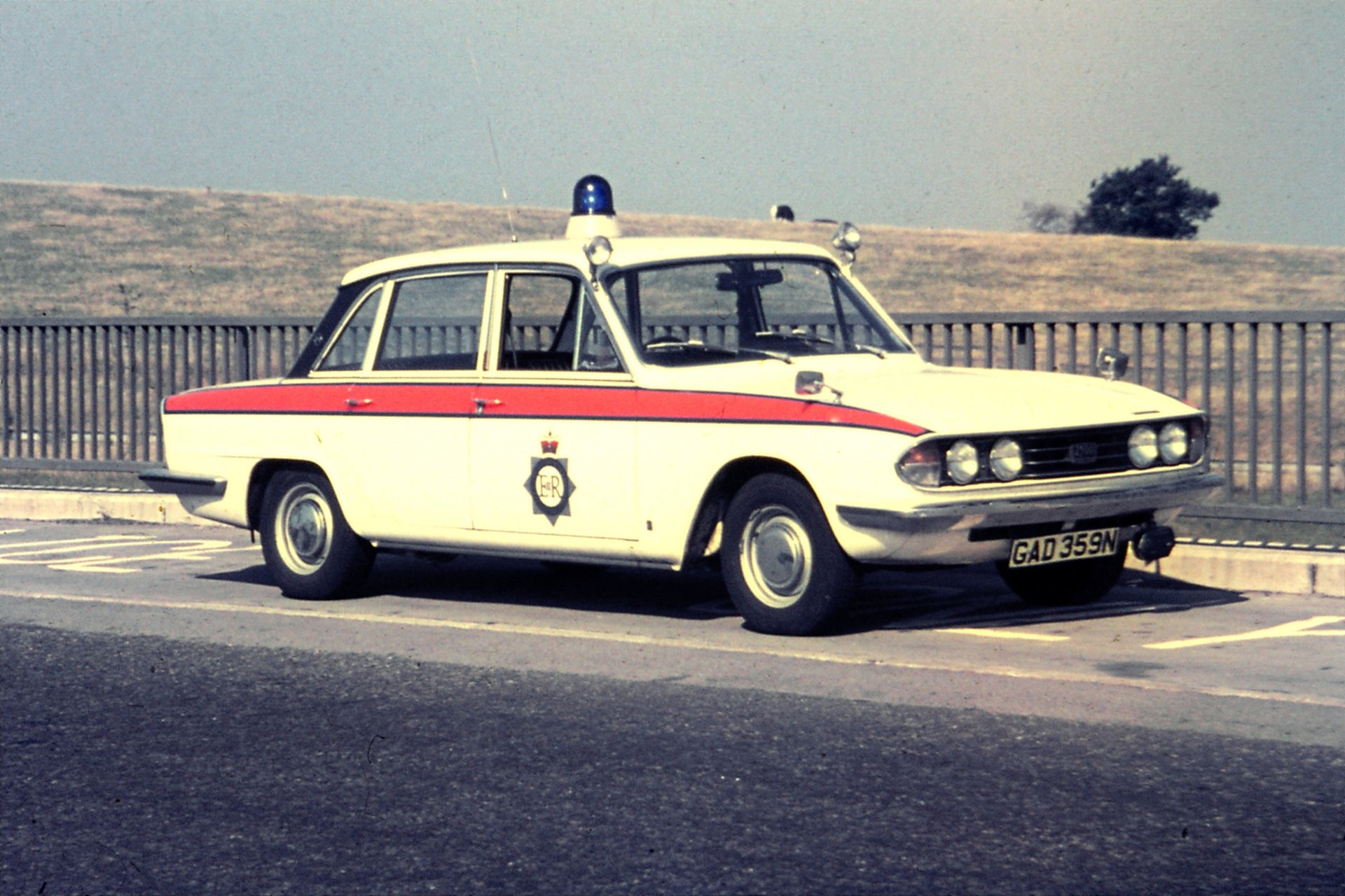
The headline typography is also impressive. Set in red Franklin Gothic Heavy with distinctive blue keylines, it stands out as the only colour element on the page. But why red? And why the blue lines? This nice art direction idea is based on the livery of police cars at the time which had a thick red stripe along the side, bordered by thinner blue stripes. See below.
It is of course a vastly tougher job being a cop on London’s streets, where all of the above can happen, and much more.
CDP creative team Graham Fink and Jeremy Clarke discovered quite how difficult the police have it by spending several days shadowing officers in Brixton, London, not long after a major riot in the area had left a photojournalist dead, with 43 civilians and 10 police officers badly hurt.
The visit was deemed valuable preparation for working on a recruitment campaign for the Metropolitan Police. A particularly tricky brief; let’s face it, how on earth do you convince someone that endlessly enduring violence and insults is some kind of rewarding career choice?
In fact the creative team were probably bracing themselves for a few choice insults when, after several weeks, they sheepishly went into the creative director’s office to explain that they didn’t actually have anything good yet. But instead, they were sent to stay in a luxury hotel for a week in the hope that a change of scenery may aid the creative process.
It did. The fantastic ad above is testament to that.
It forms part of a campaign that challenges potential applicants by presenting various scenarios that the police can encounter. Each ad then goes on to describe the training, intelligence and bravery required to deal with each situation.
Compelling stuff. Expertly expressed in the above example with the image of someone pointing a shotgun directly at the reader, juxtaposed with a headline containing the clever play on words: ‘Could you disarm him?’
When reproduced in print this idea would certainly be one of the more interesting things to read in the entire magazine. And since people read magazines for the articles, not the ads, the art director decided to further increase readability and therefore effectiveness by making the ad look like editorial.
For a start, there’s way more copy than most ads. Four dense columns complete with editorial page furniture such as an initial drop cap, pull quotes, image caption and subhead. And can we please take a moment to appreciate the expert copyfitting and typography of the subhead; four perfectly justified lines ranging with the width of the headline over three columns.
There’s even a photographer’s credit. And what a photographer. Don McCullin, the great photojournalist; such a smart choice for the subject matter.
Apparently during casting, this particular model was the only one to convincingly point the gun into McCullin’s face. Something the photographer had extensive experience of after covering 12 war zones for UK newspapers.
The realism was further enhanced by the model’s stressed, sweaty and aggressive demeanour. This was achieved on the shoot day without the use of ‘hair & makeup’, by McCullin forcing the model to repeatedly sprint 200 meters. After that, needless to say, the model looked just right and did indeed want to kill the photographer. This image wasn’t shot in a studio but in a disused area of a train station, providing appropriate natural lighting with a dark urban ambience. It’s also brilliantly composed, with the shotgun graphically out of focus and all the attention on the model’s sharp, wildly staring eyes. Because the story is all about dealing with the psychology of the criminal, not just trying to grab the gun.
Another photographic masterstroke is the gritty tonal quality of the image, which was shot on pushed Tri-X 35mm black & white film to create dramatic contrast and grain, further enhancing the menacing mood.
There are two images on the spread. The second smaller photo features the sawn-off shotgun from the main picture; this time sharp. Again, it’s not a contrived studio set-up, but shot for real on a wet Camden pavement with the perfectly positioned reflected white highlight along the length of the gun barrel created by a conveniently parked white van.
This picture protrudes into the second column of type. It would be too small if restricted to the width of just one column. But the coupon neatly uses just one column width, tucked away in the lower right corner of the text page. One big problem that pre-internet print art directors often had was how to handle coupons. Here it’s in a logical place, making it unignorable yet as unobtrusive as possible.
The coupon also contains the subtle branding, with the words ‘Metropolitan’ and ‘ Police’ set in about 4pt type within the Police emblem. But subtle is the right approach here because editorial spreads do not of course have logos.
The headline typography is also impressive. Set in red Franklin Gothic Heavy with distinctive blue keylines, it stands out as the only colour element on the page. But why red? And why the blue lines? This nice art direction idea is based on the livery of police cars at the time which had a thick red stripe along the side, bordered by thinner blue stripes. See below.
Okay, so the headline’s great, but would anyone actually read the whole ad? It has become fashionable in recent years to say that people don’t read copy in ads. From my point of view, this is simply an admission that you can’t write in a sufficiently interesting way. The fact that many people read every single word on the page is proved by the phenomenal response rate. It was by far the most effective campaign the Met had ever run.
And of course the spread doesn’t just work as a recruitment ad. This fascinating story of everyday violence does an excellent brand job for the Met Police too.
And speaking of threats and intimidation, when the Sunday Times Magazine first received the artwork for this ad, they were concerned that it looked too much like editorial, so insisted that the agency put the words ‘Advertisement’ in large type above each page. CDP responded by saying that they would never run another ad in the Sunday Times unless the magazine backed down.
It was a tense stand-off. But I’m very pleased to say that the agency (and the cops) prevailed.