Levi’s press campaign
04.10.20
Agency: BBH. Year: 1992.
Art Director: Martin Galton. Writer: Will Awdry.
Photographer: Richard Avedon. Stylist: Simone Colina
Art Director: Martin Galton. Writer: Will Awdry.
Photographer: Richard Avedon. Stylist: Simone Colina
Agency: BBH, Year: 1992, Art Director: Martin Galton, Writer: Will Awdry, Photographer: Richard Avedon
This blog is about celebrating and analysing great design and advertising. In each post I’ll discuss what makes the featured work great. It’ll be tough to not use up all my superlatives with this offering though. It’s one of the best print campaigns I’ve ever seen. Why?
For a start they’re double page spreads. Clearly more than twice as powerful as a single page. Although I’d be surprised if any of our media buying chums have a chart for that.
This campaign for Levi’s is so ahead of the curve, it even failed to get into the D&AD Annual.
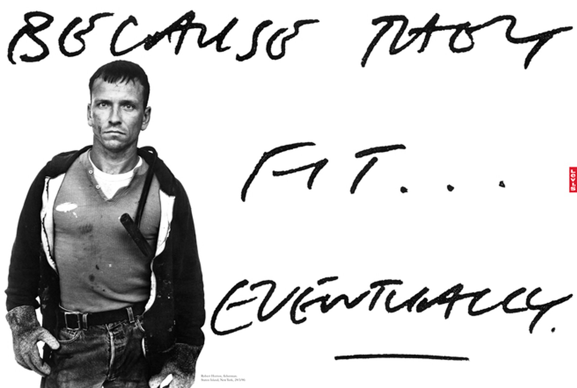
But of course inordinately misguided D&AD jurors were the least of the team’s worries. I can think of a client criticism for every element in this ad. The headline isn’t legible. The type looks ugly. And it isn’t specified in the brand guidelines. The product isn’t shown clearly. Or in colour. The models aren’t aspirational enough and they don't look happy. And wait for it… the logo is way too small and in a weird place.
For a start they’re double page spreads. Clearly more than twice as powerful as a single page. Although I’d be surprised if any of our media buying chums have a chart for that.
This campaign for Levi’s is so ahead of the curve, it even failed to get into the D&AD Annual.
But of course inordinately misguided D&AD jurors were the least of the team’s worries. I can think of a client criticism for every element in this ad. The headline isn’t legible. The type looks ugly. And it isn’t specified in the brand guidelines. The product isn’t shown clearly. Or in colour. The models aren’t aspirational enough and they don't look happy. And wait for it… the logo is way too small and in a weird place.
Refreshing isn’t it? To see two fingers raised so gloriously to the mind-numbing, arse-covering, suicidal timidness many of us have to patiently argue against every single day.
And how ironic that each and every one of those predictible client ‘mandates’, naively intended to make the ad work ‘harder’ would actually make it less effective, by incrementally turning it into something clichéd and ignorable.
You see, unlike 99.99% of all ad campaigns, I actually believe this one. It’s based on a great insight. An undeniable product truth. And it’s then visually dramatised about as well as it possibly could be.
It takes great skill to make the type look that bad. And real.
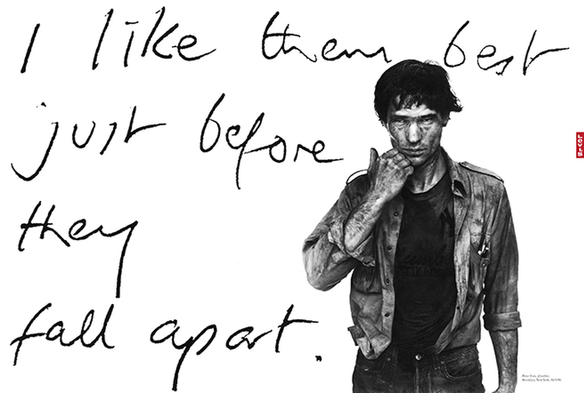
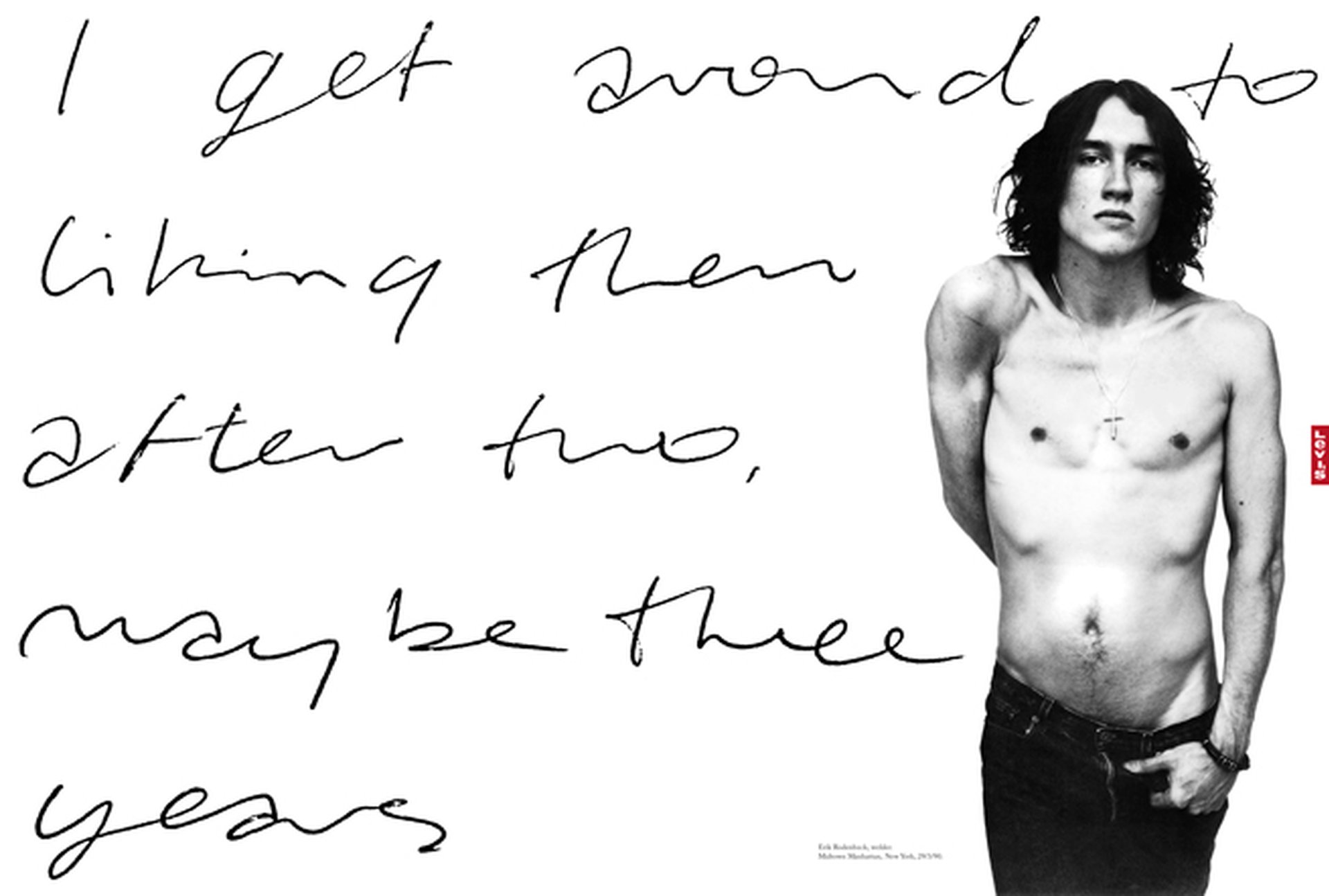
And the photography is sublime. By Richard Avedon, inspired by his American West series. A supremely appropriate style for the ad. And the reason the people in the ads don’t look like models is because they aren’t models. There’s a plumber, a welder and a fisherman. And they’re wearing what looks like their own Levi’s. In fact all the featured jeans turned up brand new, and their superbly authentic distressed look was actually created by stylist Simone Colina dragging them around the sidewalk outside the 75th Street studio. A one day shoot then turned into a two day shoot to allow just the right amount of stubble to grow on the models. And when even that wasn't quite right, the stylist collected dirt from the street outside and sprayed it over the guys’ faces.
It’s obvious really when you think about it. But how many other jeans ads would do all that? And do we really need to see any more of the product? No. I reckon everyone knows what a pair of Levi’s looks like.
The reader either cares about this communication or they don’t. A bigger logo won’t make them care any more. In fact a smaller logo may actually make them care more. Because it’s confident. And less patronising. And cooler. And less like a bloody ad.
Now I’m starting to rant. Better stop. I’m all out of superlatives anyway.
And how ironic that each and every one of those predictible client ‘mandates’, naively intended to make the ad work ‘harder’ would actually make it less effective, by incrementally turning it into something clichéd and ignorable.
You see, unlike 99.99% of all ad campaigns, I actually believe this one. It’s based on a great insight. An undeniable product truth. And it’s then visually dramatised about as well as it possibly could be.
It takes great skill to make the type look that bad. And real.
And the photography is sublime. By Richard Avedon, inspired by his American West series. A supremely appropriate style for the ad. And the reason the people in the ads don’t look like models is because they aren’t models. There’s a plumber, a welder and a fisherman. And they’re wearing what looks like their own Levi’s. In fact all the featured jeans turned up brand new, and their superbly authentic distressed look was actually created by stylist Simone Colina dragging them around the sidewalk outside the 75th Street studio. A one day shoot then turned into a two day shoot to allow just the right amount of stubble to grow on the models. And when even that wasn't quite right, the stylist collected dirt from the street outside and sprayed it over the guys’ faces.
It’s obvious really when you think about it. But how many other jeans ads would do all that? And do we really need to see any more of the product? No. I reckon everyone knows what a pair of Levi’s looks like.
The reader either cares about this communication or they don’t. A bigger logo won’t make them care any more. In fact a smaller logo may actually make them care more. Because it’s confident. And less patronising. And cooler. And less like a bloody ad.
Now I’m starting to rant. Better stop. I’m all out of superlatives anyway.