Lanson press ad
01.06.21
Agency: Saatchi & Saatchi. Year: 1989.
Art director: Zelda Malan. Copywriter: Eugene Ruane.
Typographer: Roger Kennedy.
Photographer: Graham Cornthwaite.
Art director: Zelda Malan. Copywriter: Eugene Ruane.
Typographer: Roger Kennedy.
Photographer: Graham Cornthwaite.
Agency: Saatchi & Saatchi. Year: 1989. Art director: Zelda Malan. Copywriter: Eugene Ruane. Typographer: Roger Kennedy. Photographer: Graham Cornthwaite.
There’s a great ad in any brief.
I substantiate the claim by directing you to the 1989 Campaign Press Award winners brochure. Page 53 to be precise, out of a whopping 77 pages of great work. It’s where I found this low budget trade ad for Lanson which ran in ‘Caterer & Hotelkeeper’ magazine. The brief was for a range ad designed to flog not just one product, but four.
Doesn’t sound too promising does it?
But none of the above deterred the team form creating something intelligent, beautiful and no doubt highly effective.
I don’t think an ad of this quality would be done today on the same brief. And even if it was, I’m pretty sure it wouldn’t win any creative awards. Crazy.
What makes this ad so good? Simple: Idea, photography, art direction, writing and typography. In other words, absolutely every person involved was supremely talented and at the top of their game. And they gave a damn. Including the account team.
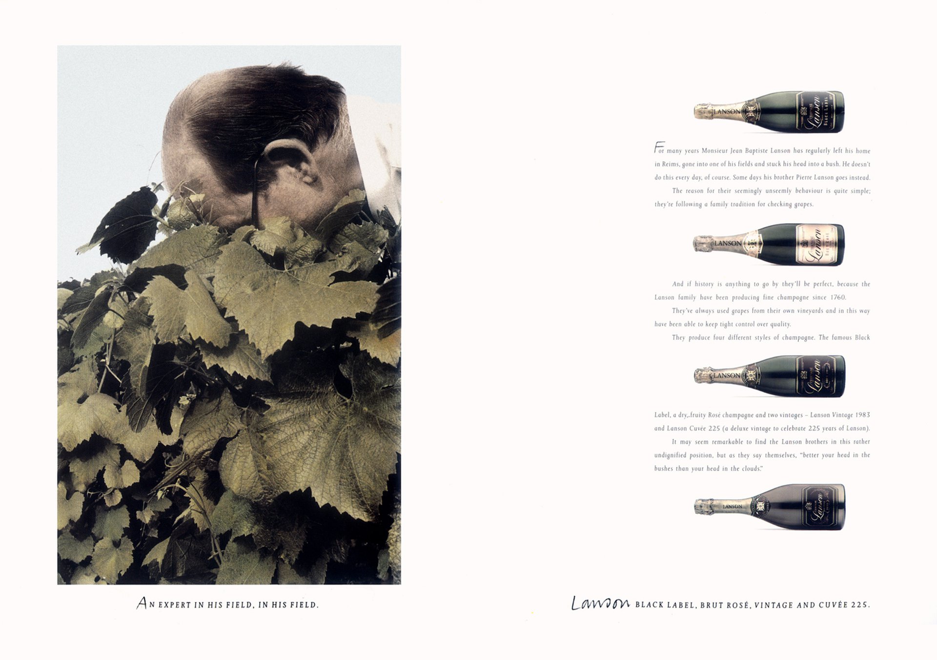
Let’s start with the headline. Or, more accurately, the caption. The ad celebrates the quality of grapes that Lanson use to make their champagne. This leads to the simple yet great headline: ‘An expert in his field, in his field.’ Under a picture of, not surprisingly, an expert in a field.
This could have merely been a nice portrait of a man standing in a vineyard. But instead we have something much better. An unusual, attention-grabbing surreal photograph of a man with his head buried deep in a vine, sniffing a bunch of grapes. It’s brilliant and true. Research into the production of Lanson champagne revealed that this is what they actually do. It’s a real page-stopper of an image. The tones are subtle and slightly desaturated with the greens nicely balancing the green bottles in the layout. I wonder if it’s a hand-coloured black and white print? And our balding expert looks wonderfully interesting; about as far from a bland model as it’s possible to be.
It’s unusual to have both a clever visual and a clever headline. In most good advertising it’s generally one or the other. The headline here is certainly good enough to be reproduced big on the page. But then it would reduce the impact of the picture. So, counterintuitively, the overall effect is more powerful when it’s set small, as a caption under the image.
Which brings us to the typography. Interestingly, the logo in this ad isn’t the real logo. The brand name is simply rendered in handwriting; not the more clichéd script type of the actual logo visible on the bottle labels. This same handlettering and size has been used to create initial caps for the headline and body copy; a lovely subtle touch, with the rest of the headline set in elegant tracked out italic caps. There’s no endline clutter, just a list of the four products, set exactly the same as the headline, and balancing it on the opposite page.
The dreaded pack shot problem is solved beautifully here. Rather than being lumped together in the bottom right-hand corner, the bottles are placed on their sides and spaced out vertically, interspersed with nicely written body copy to the height of the picture. This makes the four product shots an integral and graphically important part of the layout rather than just something tucked away in a corner. And let’s not forget the contribution of the white space, adding elegance and giving the other elements room to breathe. This really is terrific art direction. In fact bravo to the whole team.
Lanson Cuvée 225 all round I reckon.
I substantiate the claim by directing you to the 1989 Campaign Press Award winners brochure. Page 53 to be precise, out of a whopping 77 pages of great work. It’s where I found this low budget trade ad for Lanson which ran in ‘Caterer & Hotelkeeper’ magazine. The brief was for a range ad designed to flog not just one product, but four.
Doesn’t sound too promising does it?
But none of the above deterred the team form creating something intelligent, beautiful and no doubt highly effective.
I don’t think an ad of this quality would be done today on the same brief. And even if it was, I’m pretty sure it wouldn’t win any creative awards. Crazy.
What makes this ad so good? Simple: Idea, photography, art direction, writing and typography. In other words, absolutely every person involved was supremely talented and at the top of their game. And they gave a damn. Including the account team.
Let’s start with the headline. Or, more accurately, the caption. The ad celebrates the quality of grapes that Lanson use to make their champagne. This leads to the simple yet great headline: ‘An expert in his field, in his field.’ Under a picture of, not surprisingly, an expert in a field.
This could have merely been a nice portrait of a man standing in a vineyard. But instead we have something much better. An unusual, attention-grabbing surreal photograph of a man with his head buried deep in a vine, sniffing a bunch of grapes. It’s brilliant and true. Research into the production of Lanson champagne revealed that this is what they actually do. It’s a real page-stopper of an image. The tones are subtle and slightly desaturated with the greens nicely balancing the green bottles in the layout. I wonder if it’s a hand-coloured black and white print? And our balding expert looks wonderfully interesting; about as far from a bland model as it’s possible to be.
It’s unusual to have both a clever visual and a clever headline. In most good advertising it’s generally one or the other. The headline here is certainly good enough to be reproduced big on the page. But then it would reduce the impact of the picture. So, counterintuitively, the overall effect is more powerful when it’s set small, as a caption under the image.
Which brings us to the typography. Interestingly, the logo in this ad isn’t the real logo. The brand name is simply rendered in handwriting; not the more clichéd script type of the actual logo visible on the bottle labels. This same handlettering and size has been used to create initial caps for the headline and body copy; a lovely subtle touch, with the rest of the headline set in elegant tracked out italic caps. There’s no endline clutter, just a list of the four products, set exactly the same as the headline, and balancing it on the opposite page.
The dreaded pack shot problem is solved beautifully here. Rather than being lumped together in the bottom right-hand corner, the bottles are placed on their sides and spaced out vertically, interspersed with nicely written body copy to the height of the picture. This makes the four product shots an integral and graphically important part of the layout rather than just something tucked away in a corner. And let’s not forget the contribution of the white space, adding elegance and giving the other elements room to breathe. This really is terrific art direction. In fact bravo to the whole team.
Lanson Cuvée 225 all round I reckon.