Esquire magazine cover
27.12.21
Agency: Pappert Koenig Lois. Year: 1969.
Designer: George Lois. Photographer: Carl Fischer.
Designer: George Lois. Photographer: Carl Fischer.
Agency: Pappert Koenig Lois. Year: 1969. Designer: George Lois. Photographer: Carl Fischer.
Clients get the creative work they deserve.
Nowhere is this better illustrated than the relationship between magazine editor Harold Hayes and adman / designer George Lois.
Hayes worked at Esquire from 1956 to 1973, first becoming managing editor and then editor. He was that rare phenomenon, a client who instantly recognised brilliant work.
It didn’t scare him.
He also understood that he needed to find and trust the equally rare creative people capable of producing it.
So he commissioned George Lois to design all the Esquire covers for an entire decade, starting in October 1962.
The brief? ‘Reinvent the magazine cover’.
Prior to this utopian arrangement, it was not uncommon to create up to 10 different concept-free cover mock-ups for each issue and then let a visually illiterate committee decide on the final design. This of course always resulted in the least effective, most boring option being chosen. Which meant that circulation was falling and Esquire was in trouble.
To remedy the situation Hayes did not initiate a protracted pitch process making multiple designers jump through endless soul-destroying hoops for free. There was no bullying cost controller hammering down the creative fee. And absolutely no requirement for the yawn fest of a 100-page strategy deck.
Hayes noticed and liked Lois’ work. They met for a chat. It went well. He got the gig. Clients please take note; it really can be that straightforward.
And if you think that’s radical, wait until you hear about their working method. It generally went something like this: Each cover was created three months in advance. Hayes suggested the subject matter e.g. ‘let’s do something on pop art’ and he‘d then discuss the editorial approach to the story. A week later, from his office 12 blocks away, Lois would call Hayes and tell him what he wanted to do.
Then he went off and did it.
No interminable, unnecessary pre-production meetings. No messing photographers around with ‘treatment’ requests and competitive bidding. No ridiculous client / agency entourage on the shoot. And obviously no consumer testing — just imagine the carnage…
A few weeks later, a messenger would deliver the cover to Hayes as a full-sized colour print, frame-matted and covered in acetate. With all the type in place, the logo, the cover line (also written by Lois) and the cover date.
This degree of creative freedom revolutionised what a magazine cover could be.
During those Hayes years, circulation increased from 750,000 to almost 2 million. (And in 1973 when Hayes and Lois bailed out, it went right back down to 750,000.)
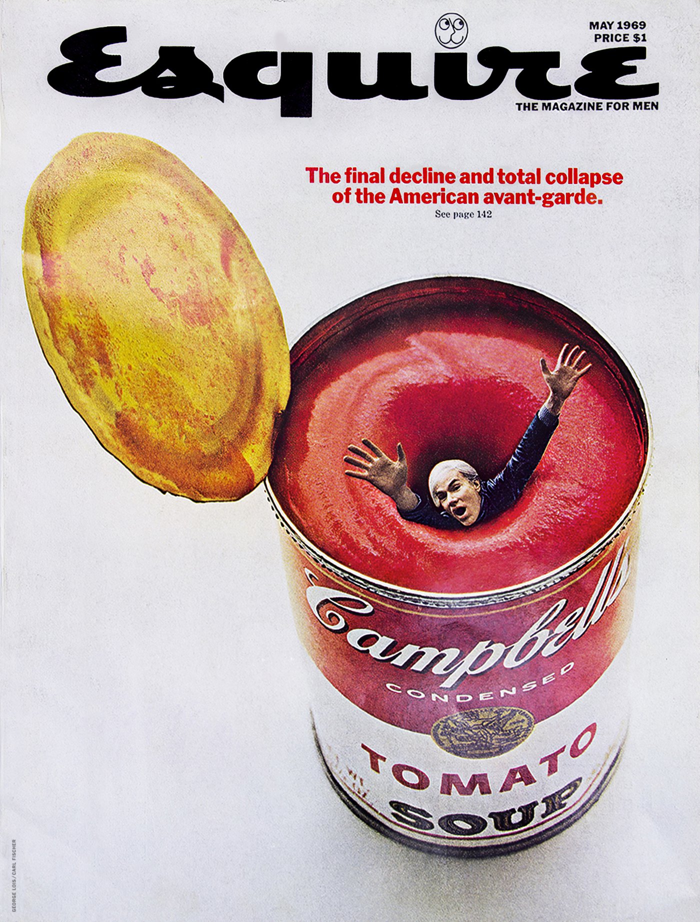
I was lucky enough to see a stunning set of 31 of these covers in the flesh at MoMA New York in 2008. Every single one of them had a beautifully executed, memorable idea (unlike any other magazine covers at the time; or most since). The example above is from May 1969. It features the terrific visual of Andy Warhol drowning in a can of his Campbell’s soup. The cover therefore becomes an elegant symbol of Esquire’s celebration of pop culture but it’s also a deconstruction of celebrity. So you just know that the writing inside is going to be interesting.
This design clearly owes much to Lois’ advertising background. It uses the technique developed by Bill Bernbach at DDB (where Lois used to work) a decade earlier; a clever, witty visual, juxtaposed with a copy line or vice-versa. Common in advertising by the late sixties, but unheard of on the front of a magazine. It’s even typeset in the style an ad of that era, using centred Franklin Gothic No2, in red to match the tomato soup. Note the full-stop — very un-editorial. Also note the complete lack of any other superfluous, distracting crap on the cover.
Photographer Carl Fischer (who collaborated on many of the covers) shot Warhol and the soup separately, trusting his retoucher to skilfully and seamlessly combine the two images in post-production.
The key word here at every stage is ‘trust’. Without it, the creative process tends to be slow and painful and the work becomes watered-down and boring.
The Esquire board trusted Hayes. Hayes trusted Lois. Lois trusted Hayes and Fischer. And of course Warhol trusted Lois.
In fact Andy Warhol provides the common link to another great story of client / creative trust.
At exactly the same time as the Esquire cover, Warhol received a brief from Mick Jagger. The task was to design the sleeve for a Rolling Stones album. This eventually turned into a project to design the artwork for ‘Sticky Fingers’.
Here’s the brief.
Nowhere is this better illustrated than the relationship between magazine editor Harold Hayes and adman / designer George Lois.
Hayes worked at Esquire from 1956 to 1973, first becoming managing editor and then editor. He was that rare phenomenon, a client who instantly recognised brilliant work.
It didn’t scare him.
He also understood that he needed to find and trust the equally rare creative people capable of producing it.
So he commissioned George Lois to design all the Esquire covers for an entire decade, starting in October 1962.
The brief? ‘Reinvent the magazine cover’.
Prior to this utopian arrangement, it was not uncommon to create up to 10 different concept-free cover mock-ups for each issue and then let a visually illiterate committee decide on the final design. This of course always resulted in the least effective, most boring option being chosen. Which meant that circulation was falling and Esquire was in trouble.
To remedy the situation Hayes did not initiate a protracted pitch process making multiple designers jump through endless soul-destroying hoops for free. There was no bullying cost controller hammering down the creative fee. And absolutely no requirement for the yawn fest of a 100-page strategy deck.
Hayes noticed and liked Lois’ work. They met for a chat. It went well. He got the gig. Clients please take note; it really can be that straightforward.
And if you think that’s radical, wait until you hear about their working method. It generally went something like this: Each cover was created three months in advance. Hayes suggested the subject matter e.g. ‘let’s do something on pop art’ and he‘d then discuss the editorial approach to the story. A week later, from his office 12 blocks away, Lois would call Hayes and tell him what he wanted to do.
Then he went off and did it.
No interminable, unnecessary pre-production meetings. No messing photographers around with ‘treatment’ requests and competitive bidding. No ridiculous client / agency entourage on the shoot. And obviously no consumer testing — just imagine the carnage…
A few weeks later, a messenger would deliver the cover to Hayes as a full-sized colour print, frame-matted and covered in acetate. With all the type in place, the logo, the cover line (also written by Lois) and the cover date.
This degree of creative freedom revolutionised what a magazine cover could be.
During those Hayes years, circulation increased from 750,000 to almost 2 million. (And in 1973 when Hayes and Lois bailed out, it went right back down to 750,000.)
I was lucky enough to see a stunning set of 31 of these covers in the flesh at MoMA New York in 2008. Every single one of them had a beautifully executed, memorable idea (unlike any other magazine covers at the time; or most since). The example above is from May 1969. It features the terrific visual of Andy Warhol drowning in a can of his Campbell’s soup. The cover therefore becomes an elegant symbol of Esquire’s celebration of pop culture but it’s also a deconstruction of celebrity. So you just know that the writing inside is going to be interesting.
This design clearly owes much to Lois’ advertising background. It uses the technique developed by Bill Bernbach at DDB (where Lois used to work) a decade earlier; a clever, witty visual, juxtaposed with a copy line or vice-versa. Common in advertising by the late sixties, but unheard of on the front of a magazine. It’s even typeset in the style an ad of that era, using centred Franklin Gothic No2, in red to match the tomato soup. Note the full-stop — very un-editorial. Also note the complete lack of any other superfluous, distracting crap on the cover.
Photographer Carl Fischer (who collaborated on many of the covers) shot Warhol and the soup separately, trusting his retoucher to skilfully and seamlessly combine the two images in post-production.
The key word here at every stage is ‘trust’. Without it, the creative process tends to be slow and painful and the work becomes watered-down and boring.
The Esquire board trusted Hayes. Hayes trusted Lois. Lois trusted Hayes and Fischer. And of course Warhol trusted Lois.
In fact Andy Warhol provides the common link to another great story of client / creative trust.
At exactly the same time as the Esquire cover, Warhol received a brief from Mick Jagger. The task was to design the sleeve for a Rolling Stones album. This eventually turned into a project to design the artwork for ‘Sticky Fingers’.
Here’s the brief.
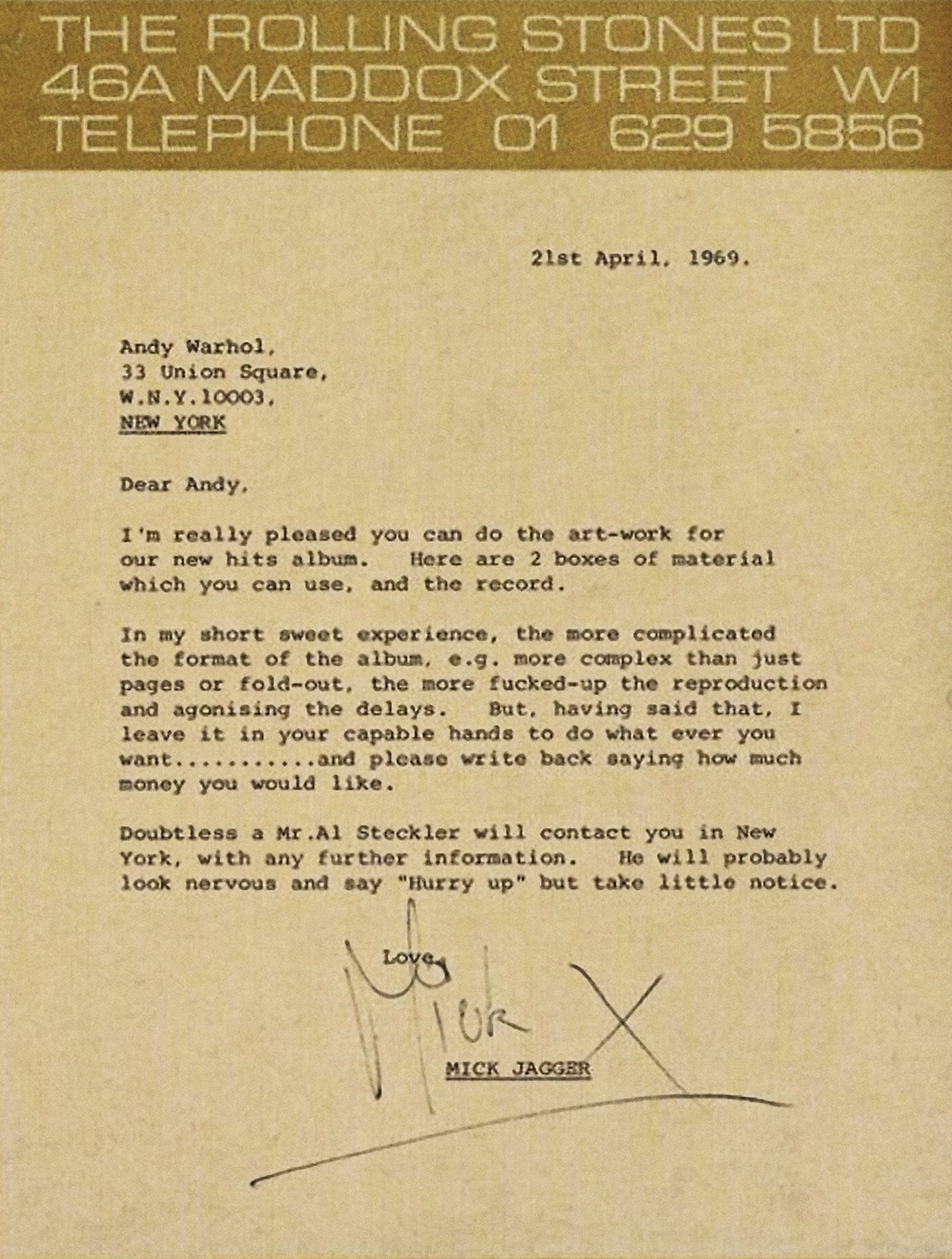
Brilliant isn’t it: Creative freedom, background information, a generous timescale and a decent fee. Again, a client has created the perfect conditions to encourage great work.
And boy did Warhol deliver.
After calling Jagger to sell his idea, Warhol collaborated with his trusted print guy Craig Braun (who he previously worked with on the Velvet Underground & Nico famous banana print sleeve).
The resulting design was a gritty, iconic photograph by Billy Name of Corey Grant Tippin’s denim-clad crotch, complete with a working zipper, pulled half-way down so that it lined up with the centre of the record and didn’t damage the vinyl.
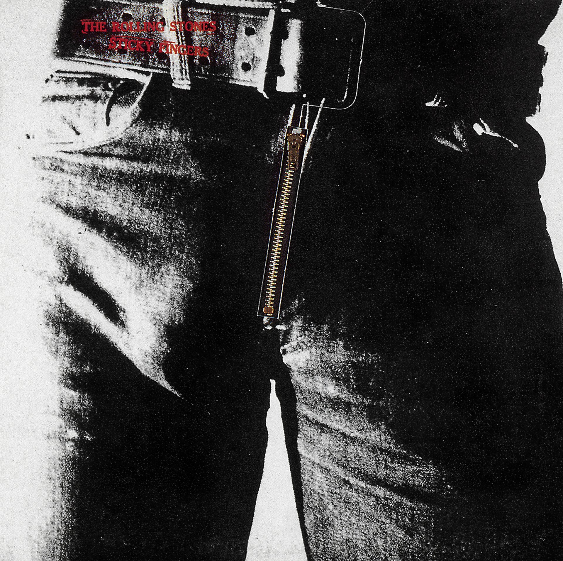
Apparently the black and white Polaroids were such poor quality that Braun had to use a new technique called posterisation which created a very high contrast result, significantly adding to the mood of the image. This was further enhanced by creating a mezzotint line conversion to give it a slight stippled effect.
Another nice touch was having a similar image of Tippin’s denim-clad ass on the back cover. The design was completed with simple understated typography created using rubber stamps to complement the grungy style.
Named by VH1 as the greatest album cover of all time, it reached number one in both The US and The UK, with original sales in excess of 9,350,000.
See? Trust. It works. Surely good creative people deserve a little more.