Die Neue Sammlung poster
27.04.21
Studio: Mendell & Oberer. Year: 1994.
Design: Pierre Mendell.
Design: Pierre Mendell.
Studio: Mendell & Oberer. Year: 1994. Design: Pierre Mendell.
I can’t wait to get back to London’s galleries, museums and theatres as they open up after the pandemic.
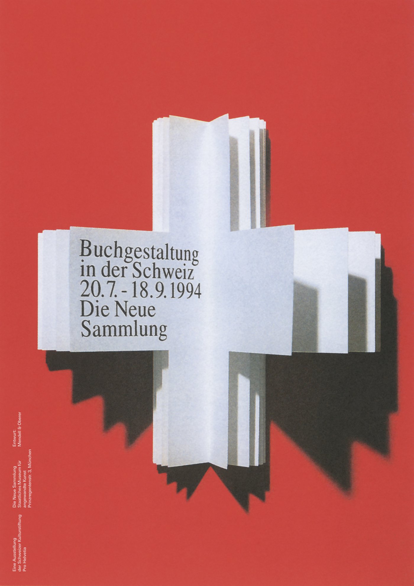
But one thing I’m not particularly looking forward to seeing are all the sub-standard posters for the various shows.
Very few will be as good as the work featured here for an exhibition about Swiss book design.
Unusual isn’t it. An actual idea on an exhibition poster for a cultural institution. The default position for pretty much all of them seems to be just reproduce an image of something from the show. Almost certainly badly cropped and with dodgy colours. And let’s plonk some type all over it for good measure.
This is not only disrespectful to the artist but also lazy and mind-numbingly boring.
The curators and marketing people who insist on this short-sighted and ineffective approach, misunderstand how communications work. It’s surely more unique and powerful to dramatise the idea behind a show.
For example, this poster about Swiss book design reproduces the Swiss flag as a book. Simple, yet brilliant. And more memorable than just showing a book from the exhibition.
So how do we execute the idea?
Well there’s quite a lot to cram in: Exhibition title, dates, venue, address… all vital stuff. And hard to handle well. The way it’s done here is beautifully elegant. One typeface, one point size (perfectly big enough but not the shouting type we usually see) and one colour. Printed on a page of the book. Secondary details are nicely set in small white type in the lower left, so that they don’t detract from the main message.
The black, white and red colour palette is relevant and looks great and the hard black shadows from the book are particularly striking. This poster not only looks superb, it communicates everything we need to know.
But hang on, where’s the Museum logo? Where’s the strapline lock-up? Where’s the sponsor’s logo? In fact let’s have a whole row of ugly, ignorable corporate graffiti. Oh, and let’s not forget the buy tickets NOW line or, even better, let’s put it in one of those diagonal flashes across one of the corners, in a bright contrasting colour. Um, let’s see, how else can we ruin it and make it more ignorable? I know, yes... a big phone number for the booking line. And while we’re at it, we might as well squeeze a big web address in there. In bold. I’ll stop now. I’m getting flashbacks of too many painful meetings.
It’s a poster. It has to be simple to be effective.
Not only does this one contain a great idea that communicates in a nanosecond, the client at the Museum for Applied Art, Munich had the good sense to agree to drop all the usual other superfluous clutter off this wonderful work. And it communicates much better because of it.
Are you listening Tate, V&A, Royal Academy, Barbican etc?