Covent Garden Art Co. press ad
17.01.21
Year: 1986. Art director: Derrick Hass. Copywriter: Howard Fletcher.
Typographers: Derrick Hass, Richard Taylor. Photographer: John Claridge.
Typographers: Derrick Hass, Richard Taylor. Photographer: John Claridge.
Year: 1986. Art director: Derrick Hass. Copywriter: Howard Fletcher. Typographers: Derrick Hass, Richard Taylor. Photographer: John Claridge.
An anonymous online troll once took exception to the fact that I art directed an ad campaign without a logo on it. Oh, the irony.
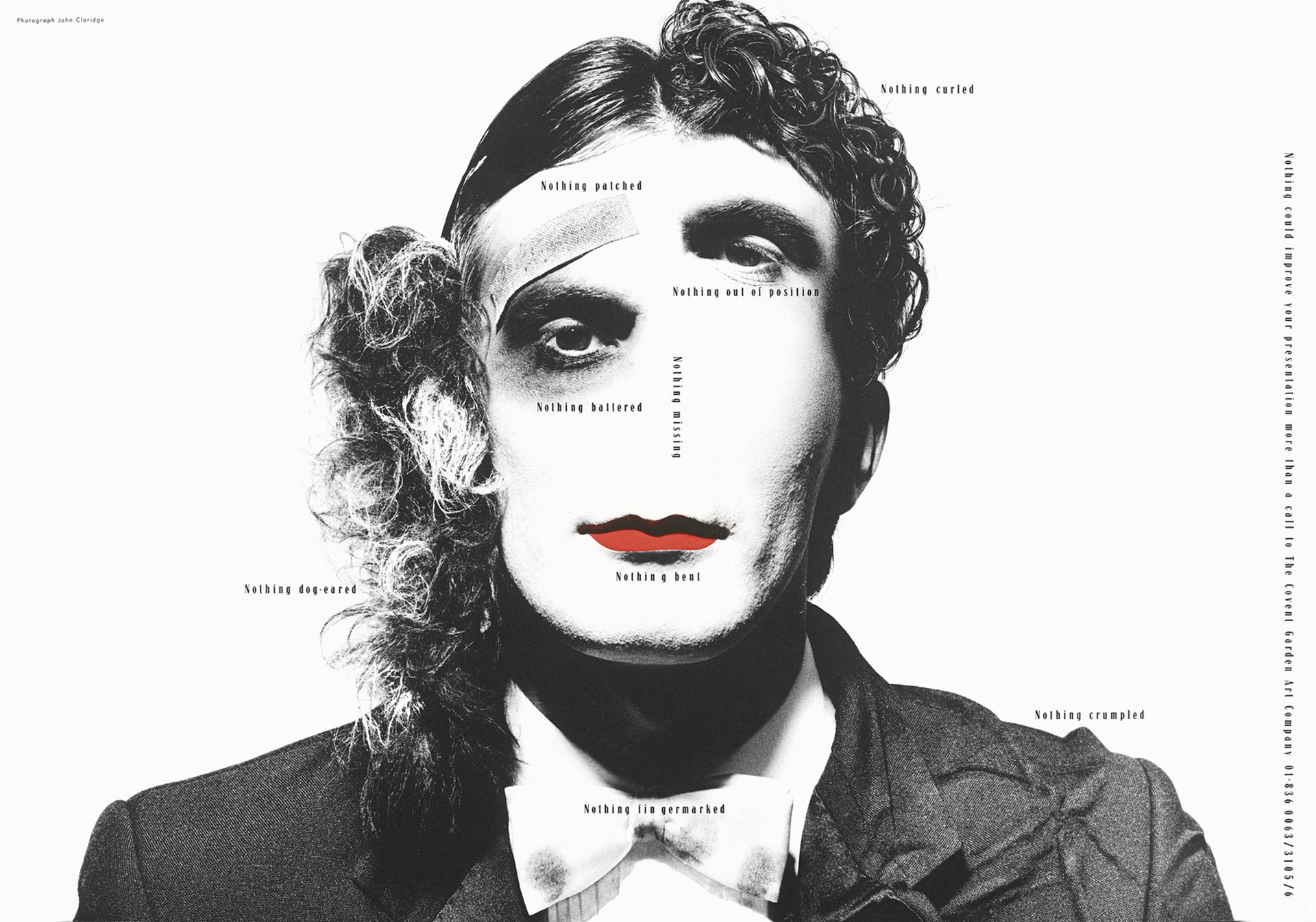
But losing the logo is not necessarily such a crazy idea. As demonstrated by the above piece of brilliance from 1986 by art director Derrick Hass.
I’d be gobsmacked if anyone who saw this ad (at the size it ran) didn’t know who the client was within a few seconds. Because the stunning visual and layout demands that you read the copy. Where you will quickly discover that it’s an ad for The Covent Garden Art Company. An artworking studio.
It was a double-page spread in Campaign magazine, aimed at art directors and production people. And the copy says: ‘Nothing could improve your presentation more than a call to The Covent Garden Art Company.’ The captions, artfully positioned over the image, say things like, ‘Nothing dog-eared’ next to the dog ear, ‘Nothing battered’, next to the black eye and ‘Nothing missing’ next to where the nose should be etc.
So how do we execute this visual idea? After all, this is an ad about details. Colour or black and white photography? Tonality? Male or female model? Clothing style? Hair style? Light, dark or mid-tone background? Typeface? And countless other decisions. Each one, if the art director doesn’t mess up, will contribute to the power of the communication. The splash of red spot colour on the lips for example. Fantastic. The choice of photographer is also critically important. And the great John Claridge no doubt brought a lot to the party.
Let’s also appreciate the skillful restraint of the typography. (I’m even tempted to forgive the 1980s trend of excessively tracking out the lowercase characters… but I don’t think I can.) Everything is set in just one typeface, at one weight and one point size. It’s sufficiently large to be perfectly legible but not so big that it takes anything away from the visual. Running the body copy vertically down the edge of the right-hand page also gets it out of the way, allowing the picture to be bigger.
It’s counterintuitive I know, because we obviously want people to read the copy. But the net effect of minimising distractions to the image is to massively increase the impact and, therefore, memorability of the entire spread. It goes against the usual client mantra of ’make everything bigger’ and means that this layout doesn’t look like just another ad. In fact it doesn’t look like an ad at all. And that’s a very good thing in terms of getting noticed.
There may be no logo. But this ad is anything but anonymous.