Banks’s Hanson’s poster
18.02.21
Agency: TBWA. Year: 1982.
Art director: John Knight. Writer: Lyndon Mallet.
Art director: John Knight. Writer: Lyndon Mallet.
Agency: TBWA. Year: 1982. Art director: John Knight. Writer: Lyndon Mallet.
There’s a really useful feature on Apple Macs that most art directors don’t know about.
It’s called an off button.
And it just might improve some of your work. So next time you’re putting a new campaign together, why not consider any analogue techniques available to you? Are they relevant? And would the result be more unique and interesting than taking the default option and designing it digitally?
I once had the challenge of creating ’liquid-looking’ type. So I went out and bought a small fish tank and photographed the type for real through the water. It worked a treat. Infinitely better than Photoshop.
I’ve also dabbled with screen printing, rubber stamps and all manner of analogue photographic techniques such as Polaroid transfers, photograms and lith printing (great for happy accidents). And I’ve had fascinating collaborations with some incredible craftspeople; from calligraphers to letterpress printers to graffiti artists to an ice sculptor, who once made me a frozen alphabet.
This approach to art direction can add another dimension to our work. And it’s an opportunity to stand out from so much of today’s sharp, shiny yet soulless advertising.
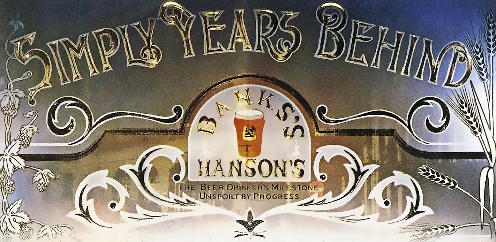
I haven’t recently seen anything with the craft, love and authenticity of this poster for Wolverhampton & Dudley Breweries (Banks’s & Hansons). It was created in 1982 (when of course there wasn’t a cheaper, quicker, crappier, digital alternative). And it’s wonderful. On every level.
Apparently art director John Knight had to rescue Lyndon Mallet‘s clever three word headline from the bin. The parody of vacuous corporate puffery brilliantly dramatises the proposition of a ‘traditional pint’. And so does the stunning art direction.
This 48 sheet poster is a single photograph of a model of the kind of ornate gilded and silvered windows we often see in our beloved British boozers.
The art director has skillfully arranged a big headline, a big logo, a packshot, an endline, and more than a few illustrations into a single thing of great beauty.
Let’s take a moment to appreciate the craft on display here.
The signwriting technique includes Victorian style letterform design and ornament illustration, outlining, sizing, application of gold leaf, frosting, burnishing and painting. The superb photography (using film of course) is technically extremely difficult. The highly reflective surface is perfectly lit with just the right amount of highlights and reflections to look like a pub window but not enough to obscure the message.
Ads like these are rare because they’re very difficult to do. And you need to invest in a fairly slow and expensive production process; something no one seems to want to commit to these days.
Which means that you should prepare yourself for some pretty robust discussions if you want to make this kind of work.
It’s worth it though.
The client will thank you six months after it’s run. (If you still have a job.)
It’s called an off button.
And it just might improve some of your work. So next time you’re putting a new campaign together, why not consider any analogue techniques available to you? Are they relevant? And would the result be more unique and interesting than taking the default option and designing it digitally?
I once had the challenge of creating ’liquid-looking’ type. So I went out and bought a small fish tank and photographed the type for real through the water. It worked a treat. Infinitely better than Photoshop.
I’ve also dabbled with screen printing, rubber stamps and all manner of analogue photographic techniques such as Polaroid transfers, photograms and lith printing (great for happy accidents). And I’ve had fascinating collaborations with some incredible craftspeople; from calligraphers to letterpress printers to graffiti artists to an ice sculptor, who once made me a frozen alphabet.
This approach to art direction can add another dimension to our work. And it’s an opportunity to stand out from so much of today’s sharp, shiny yet soulless advertising.
I haven’t recently seen anything with the craft, love and authenticity of this poster for Wolverhampton & Dudley Breweries (Banks’s & Hansons). It was created in 1982 (when of course there wasn’t a cheaper, quicker, crappier, digital alternative). And it’s wonderful. On every level.
Apparently art director John Knight had to rescue Lyndon Mallet‘s clever three word headline from the bin. The parody of vacuous corporate puffery brilliantly dramatises the proposition of a ‘traditional pint’. And so does the stunning art direction.
This 48 sheet poster is a single photograph of a model of the kind of ornate gilded and silvered windows we often see in our beloved British boozers.
The art director has skillfully arranged a big headline, a big logo, a packshot, an endline, and more than a few illustrations into a single thing of great beauty.
Let’s take a moment to appreciate the craft on display here.
The signwriting technique includes Victorian style letterform design and ornament illustration, outlining, sizing, application of gold leaf, frosting, burnishing and painting. The superb photography (using film of course) is technically extremely difficult. The highly reflective surface is perfectly lit with just the right amount of highlights and reflections to look like a pub window but not enough to obscure the message.
Ads like these are rare because they’re very difficult to do. And you need to invest in a fairly slow and expensive production process; something no one seems to want to commit to these days.
Which means that you should prepare yourself for some pretty robust discussions if you want to make this kind of work.
It’s worth it though.
The client will thank you six months after it’s run. (If you still have a job.)