Paul Belford Ltd
Case studies
About
Introduction
Information
People
Testimonials
Work
Contact
Blog
<
01
/10>
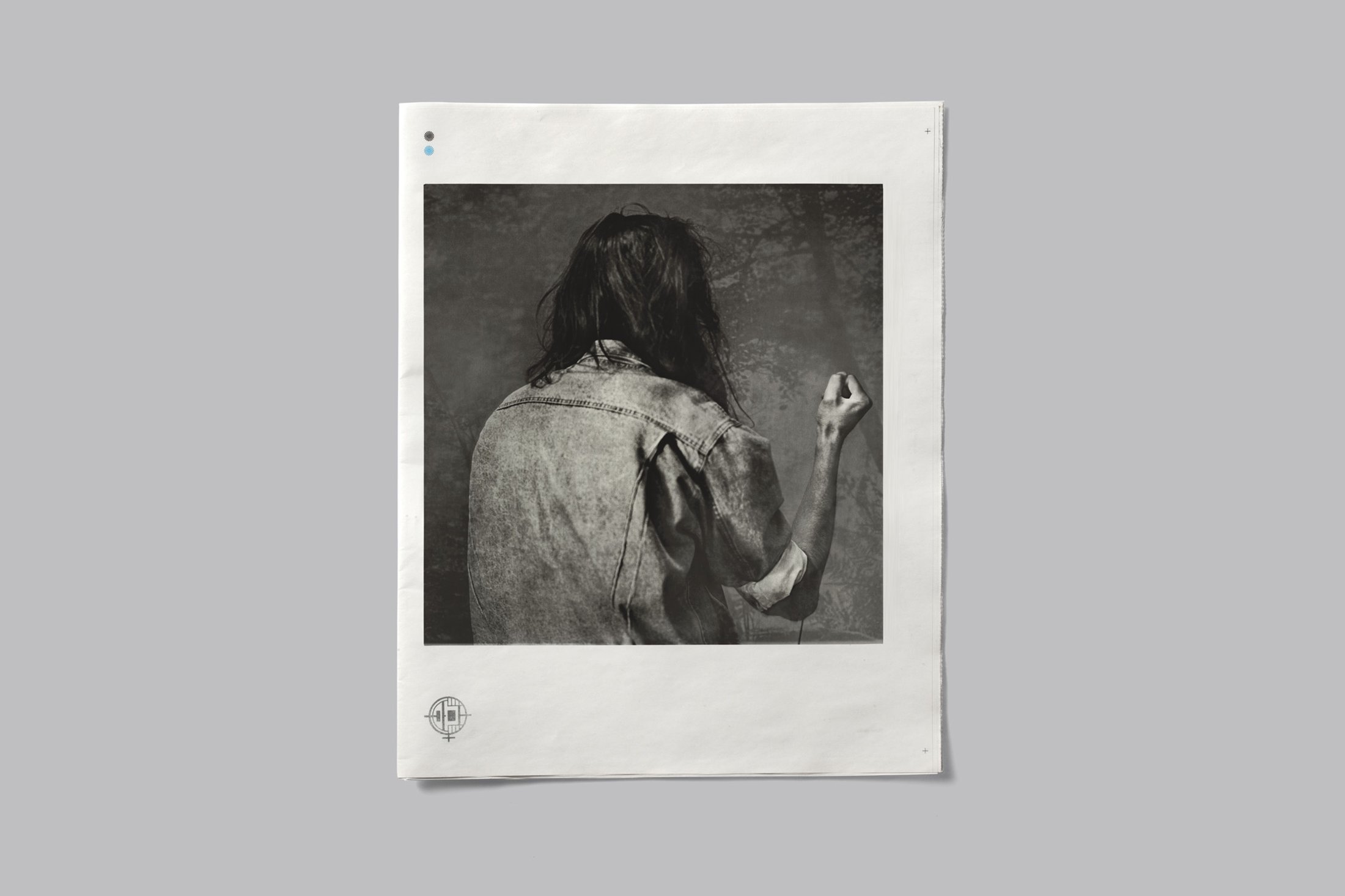
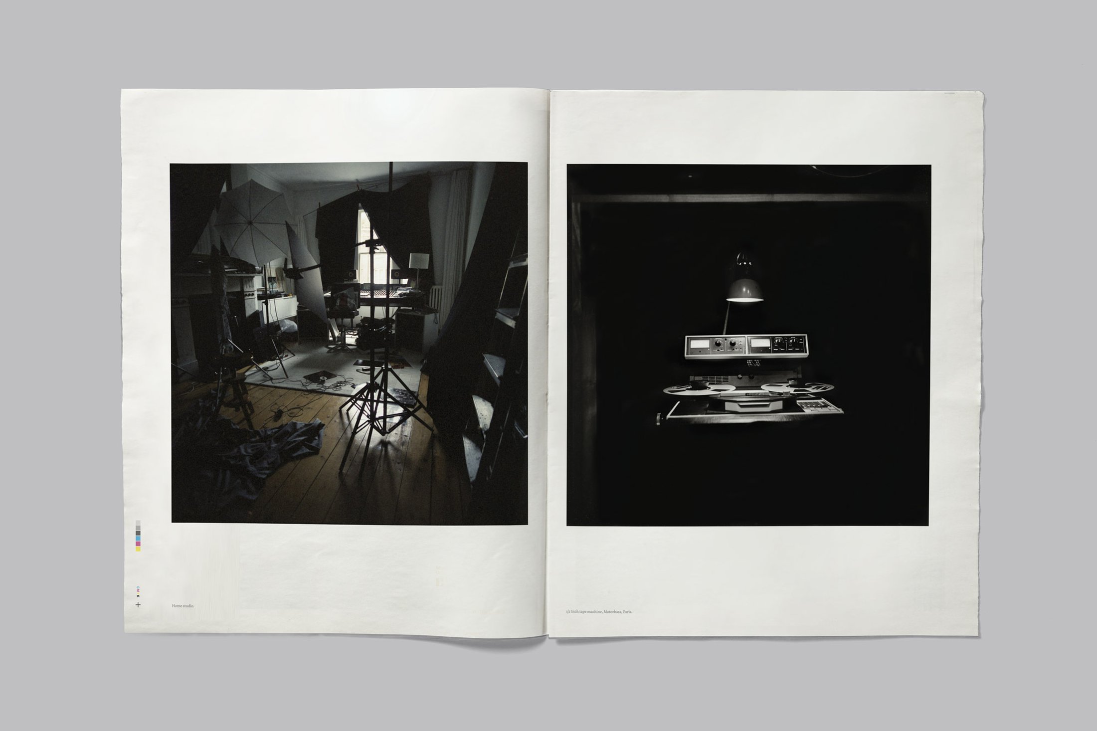
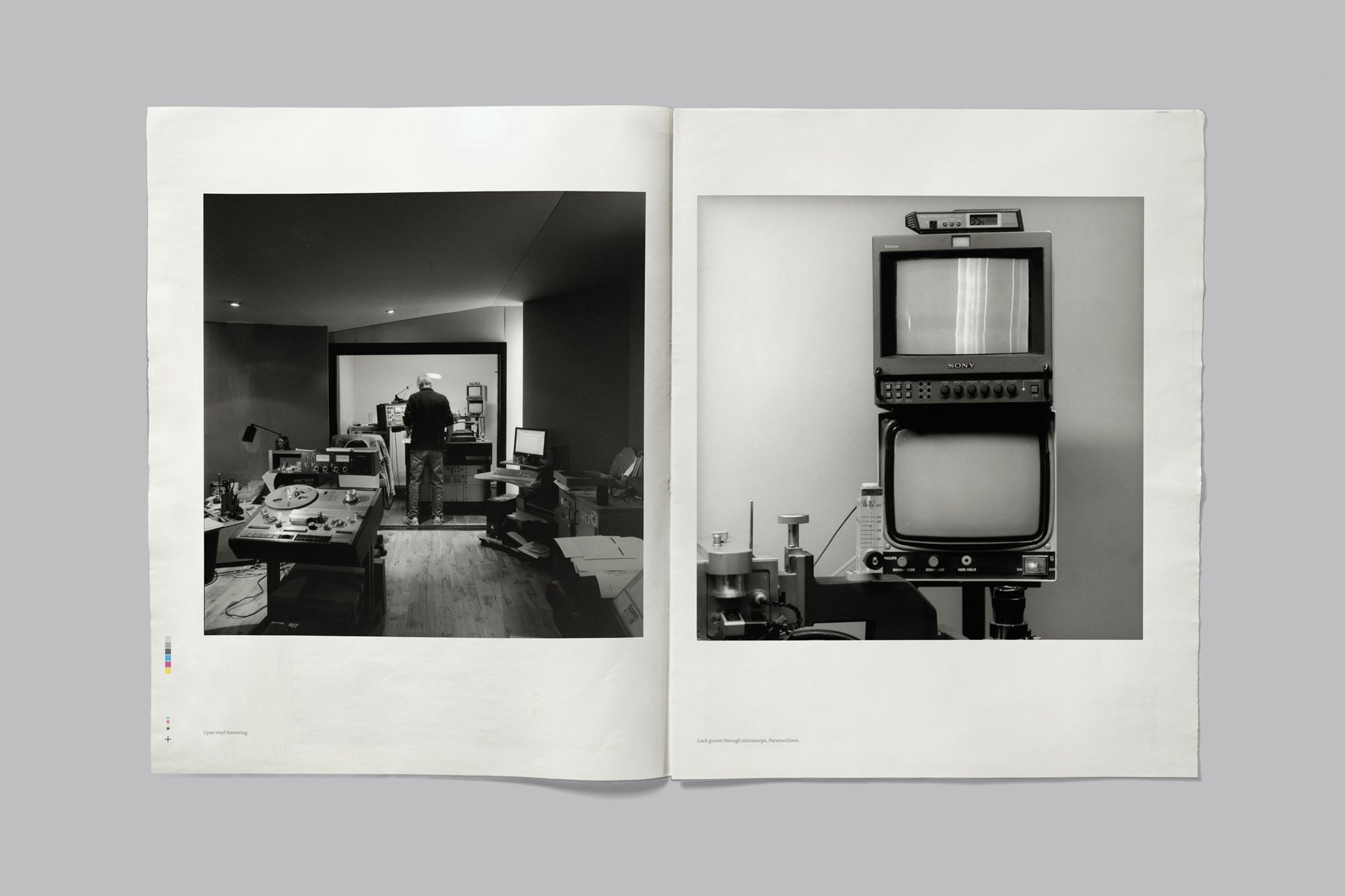
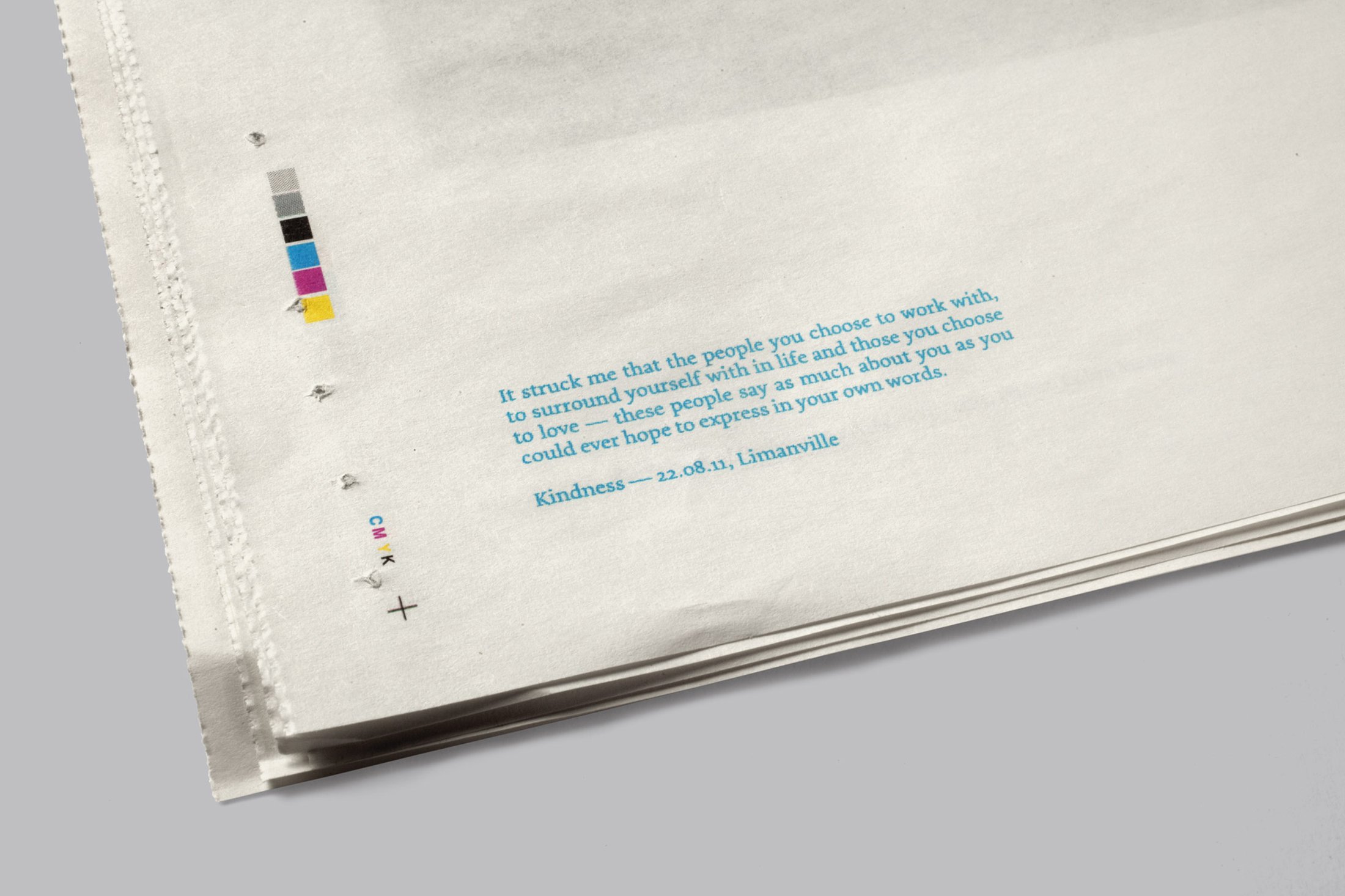
Female Energy—Brand
+
Identity and packaging for the record label.
The logo combines the symbols for female
and energy (in the form of a battery symbol).
Creative direction: Paul Belford
Agency: This is Real Art
Related project:
Kindness—Packaging