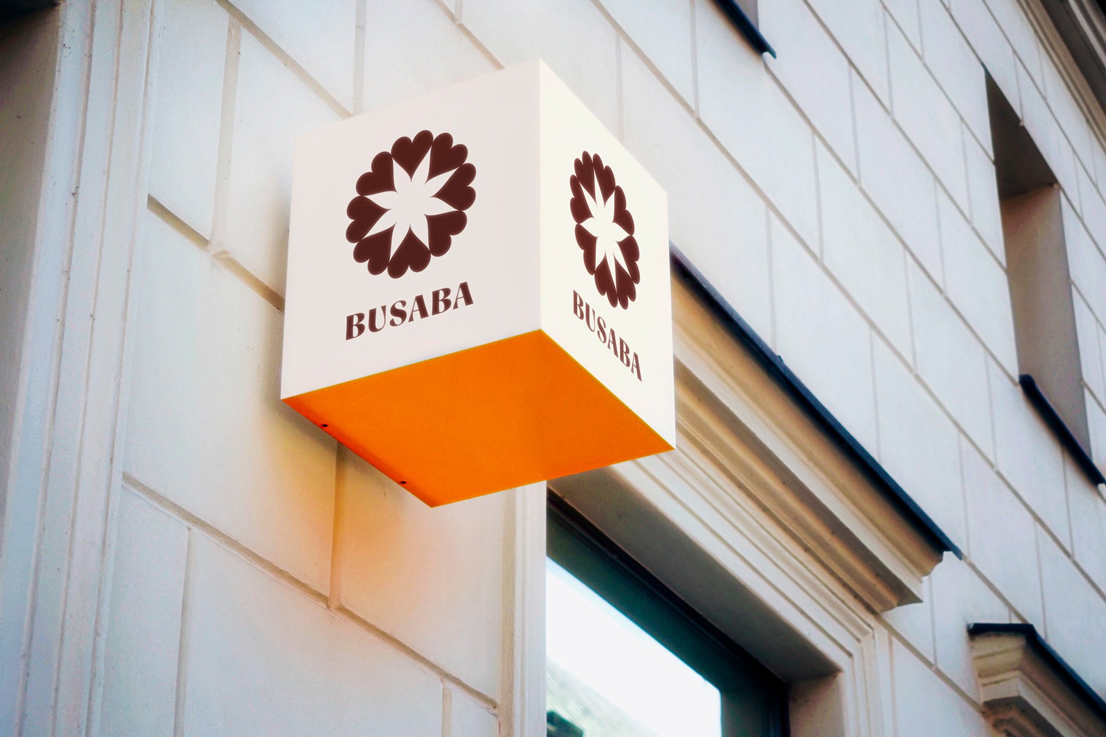
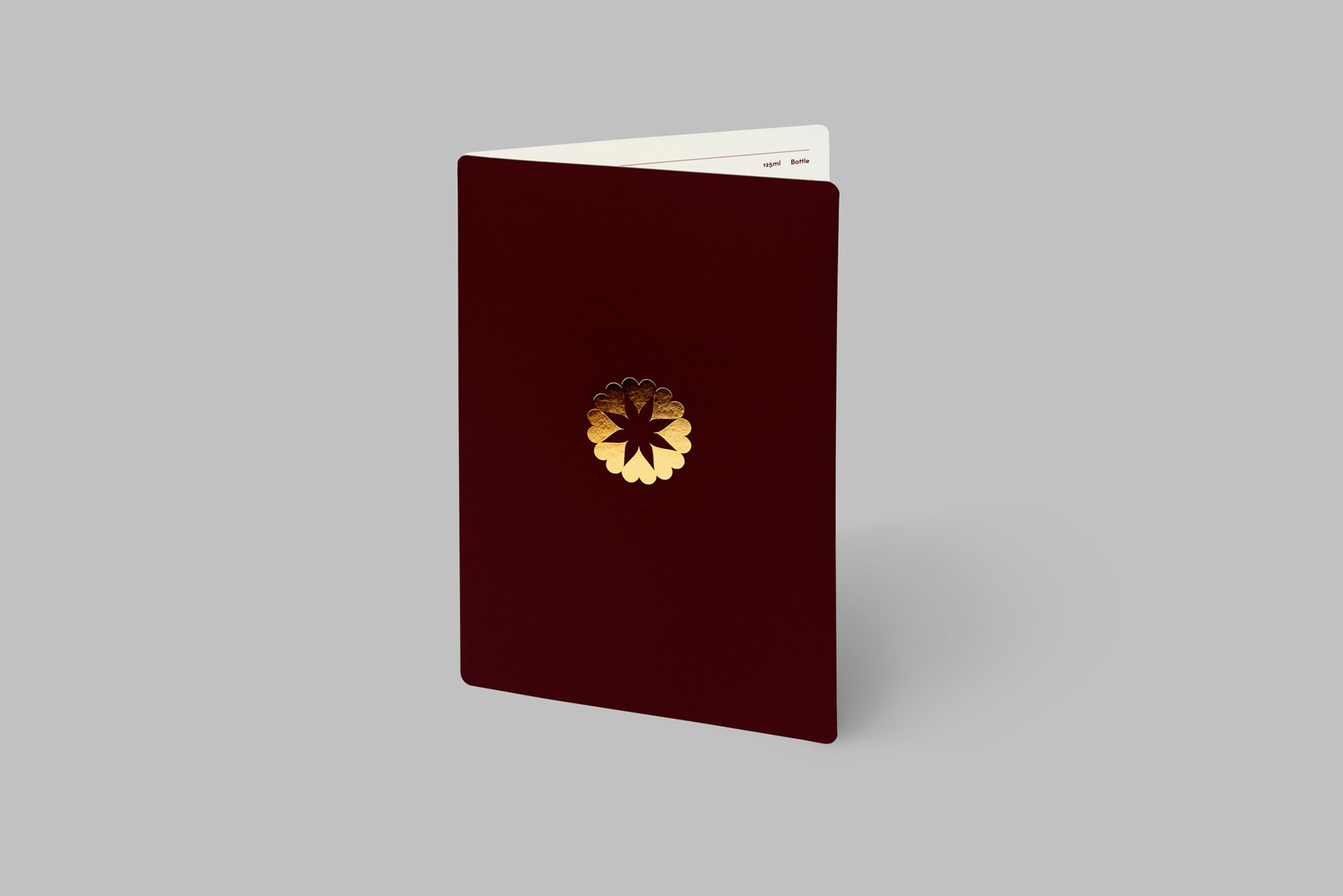
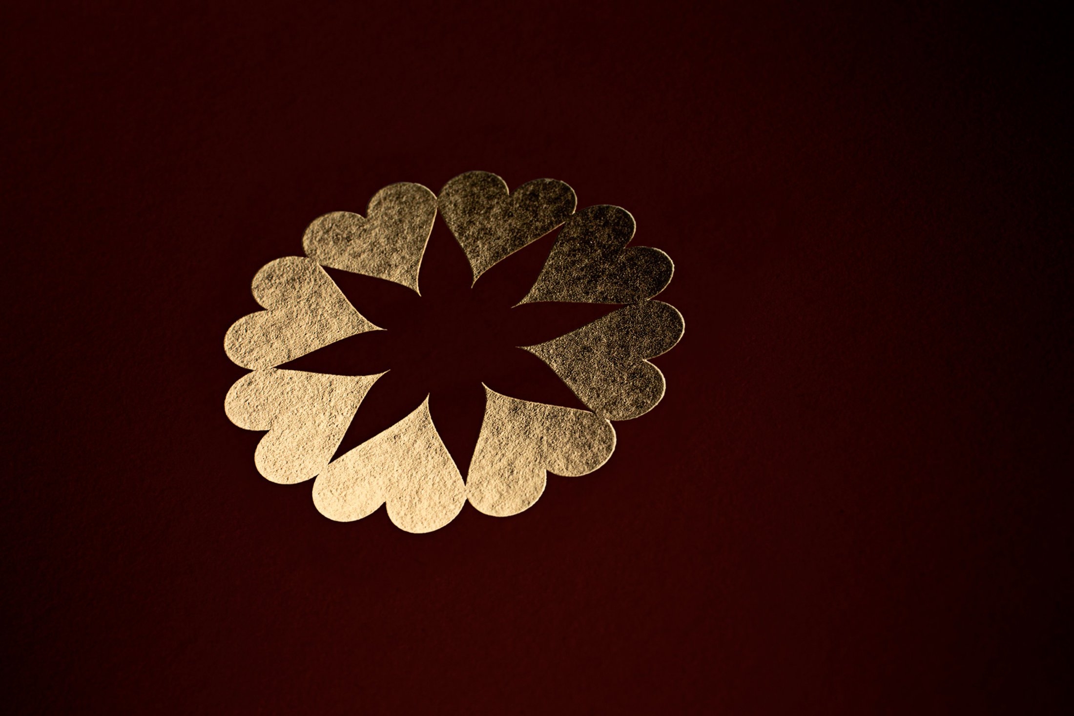
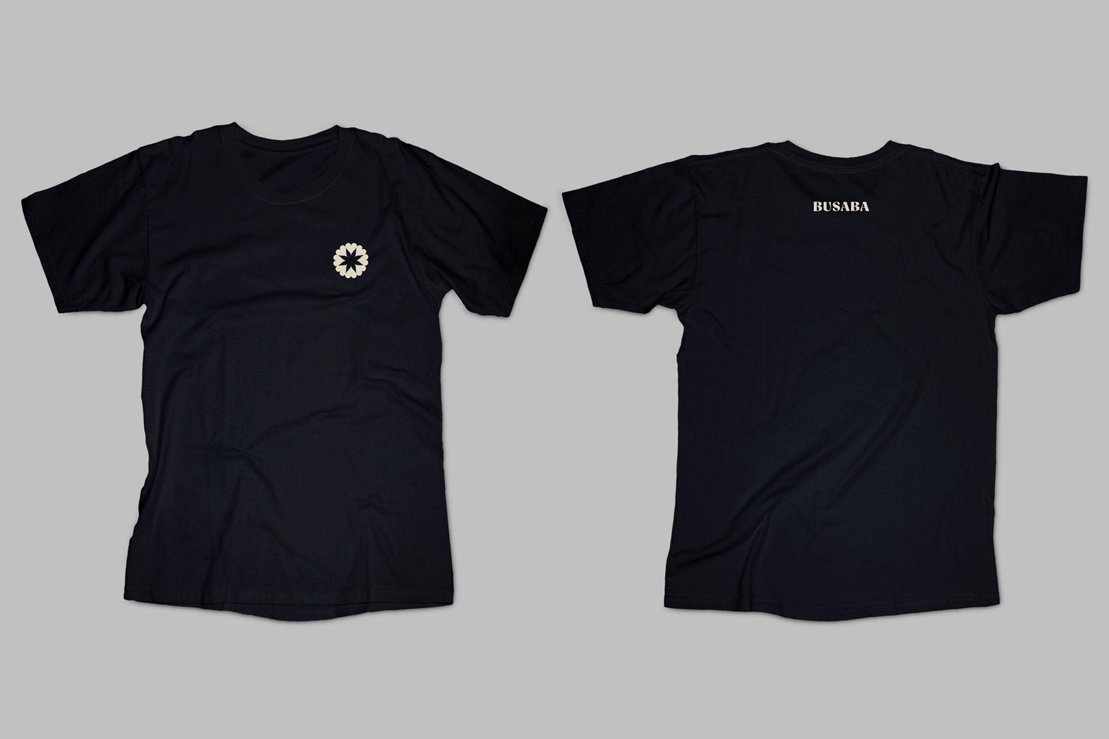
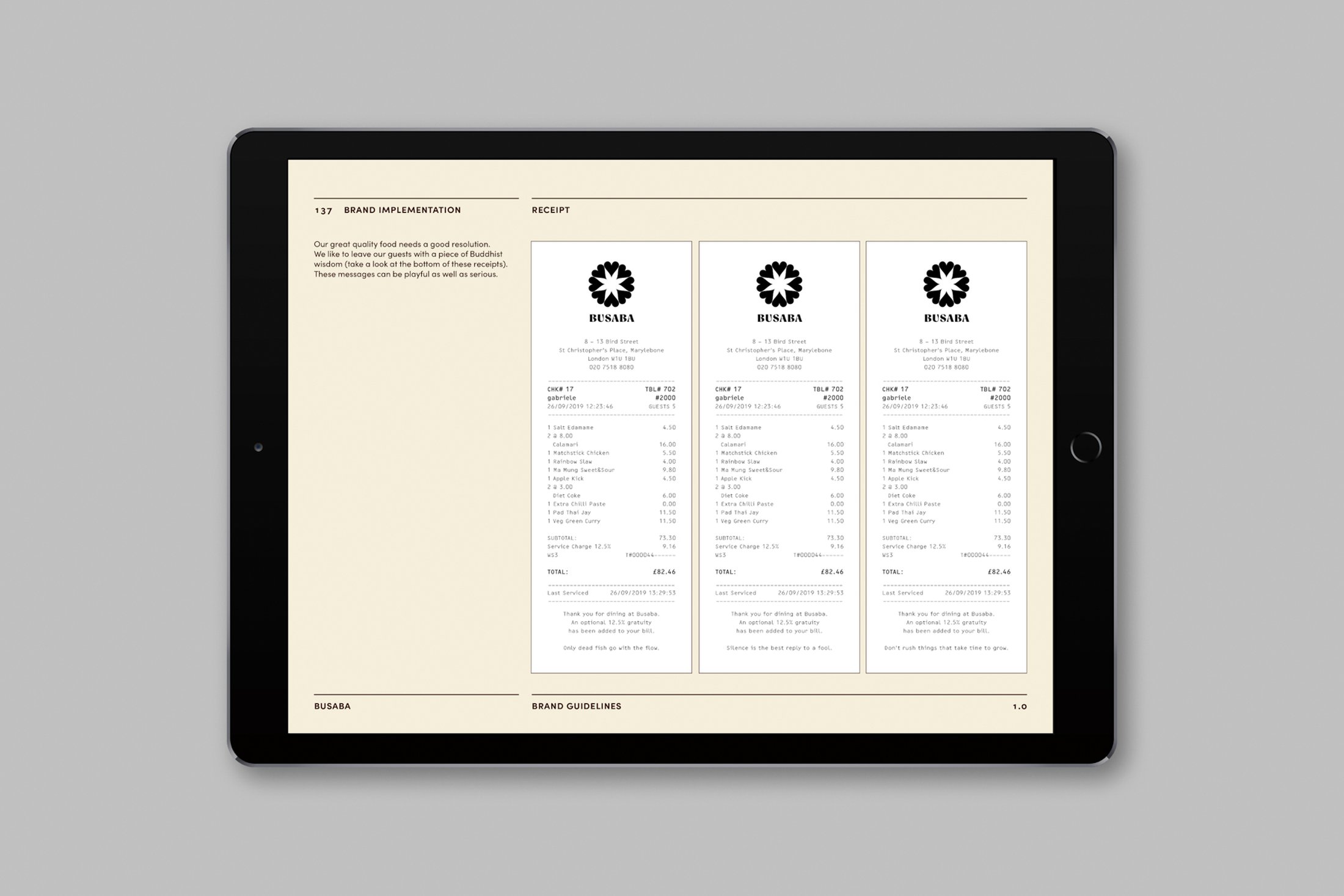
paul_belford_ltd_busaba_sign2.jpg
paul_belford_ltd_busaba_sign1.jpg
busaba_paul-belford_ltd1.gif
paul_belford_busaba_gerbera3.jpg
busaba_paul-belford_ltd3.jpg
busaba_paul-belford_ltd4.jpg
busaba_paul-belford_ltd5.jpg
busaba_paul-belford_ltd6.jpg
busaba_paul-belford_ltd7.jpg
busaba_paul-belford_ltd8.jpg
busaba_paul-belford_ltd9.jpg
busaba_paul-belford_ltd16.jpg
paul_belford_ltd_busaba_sign3.jpg
busaba_paul-belford_ltd10.jpg
paul_belford_ltd_busaba_maidenmarbling2.jpg
paul_belford_ltd_busaba_maidenmarbling1.jpg
paul_belford_ltd_busaba_pattern_5.jpg
paul_belford_ltd_busaba_pattern_9.jpg
paul_belford_ltd_busaba_pattern_10.jpg
paul_belford_ltd_busaba_menu1.jpg
paul_belford_ltd_busaba_menu3.jpg
busaba_paul-belford_ltd14.jpg
paul_belford_ltdbusaba__menu_cards4.jpg
paul_belford_ltd_busaba_pandan_chicken2.jpg
paul_belford_ltd_busaba_food2.jpg
paul_belford_ltd_busaba_menu4.jpg
paul_belford_ltd_busaba_menu5.jpg
paul_belford_ltd_busaba_black_t.jpg
busaba_paul-belford_ltd11.jpg
busaba_paul-belford_ltd12.jpg
busaba_paul-belford_ltd15.jpg
<01/31>
Busaba—Brand + 
 
Our rebrand for Busaba is rich in meaning,
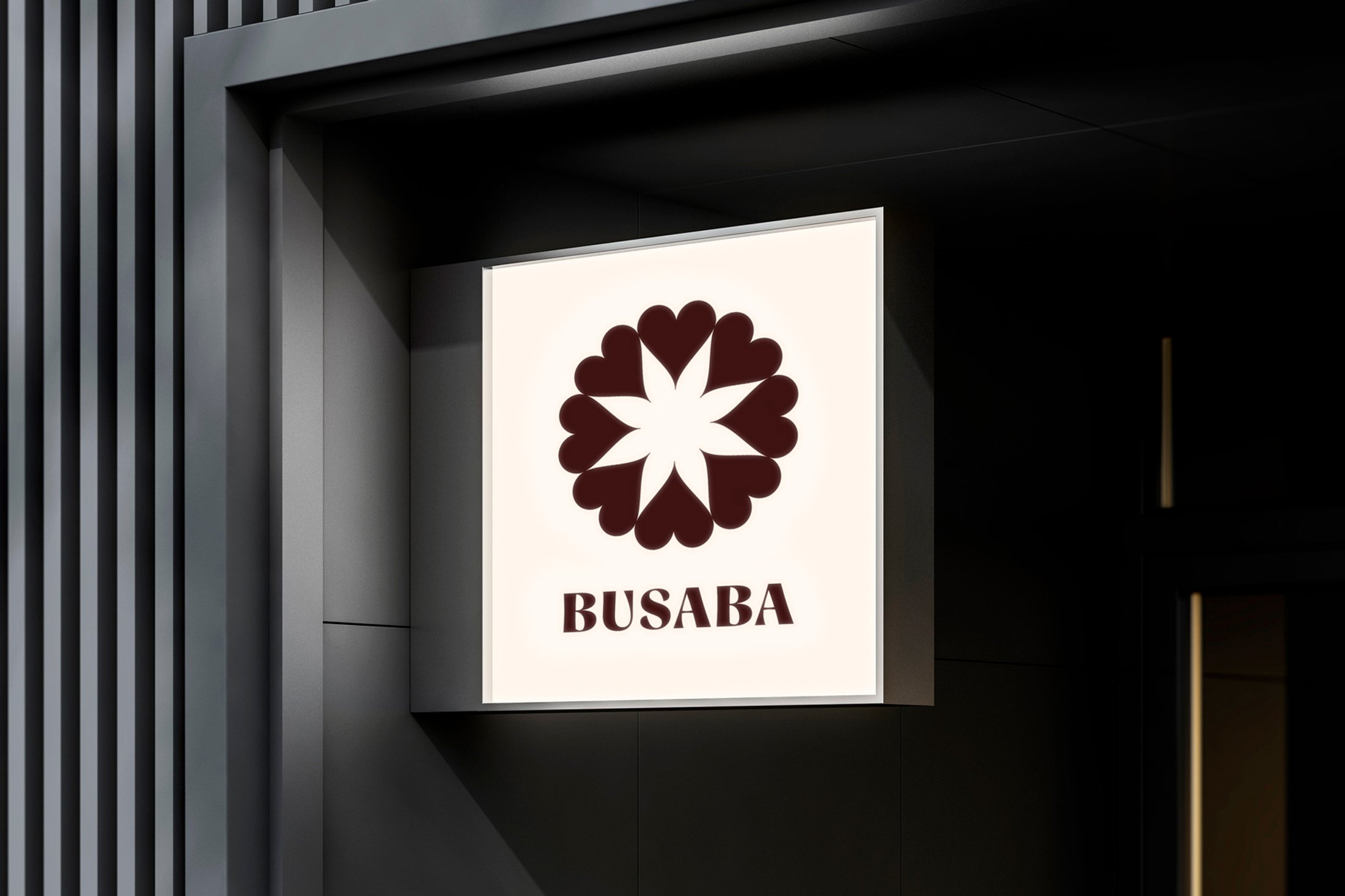
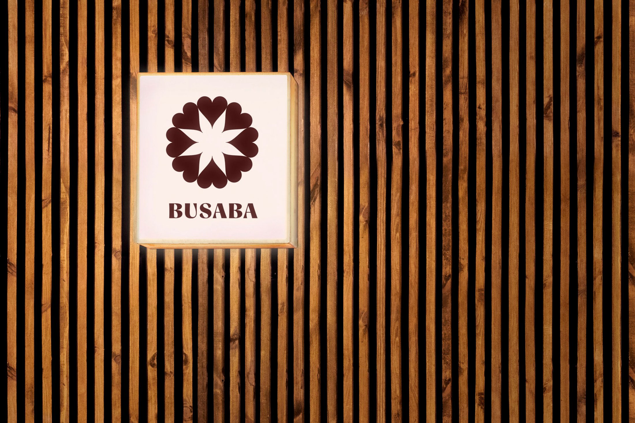
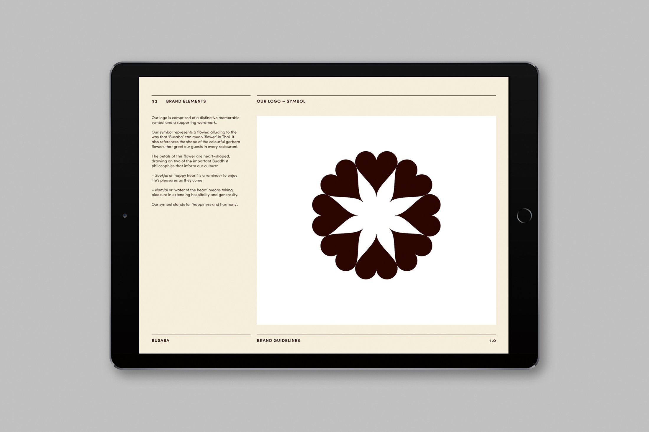
reflecting the Thai restaurant group’s founding
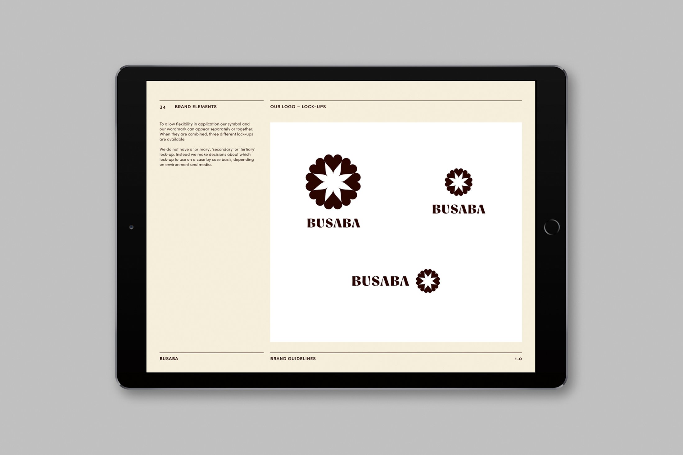
Buddhist philosophy. Our new logo represents
a flower, alluding to the fact that ‘Busaba’ can
mean ‘flower’ in Thai. It also references the
shape of the gerbera flowers that greet guests
in every restaurant. These symbolise impermanence
and serve as reminder to live in the present
moment. The petals of the flower logo are heart-
shaped, drawing on two of the important philosophies
that inform Busaba’s culture: ‘sookjai’ and
‘namjai’. ‘Sookjai’, meaning ‘happy heart’, has
similarities to the Western idea of mindfulness.
Meanwhile the principle of ‘namjai’, or ‘water
of the heart’, encourages taking pleasure in acts
of hospitality.

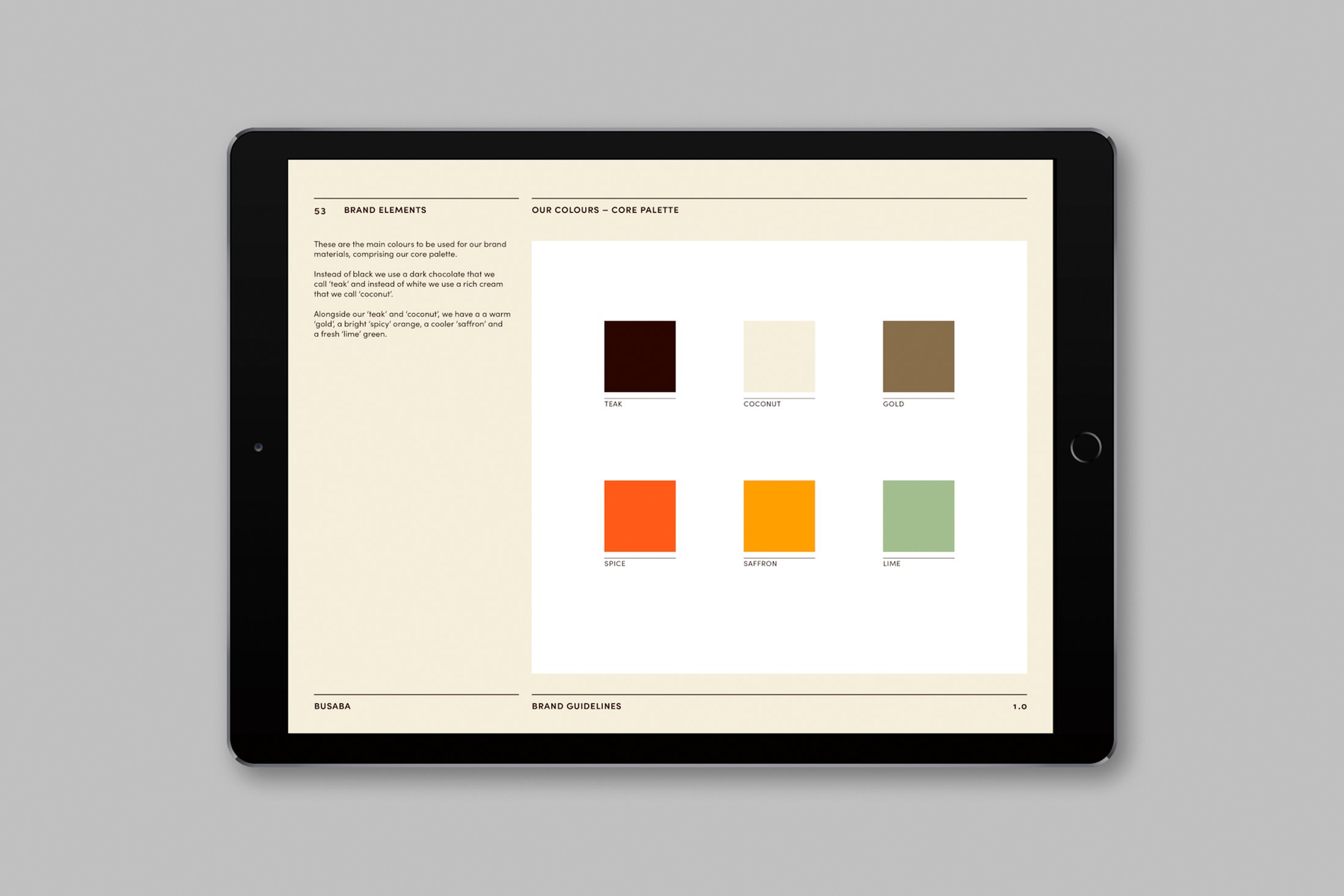
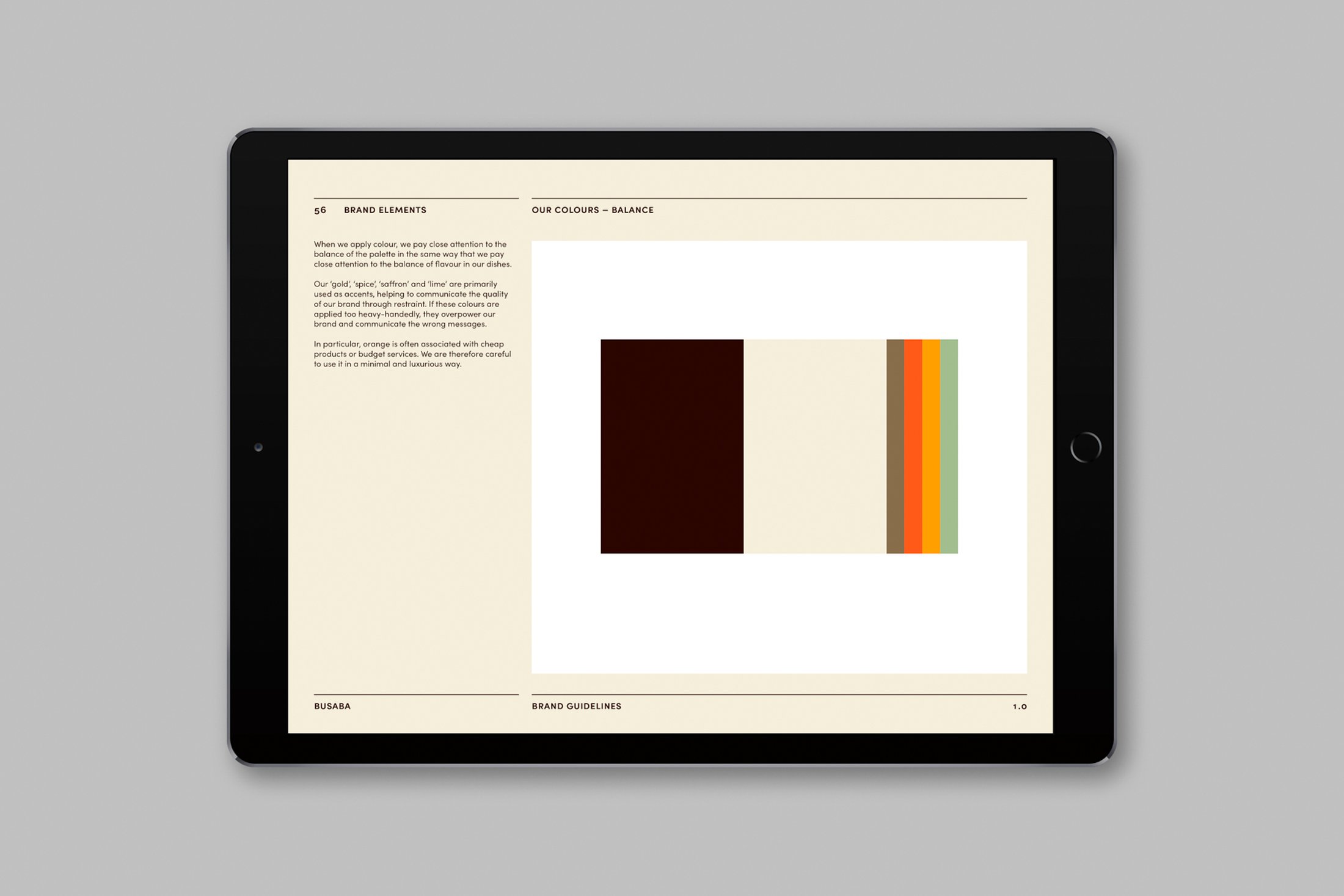
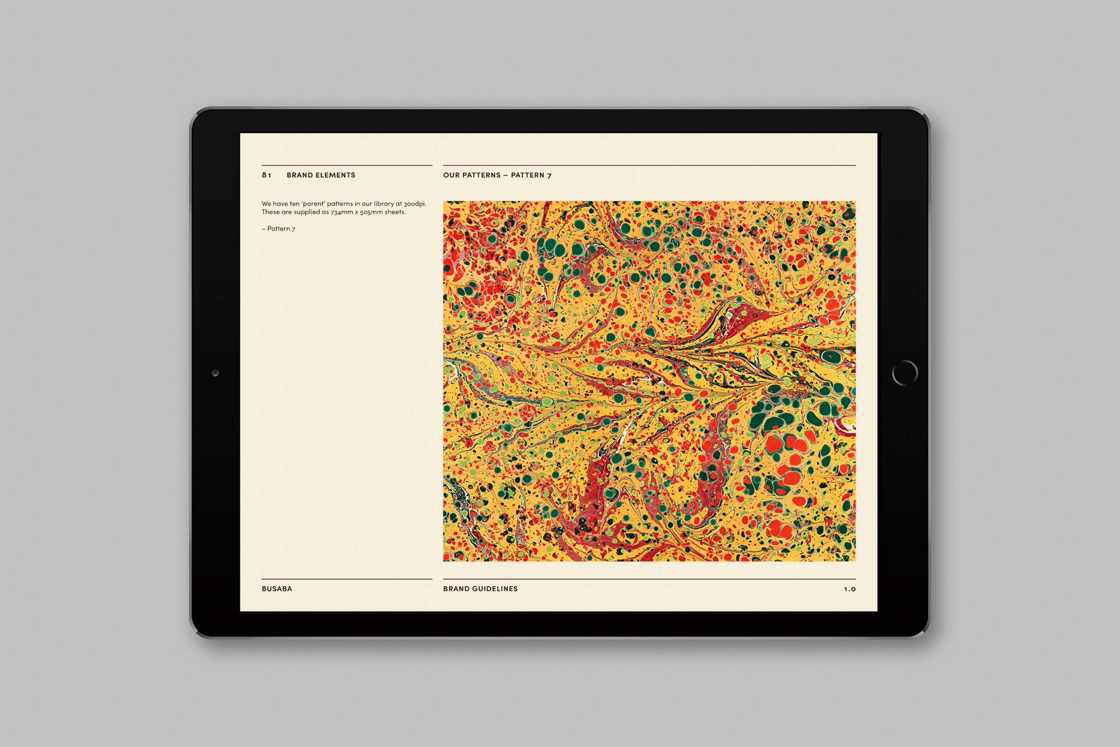
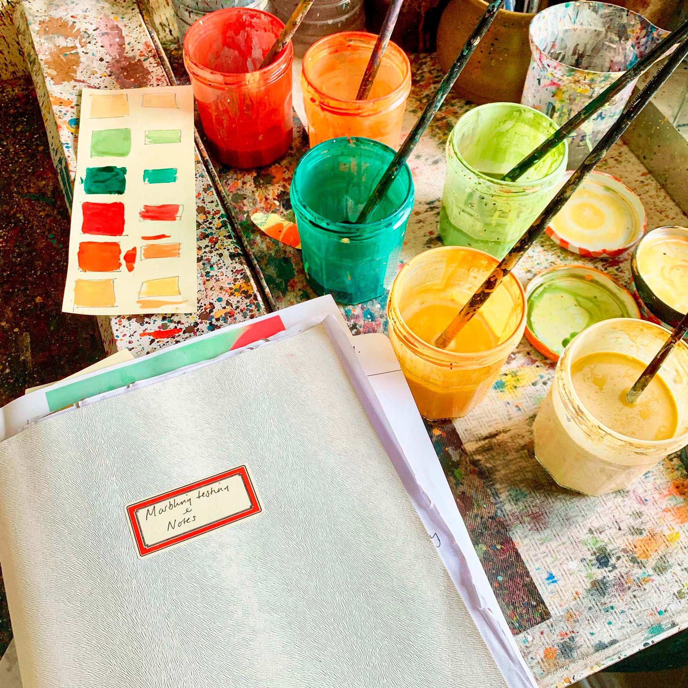
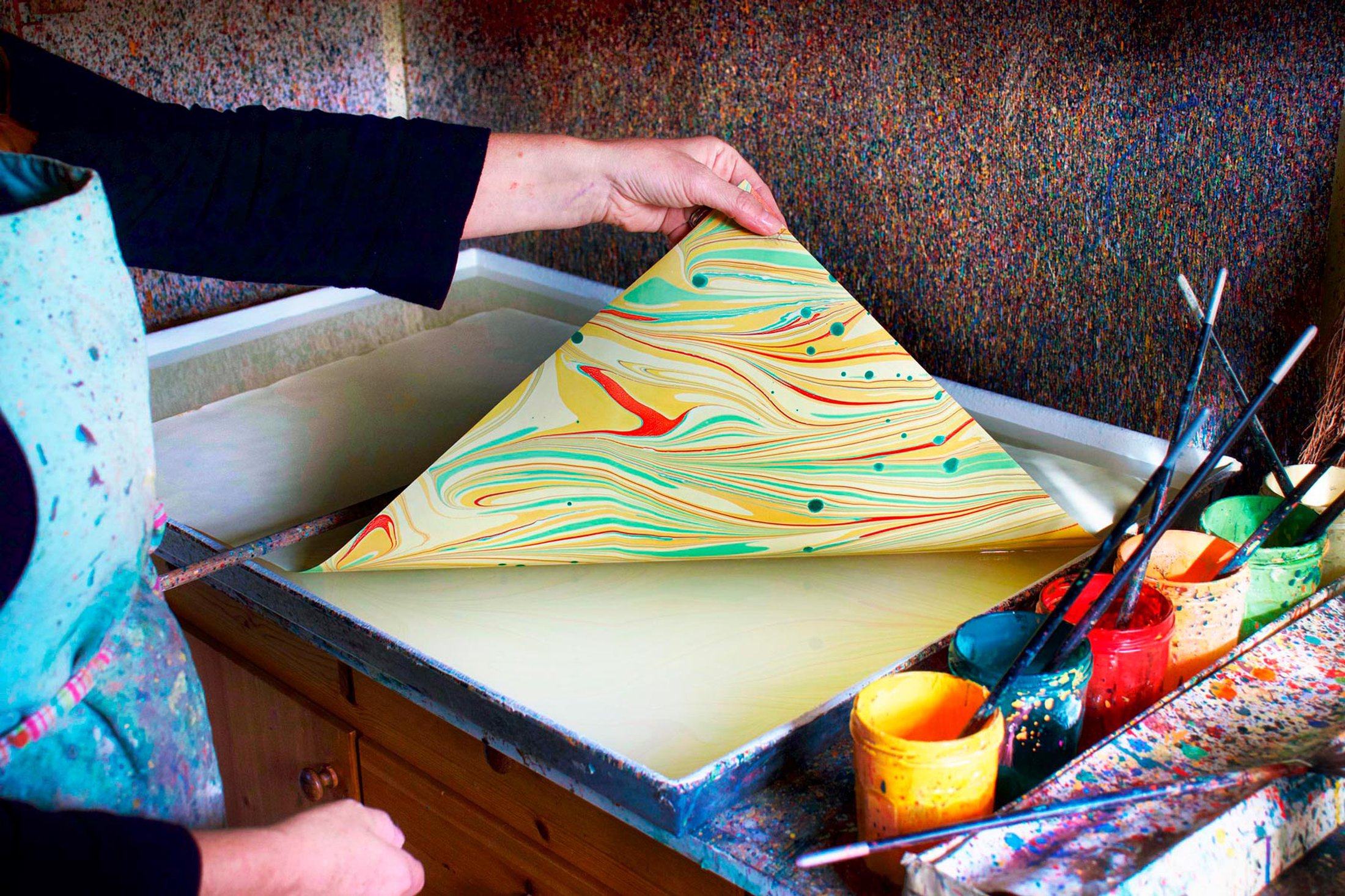
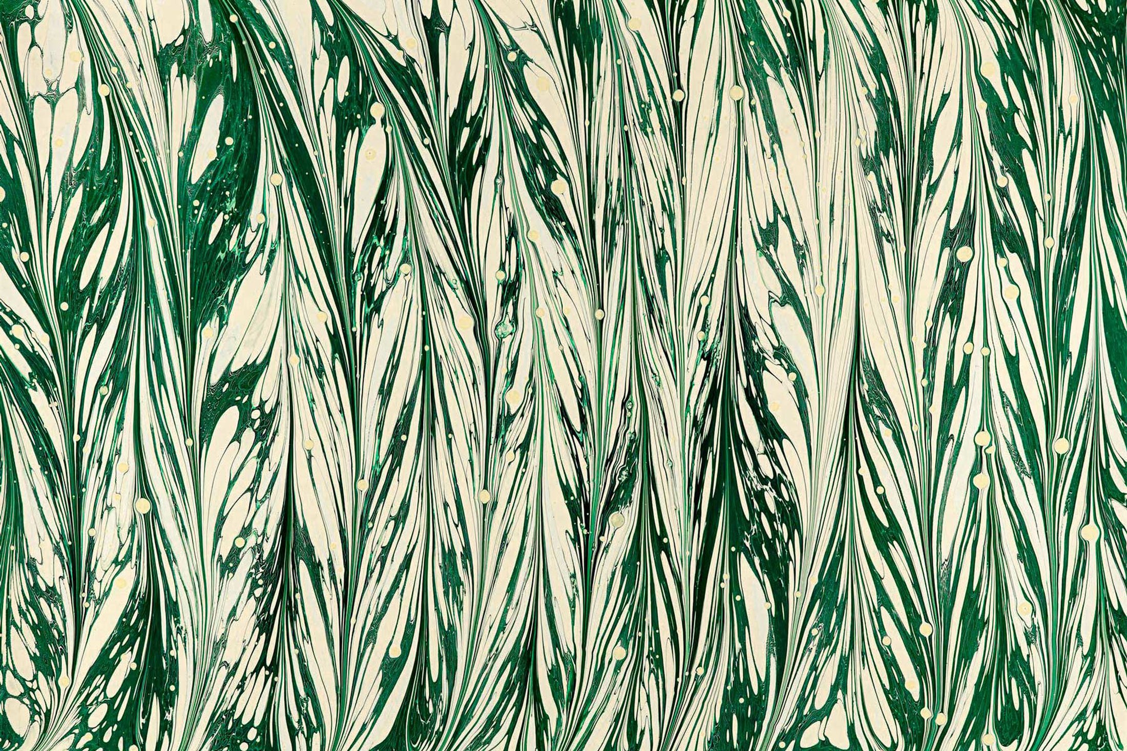
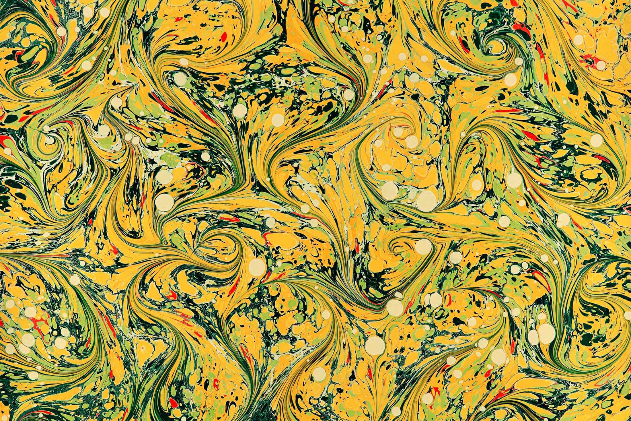
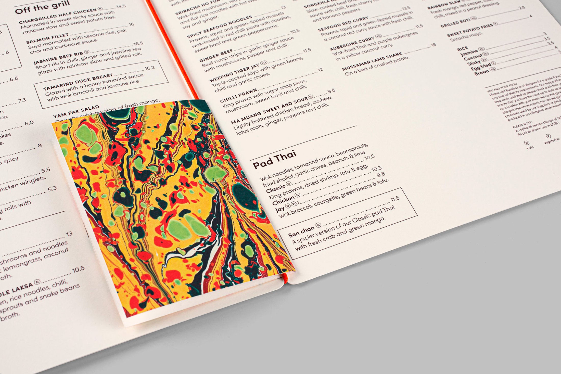
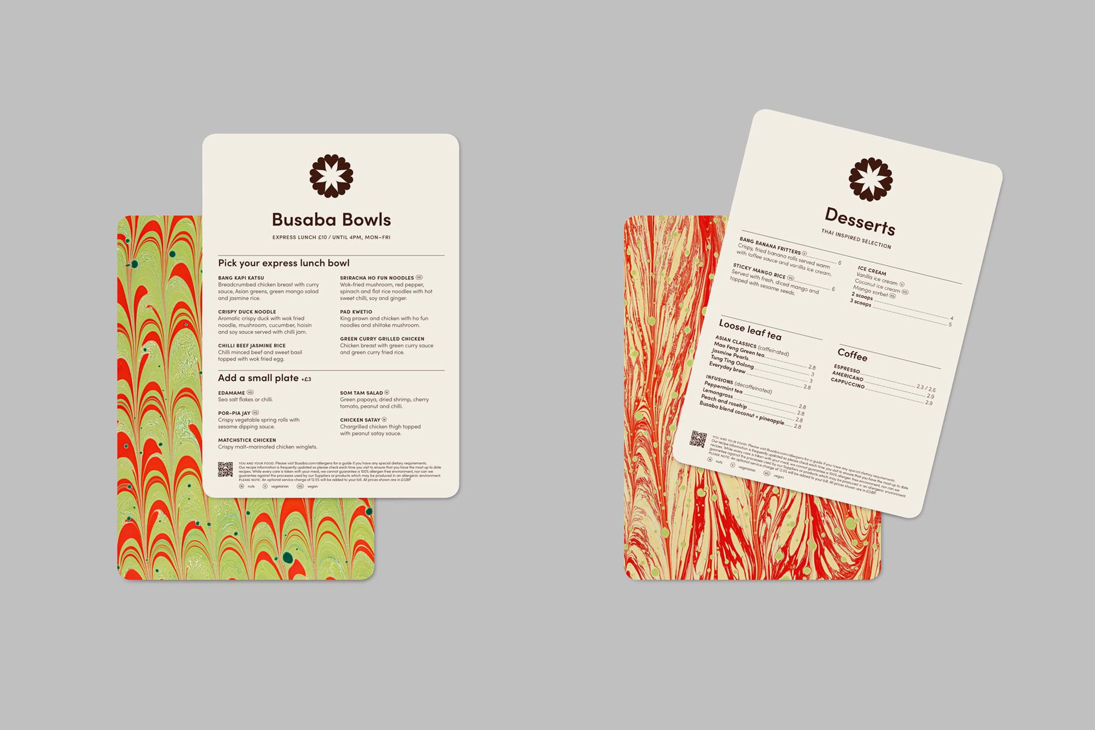
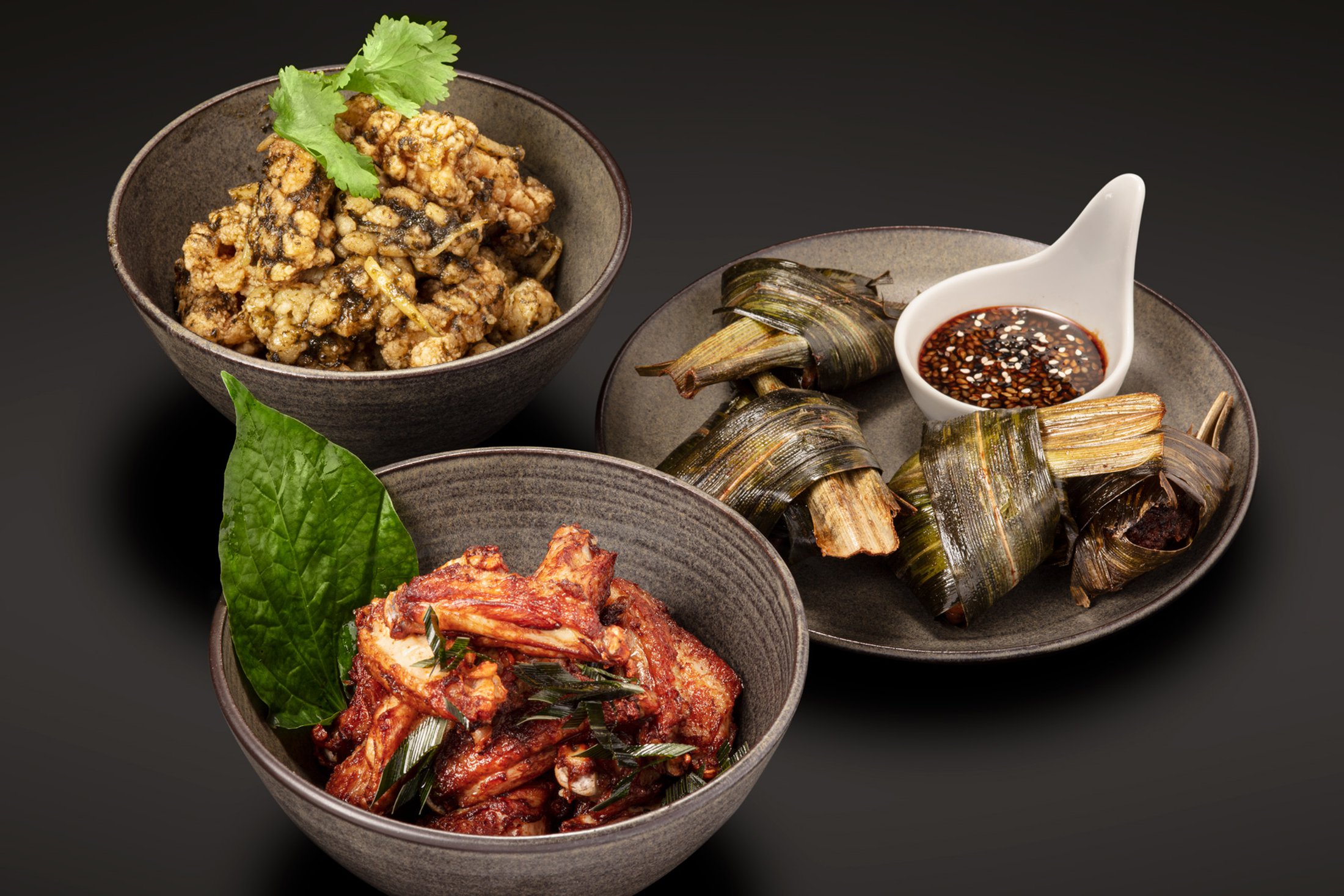
We also introduced a library of patterns that draw
inspiration and colours from Busaba’s vibrant
sauces, visualising the harmonious mix of flavours
in Thai cuisine. These are bespoke marbled papers,
produced in collaboration with artist Rachel
Maiden. The patterns make a bold graphic impact,
helping to create a rich brand language.
 
Design/Agency: Paul Belford Ltd.
 
Related projects: Busaba—Advertising 2 /  Busaba—Advertising /  YO! Sushi—Brand